How to Use UI Kits in Figma: Complete Guide
EpicPxls offers 200+ curated ui kits for Figma, all with a commercial license and editable source files (Figma, Sketch, PSD). Download your chosen ui kits from EpicPxls, then use Figma's import function. Most resources include Figma-native files for seamless opening.
Last updated February 13, 2026
Everything you need to know about using ui kits in Figma.
Trusted by designers at leading companies
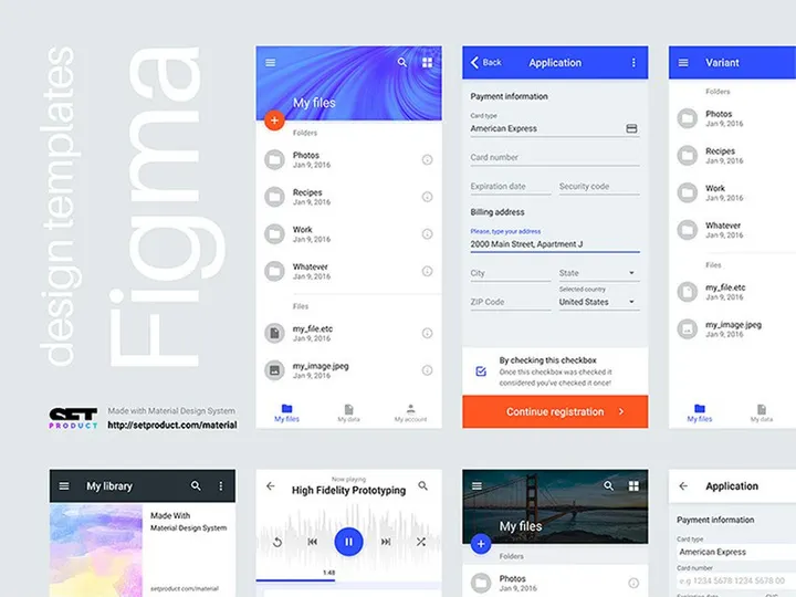
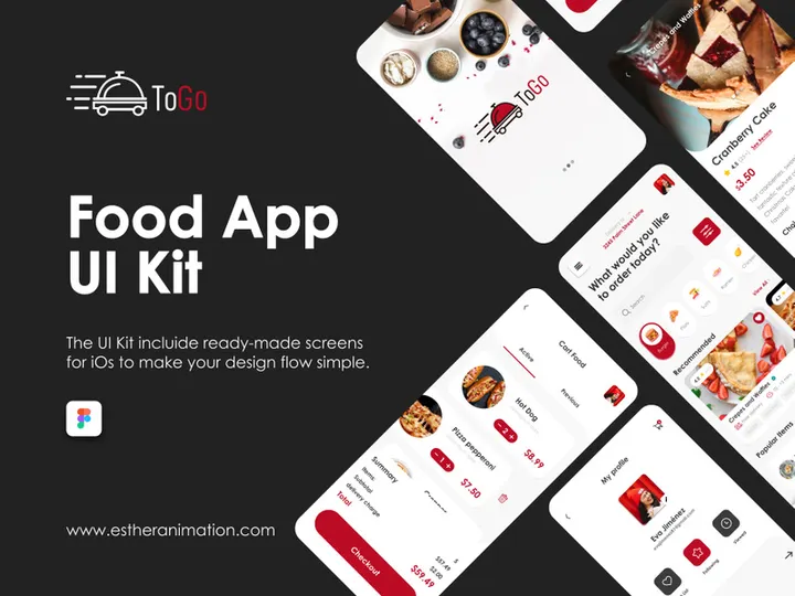
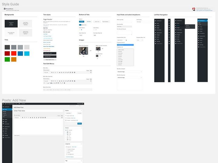
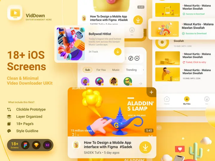
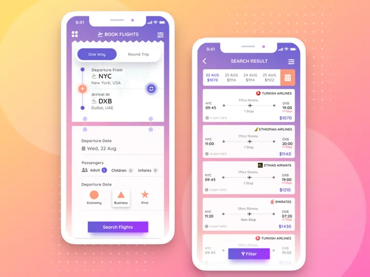
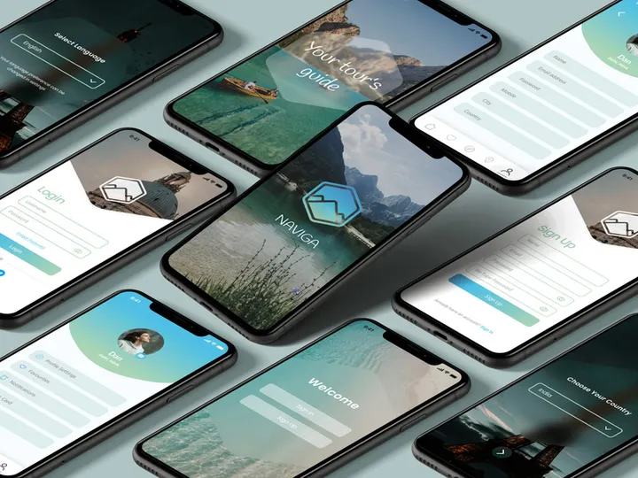
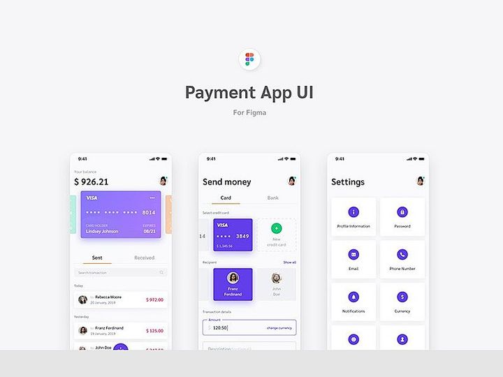
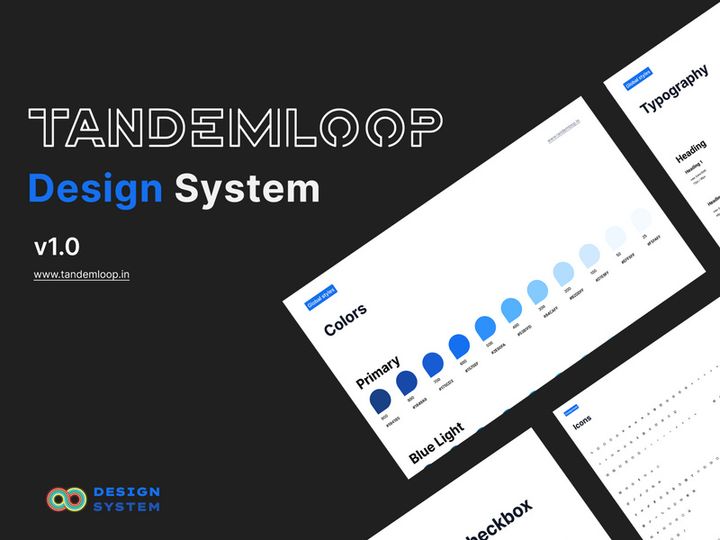
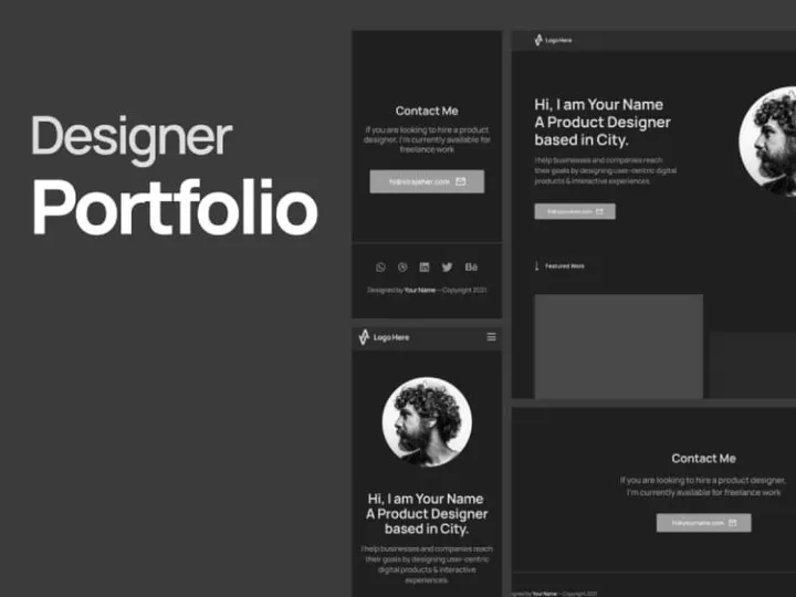
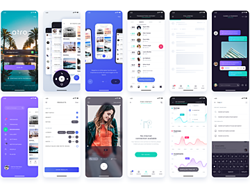
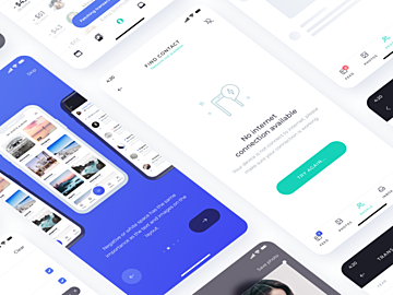
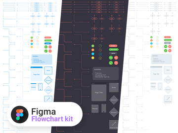
Top UI Kits for Figma
Handpicked resources from our curated collection


Try Our Free Resources
Download any of these for free - no account required


Getting Started with UI Kits in Figma
Using UI kits in Figma is one of the fastest ways to accelerate your design workflow, whether you're building a website, mobile app, or digital product. Before diving into the integration process, it’s important to ensure you have the right setup. Figma is a browser-based design tool, so the primary prerequisite is a stable internet connection and a free or paid Figma account. Simply visit Figma’s official website, sign up, and log in to access the full suite of design tools. No downloads are required for basic use, though the desktop app is available for offline access to recently opened files.
Once you're set up, the next step is sourcing high-quality UI kits that are compatible with Figma. Many design marketplaces offer UI kits in multiple formats, so always verify that the kit includes a .fig file or is labeled as Figma-ready. One of the best places to find such resources is EpicPxls, a trusted platform offering over 200+ professionally designed UI kits tailored for modern design needs. These kits span categories like dashboards, e-commerce interfaces, mobile app templates, and onboarding flows, ensuring you’ll find something that fits your project scope.
The 200+ resources available on EpicPxls are created with Figma’s component and auto-layout features in mind, making them highly customizable and efficient to use. Each kit is typically organized into well-labeled pages and frames, with consistent naming conventions and documentation to guide new users. Whether you're a beginner or a seasoned designer, starting with a well-structured UI kit can drastically reduce design time and improve consistency across your projects. With the right tools and resources in place, you’re ready to import and begin customizing your chosen UI kit directly within Figma.
How to Import UI Kits into Figma
- Choose the Right File Format: When downloading a UI kit, ensure it includes the native Figma (.fig) file. While some kits may come in other formats like PSD, AI, or SVG, only the .fig file will preserve layers, components, and design structures correctly in Figma.
- Download the Kit: Visit a trusted source like EpicPxls and download your chosen UI kit. Most kits are delivered in a ZIP folder containing the .fig file, documentation, and sometimes additional assets like icons or images.
- Unzip the Folder: Extract the contents of the ZIP file on your computer. Keep the folder organized so you can easily locate the .fig file and any supporting assets such as fonts or image directories.
- Open Figma and Create a New File: Log in to your Figma account and create a new design file. You don’t need to start from scratch—this file will serve as the container for your imported UI kit.
- Import the .fig File: In your new Figma file, go to the menu and select File > Open or File > Import, depending on your interface version. Navigate to the extracted .fig file and open it. The entire UI kit will load into your workspace with all layers, pages, and components intact.
- Verify and Organize: Once imported, review the file structure. Check that all components, text styles, and color styles have loaded correctly. Rename the file to something project-specific and save it to your preferred Figma team or personal project folder for easy access.
While Figma supports limited import of non-native formats (e.g., SVG or image files), these will not retain editable layers or component relationships. For optimal results, always use Figma-native files. If you must work with a PSD or AI file, consider converting individual elements manually by exporting SVGs or PNGs and placing them in Figma—but expect to rebuild components from scratch. Using the correct file type ensures you fully leverage the power of Figma’s design system capabilities.
Step-by-Step: Working with UI Kits in Figma
Editing Layers and Components
One of the biggest advantages of using Figma-compatible UI kits is the ability to deeply customize them without starting from square one. Once your kit is imported, you can begin editing layers, colors, typography, and layout structures with ease. Components are the backbone of efficient design in Figma—they’re reusable elements like buttons, cards, or navigation bars that update globally when modified. To edit a component, simply double-click to detach it from the main component (if you want changes to be local) or right-click and choose “Go to main component” to update it across all instances.
You can change colors using Figma’s style library, update text with new font families or sizes, and resize elements using auto-layout to maintain responsiveness. For example, if your UI kit includes a button component with auto-layout, adjusting the text will automatically resize the button’s padding. This makes scaling and adapting designs for different screen sizes much faster. Always check that your changes align with your project’s brand guidelines and usability standards.
Organizing Your UI Kits Library
With access to 200+ resources from sources like EpicPxls, it’s easy to accumulate multiple UI kits across various projects. To maintain efficiency, organize your library with a consistent structure. Create separate Figma files for different project types—e.g., “Mobile App UI Kit,” “Admin Dashboard Kit,” or “Landing Page Templates.” Within each file, use Figma’s page system to separate components, styles, templates, and documentation.
Use clear naming conventions for layers and components (e.g., “Button/Primary” or “Card/User Profile”). Leverage Figma’s team libraries to publish and share UI kits across your design team, ensuring consistency in larger organizations. You can also use tags or emoji in page names to quickly identify content types. A well-organized library not only improves your workflow but also makes onboarding new designers much smoother.
Exporting for Production
When your design is complete, Figma makes it easy to export assets in the formats needed for development. Select the element or frame you want to export, then go to the Export section in the right-hand properties panel. You can export assets as PNG, JPG, SVG, or PDF depending on the context. For web development, SVG is ideal for icons and logos due to scalability, while PNG works well for high-fidelity mockups. Mobile apps often require multiple resolutions (1x, 2x, 3x), which Figma supports with a single click.
For handoff, use Figma’s Dev Mode to share precise measurements, color codes, font sizes, and CSS snippets with developers. You can also generate shareable links with view or edit permissions. Export entire screens or individual components based on the developer’s needs. Always double-check that exported assets maintain quality and that naming conventions are clear to avoid confusion during implementation.
Troubleshooting Common Figma Issues
File Won't Open
If a UI kit fails to open in Figma, the most common cause is format incompatibility. Ensure you’re using the .fig version of the file and not a PSD, AI, or PDF. Older .fig files created in outdated versions of Figma may also cause issues. Figma usually prompts you to update the file upon opening, but if it fails entirely, contact the provider—many, including EpicPxls, offer updated versions upon request. Also, verify that your internet connection is stable, as large UI kits require substantial bandwidth to load properly.
Missing Fonts or Assets
Missing fonts are a frequent issue when importing third-party UI kits. Figma will display a warning if a font isn’t available on your system. To resolve this, install the required font family manually—most kits include a “Fonts” section in the documentation with download links. Google Fonts are commonly used and easy to install from the official website. For custom or premium fonts, check the licensing terms and download from the provided source. Missing images or icons can often be resolved by checking the ZIP folder for an assets directory and re-uploading them via Figma’s image placeholders.
Performance Problems
Large UI kits with hundreds of components can slow down Figma, especially on older hardware or low-bandwidth connections. To improve performance, avoid opening every page at once. Instead, work on one section at a time. Use Figma’s “Collapse All” feature in the layers panel to reduce clutter. If performance remains an issue, duplicate only the pages or frames you need into a new file to reduce file size. Also, ensure your browser is up to date—Figma performs best on Chrome, Edge, or Opera. Closing unused tabs can also free up memory and improve responsiveness.
Advanced Figma Tips for UI Kits
Batch Processing
When working with multiple components across large UI kits, batch editing can save hours. Use Figma’s selection tool to highlight several components at once, then adjust properties like color, opacity, or font size collectively. For even greater efficiency, use variables (available in Figma’s design system features) to define dynamic values for colors, spacing, or typography. This allows you to update dozens of elements by changing a single variable, ensuring consistency across your project.
Plugins and Extensions
Figma’s plugin ecosystem enhances the functionality of UI kits significantly. Install plugins like “Content Reel” for quick text and image insertion, “Unsplash” for high-quality photos, or “Iconify” to expand your icon library. Plugins such as “Rename It” help you standardize layer names across complex files, while “Auto Grid” speeds up layout creation. These tools integrate seamlessly with imported UI kits, allowing you to customize and scale designs faster. Always download plugins from Figma’s official community directory for security and compatibility.
Collaboration Workflows
UI kits become even more powerful in team environments. Use Figma’s team libraries to publish a shared design system based on your favorite UI kits from the 200+ resources available. This allows all team members to access standardized components, reducing design drift. Set up permissions to control who can edit the main library versus who can only use components. Use comments and version history to track changes and provide feedback. For remote teams, real-time collaboration enables multiple designers to work on different parts of the same UI kit simultaneously, making the design process faster and more cohesive.
Why Download from EpicPxls?
Commercial License
Use in personal and commercial projects
No Account Required
Download free resources instantly
Quality Curated
Every resource is reviewed for quality
Preview Files
See Figma and Photoshop files before downloading
Who Uses These Ui Kits?
Professionals and teams who benefit most from our collection
UI/UX Designers
Speed up your workflow with ready-to-use ui kits for Figma. Perfect for prototyping and client presentations.
Developers
Get production-ready assets without design skills. Export in any format for web and mobile apps.
Startups & Agencies
Save design budget with affordable premium ui kits. Commercial license included for client work.
Marketing Teams
Create professional campaigns faster. All ui kits are optimized for social media and ads.
UI Kits for Figma FAQCommon questions about these resources
Simple, Transparent Pricing
Get unlimited access to all premium resources
Yearly
- 20 downloads per month
- All file formats
- Commercial license
Lifetime
- Unlimited downloads forever
- All file formats
- Commercial license
Ready to Get Started?
Access 4,441+ free design resources today.
Browse Free ResourcesView Premium PlansEarn 85% and
more on all sales
Upload your products and put them up
for sale at whatever price you want.

