UI Kits for Adobe XD: 1774+ Resources
Discover 1774+ handpicked ui kits for Adobe XD.
Trusted by designers at leading companies
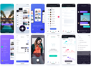
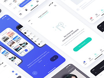
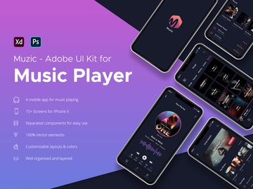
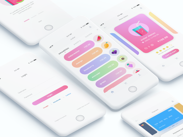
Top UI Kits for Adobe XD
Handpicked resources from our curated collection


Try Our Free Resources
Download any of these for free - no account required
What Are UI Kits?
UI kits, or User Interface kits, are comprehensive collections of pre-designed interface elements that streamline the digital product design process. These kits typically include components such as buttons, icons, navigation bars, form fields, cards, typography styles, color palettes, and even complete screen templates. Designed specifically for tools like Adobe XD, UI kits allow designers to rapidly prototype websites, mobile apps, dashboards, and other digital experiences without starting from scratch.
In today’s fast-paced design environment, efficiency and consistency are paramount. UI kits empower designers to maintain visual harmony across projects while drastically reducing design time. Instead of manually creating every button or input field, professionals can drag and drop ready-made, well-structured components directly into their layouts. This accelerates workflow, enhances collaboration, and ensures adherence to modern design standards.
Designers turn to pre-made resources not only for speed but also for inspiration and quality assurance. Many UI kits are crafted by experienced designers who follow platform-specific guidelines—such as Material Design or Apple’s Human Interface Guidelines—ensuring that interfaces are both aesthetically pleasing and functionally sound. Whether working on a startup MVP or a corporate redesign, having access to reliable, reusable components is invaluable.
EpicPxls understands the growing demand for high-quality, ready-to-use design assets. That’s why we’ve curated a vast library of over 1774+ UI kits for Adobe XD—each hand-selected for usability, style, and functionality. From minimalist wireframes to fully detailed app templates, our collection supports designers at every stage of the creative process. With such a wide range of professionally built resources, finding the perfect starting point has never been easier.
Types Available
By Style
UI kits come in a variety of visual styles to match different brand identities and project needs. Choosing the right style ensures your design feels cohesive and on-trend.
- Minimalist: Clean lines, ample whitespace, and simple color schemes make these kits ideal for modern, user-focused interfaces.
- Flat Design: Characterized by two-dimensional elements and bold colors, flat design emphasizes usability and clarity.
- Neumorphism: A newer trend blending soft shadows and subtle gradients to create a “soft UI” effect that mimics physical surfaces.
- Material Design: Inspired by Google’s design language, these kits use depth, motion, and responsive interactions to guide users intuitively.
- Dark Mode: Optimized for low-light environments, dark-themed kits improve readability and reduce eye strain, especially in media and productivity apps.
By Use Case
UI kits are also categorized by their intended application, making it easier to find components tailored to specific projects.
- Mobile App Interfaces: Designed for iOS and Android, these kits include device-specific components like status bars, tab navigations, and gesture indicators.
- Web Dashboards: Perfect for SaaS platforms, analytics tools, and admin panels, featuring data visualization widgets and responsive layouts.
- E-commerce Platforms: Include shopping carts, product grids, checkout flows, and promo banners optimized for conversion.
- Landing Pages: Focused on marketing and lead generation, with hero sections, testimonials, and call-to-action blocks.
- Onboarding Flows: Guide new users through app features using step-by-step screens, illustrations, and interactive prompts.
Free vs Premium
One of the most important distinctions among UI kits is whether they are free or premium. Free kits offer accessibility and are great for learning or small personal projects. However, they may lack advanced features, consistent styling, or comprehensive component libraries.
Premium kits, on the other hand, are typically more robust. They often include full design systems, variant components (like hover states and disabled buttons), extensive icon sets, and multi-language support. They’re also more likely to be regularly updated and come with dedicated support. While free resources are valuable, investing in premium UI kits can significantly elevate the professionalism and scalability of your designs.
At EpicPxls, we offer both free and premium options across our 1774+ resources, ensuring every designer—regardless of budget—can access high-quality assets that meet their project demands.
How to Choose
Quality Indicators
Not all UI kits deliver the same level of craftsmanship. To ensure you're selecting a reliable and effective kit, consider the following criteria:
- Consistency: Components should follow uniform spacing, corner radii, typography, and color usage for a polished look.
- Component Variety: Look for kits with a wide range of elements—buttons, inputs, modals, loaders, and navigation—to reduce the need for custom design.
- Well-Organized Layers: A clean layer structure with properly named groups and layers makes customization easier and faster.
- Responsive Design Support: Kits that include adaptive components or artboard variants for different screen sizes enhance usability.
- Design System Integration: The best kits come with style guides, reusable symbols, and global colors/text styles for scalable design.
- User Reviews & Ratings: Feedback from other designers can highlight reliability, ease of use, and potential limitations.
File Formats
Adobe XD UI kits are primarily distributed in .xd format—the native file type for Adobe XD. This ensures full compatibility with the platform’s features, including components, auto-animate, and repeat grids. Some kits may also include .sketch or .fig files for cross-platform flexibility, but the core experience is optimized for XD.
When downloading a UI kit, ensure it’s in the correct format and version. Older .xd files may not support newer features like states or responsive resize. Always check the file requirements and update your Adobe XD application if necessary. ZIP files are common for bundling multiple artboards or design systems, so be prepared to extract and organize the contents upon download.
Licensing
Understanding licensing is crucial, especially for commercial projects. Free UI kits often come with personal-use-only licenses, meaning they can’t be used in client work or products intended for sale. Always review the license terms before integrating a kit into a professional project.
Premium kits typically offer extended or commercial licenses, allowing use in client designs, SaaS platforms, mobile apps, and more. Some may even support team usage or enterprise deployment. If you’re working with a design team, ensure the license permits multiple users or shared access.
At EpicPxls, every UI kit includes clear licensing information, so you can confidently select resources that align with your project’s legal and business requirements. Whether you're freelancing or building a startup, having the right license ensures peace of mind and professional integrity.
Getting Started
Using a UI kit in Adobe XD is straightforward once you know the steps. Follow this guide to integrate any kit into your workflow quickly and effectively.
- Download the Kit: Visit a trusted source like EpicPxls and download your chosen UI kit. Most kits are delivered as ZIP files.
- Extract the Files: Unzip the folder to access the .xd file and any accompanying documentation or assets.
- Open in Adobe XD: Launch Adobe XD and open the .xd file directly from the application or by double-clicking the file.
- Explore the Artboards: Browse through the included screens and components. Look for style guides, component libraries, and usage instructions.
- Duplicate or Copy Components: Use the right-click menu to duplicate entire artboards or copy individual elements into your own project file.
- Customize for Your Needs: Replace placeholder text, adjust colors, and modify components to match your brand and project goals. Leverage XD’s components and states for interactive prototypes.
Once imported, you can save frequently used elements as reusable components in your own library for future use. This not only speeds up design but also maintains consistency across multiple projects.
Best Practices
Organization
One of the most overlooked aspects of using UI kits is maintaining organization. A well-structured file makes collaboration and iteration much smoother. Rename layers and groups clearly—avoid generic names like “Rectangle 1” or “Group 3.” Use a consistent naming convention such as “Button/Primary/Hover” to reflect component hierarchy.
Group related elements logically and utilize XD’s artboard naming to categorize screens (e.g., “Onboarding/Step 1,” “Dashboard/Overview”). Keep unused components on hidden artboards or in a “Library” section rather than deleting them outright. This preserves flexibility for future updates or alternate layouts.
Customization
While UI kits provide a strong foundation, they should never be used as-is without tailoring to your project. Customize colors to reflect your brand identity, update typography to match your voice, and adjust spacing for optimal readability. Replace placeholder images with real content as early as possible to avoid design surprises later.
Leverage Adobe XD’s powerful features like Components and Variants to create interactive, dynamic interfaces. Convert common elements (buttons, cards, inputs) into reusable components so changes propagate across all instances. This dramatically improves efficiency, especially in large projects with many screens.
Remember, the goal isn’t to replicate the kit but to adapt it. Your final design should feel original and purpose-built—even if it started with a template from our 1774+ resources.
Common Mistakes
Even experienced designers can fall into traps when using UI kits. Being aware of these pitfalls helps you avoid them and produce higher-quality work.
- Over-reliance on Templates: Using every component as-is without considering user needs or brand alignment can result in generic, uninspired designs.
- Ignoring Accessibility: Some kits use low-contrast colors or small tap targets. Always verify that your final design meets WCAG standards for accessibility.
- Poor Typography Hierarchy: Failing to adjust font sizes, weights, and line heights can make interfaces hard to scan and navigate.
- Disorganized Files: Cluttered layers and unnamed groups make collaboration difficult and increase the risk of errors during handoff.
- Skipping User Testing: Just because a design looks good doesn’t mean it works well. Always validate your interface with real users before finalizing.
By avoiding these common mistakes and applying thoughtful customization, you can turn any UI kit into a powerful tool for creating exceptional user experiences.
Whether you're building your first prototype or scaling a design system, EpicPxls offers the tools you need. With over 1774+ UI kits for Adobe XD, our library continues to grow alongside the evolving needs of modern designers. Explore, experiment, and elevate your workflow with resources designed for performance, beauty, and usability.
Why Download from EpicPxls?
Commercial License
Use in personal and commercial projects
No Account Required
Download free resources instantly
Quality Curated
Every resource is reviewed for quality
Preview Files
See Figma and Photoshop files before downloading
Who Uses These Ui Kits?
Professionals and teams who benefit most from our collection
UI/UX Designers
Speed up your workflow with ready-to-use ui kits for Adobe XD. Perfect for prototyping and client presentations.
Developers
Get production-ready assets without design skills. Export in any format for web and mobile apps.
Startups & Agencies
Save design budget with affordable premium ui kits. Commercial license included for client work.
Marketing Teams
Create professional campaigns faster. All ui kits are optimized for social media and ads.
UI Kits for Adobe XD FAQCommon questions about these resources
Simple, Transparent Pricing
Get unlimited access to all premium resources
Yearly
- 20 downloads per month
- All file formats
- Commercial license
Lifetime
- Unlimited downloads forever
- All file formats
- Commercial license
Ready to Get Started?
Access 4,436+ free design resources today.
Browse Free ResourcesView Premium PlansEarn 85% and
more on all sales
Upload your products and put them up
for sale at whatever price you want.

