UI Kits for Webs: 1196+ Resources
Discover 1196+ ui kits ideal for web design projects.
Trusted by designers at leading companies
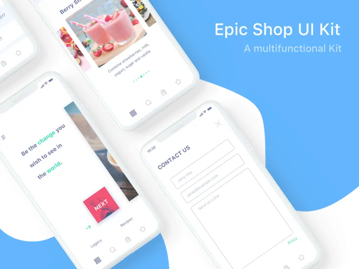
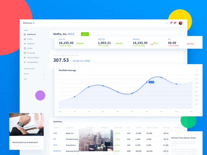
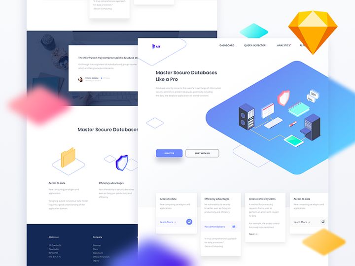
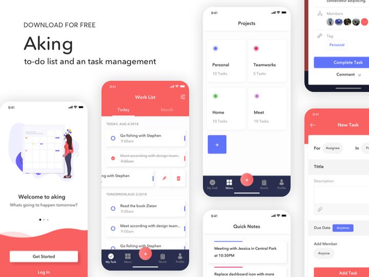
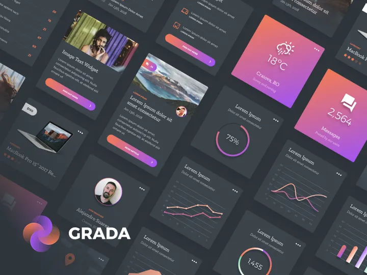
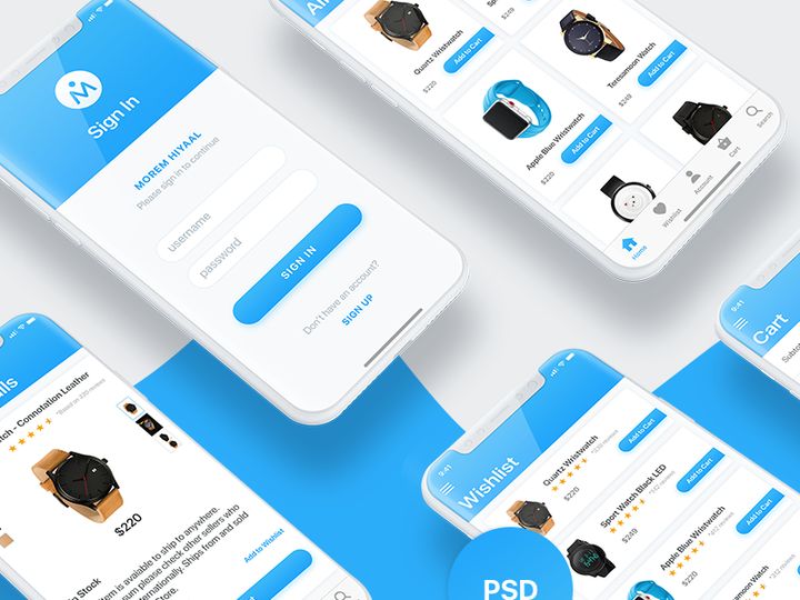
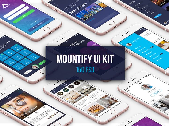
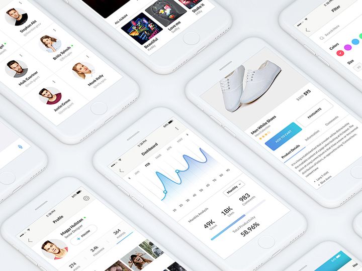
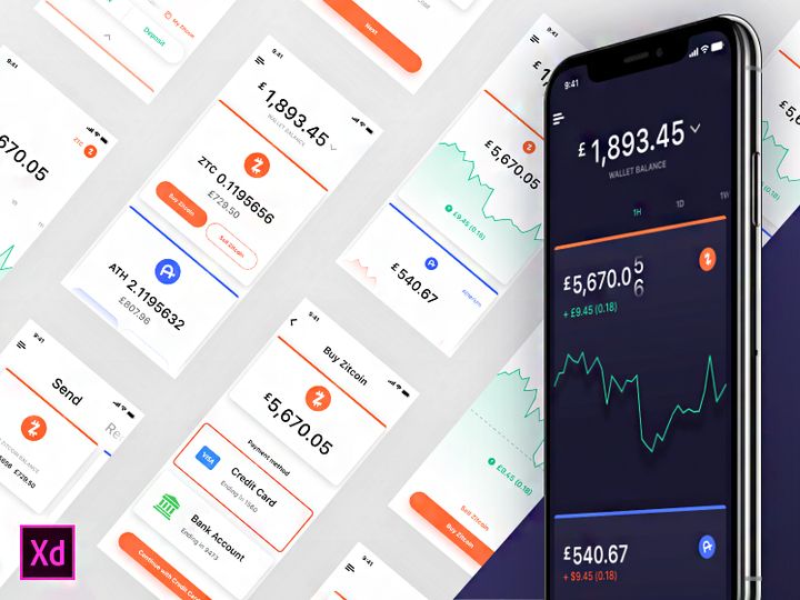
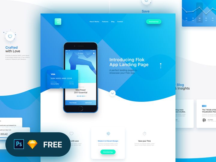
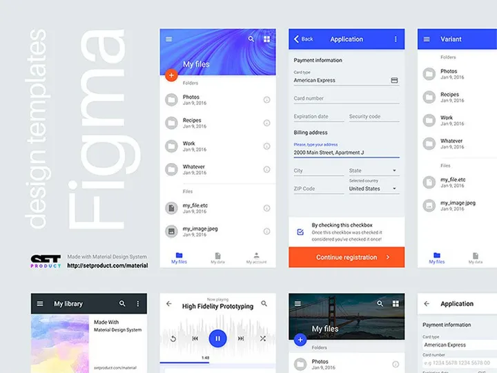
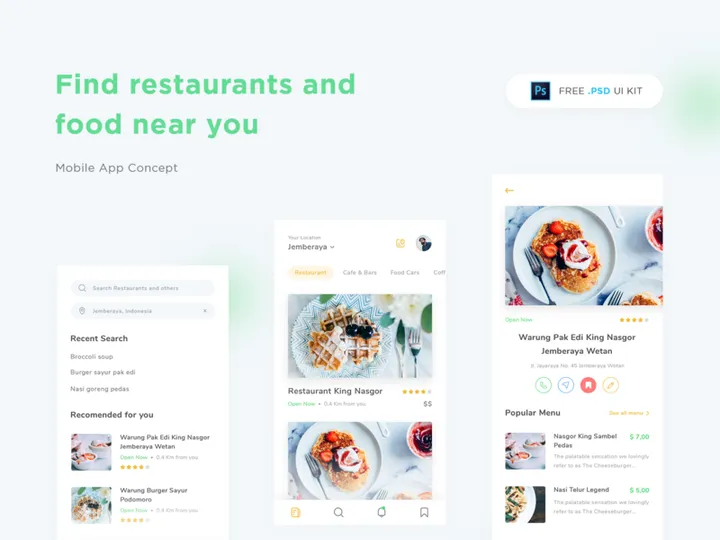
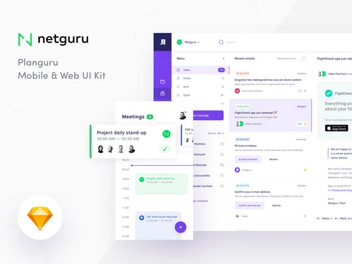
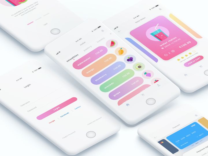
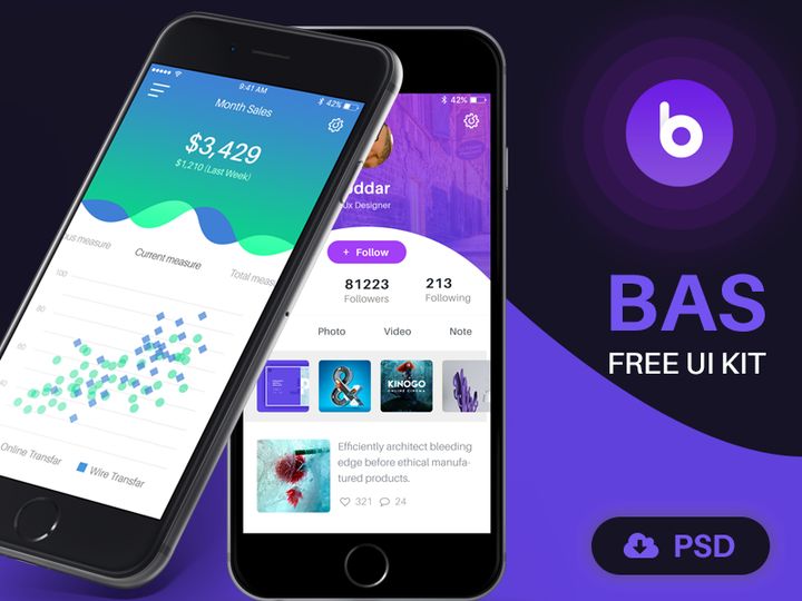
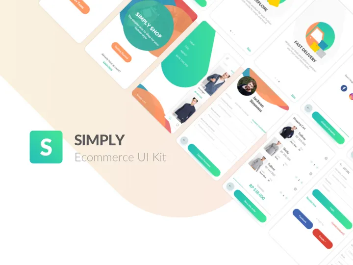
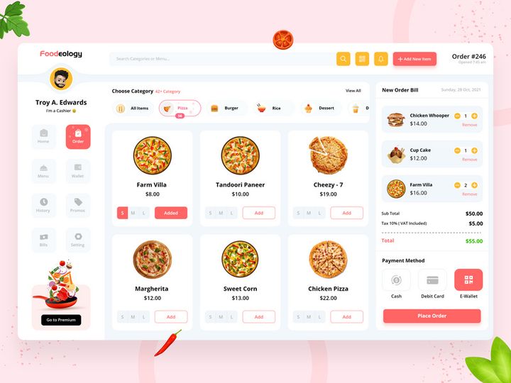
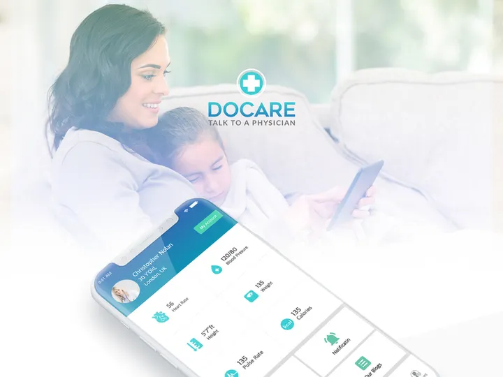
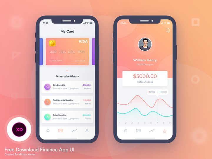
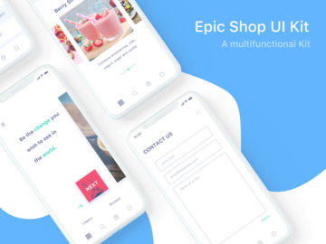
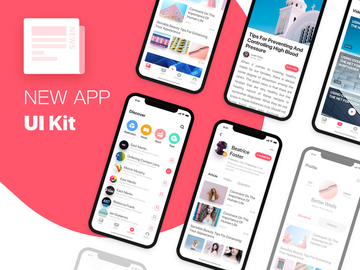
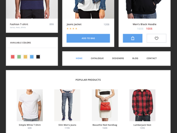
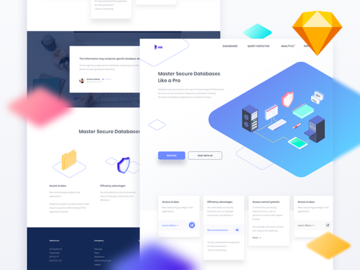
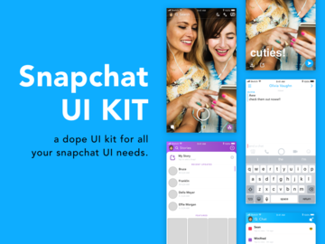
Top UI Kits
Handpicked resources from our curated collection


Try Our Free Resources
Download any of these for free - no account required

Why UI Kits for Web Projects?
UI kits have become indispensable tools for modern web designers aiming to deliver high-quality, visually consistent websites efficiently. A well-crafted UI kit provides a comprehensive library of pre-designed interface elements—buttons, forms, navigation bars, cards, modals, and more—allowing designers to focus on structure, user experience, and creative direction rather than reinventing common components from scratch. This accelerates the design phase significantly, especially in fast-paced environments where deadlines are tight and client expectations are high.
Web design projects often follow predictable patterns: responsive layouts, mobile-first approaches, consistent typography, and accessible interactions. A UI kit tailored for the web aligns with these requirements by offering components built with real-world usage in mind—scalable vector elements, grid-based structures, and adherence to modern design systems. Designers can quickly assemble landing pages, dashboards, e-commerce interfaces, and admin panels without starting from zero, ensuring faster prototyping and client approval cycles.
At EpicPxls, we understand the demands of professional web design. That’s why our curated collection features 1196+ web-ready UI kits, each selected for relevance, scalability, and design excellence. Whether you're designing a startup website, a corporate portal, or a creative portfolio, our resources are vetted to ensure they meet the technical and aesthetic standards required for modern web projects. From minimalist design systems to bold, trend-forward kits, EpicPxls offers a diverse range of tools that empower designers to build faster, smarter, and more effectively—without compromising on quality.
What Web Designers Need
Essential UI Kits Types
Not all UI kits are created equal, and web designers benefit most from kits designed specifically for digital interfaces. Common and highly useful types include dashboard UI kits, which provide components for admin panels and data visualization; landing page kits, optimized for conversion-focused websites with hero sections, testimonials, and call-to-action blocks; and ecommerce UI kits, featuring product grids, shopping carts, and checkout flows. Additionally, responsive website kits ensure designs work seamlessly across devices, while component libraries offer modular elements compatible with design systems.
Designers also seek dark mode UI kits and accessible design kits that support inclusivity and modern aesthetics. These specialized kits reduce development time by providing tested, user-friendly patterns right out of the box, making them essential for any serious web project.
Format Requirements
The file format of a UI kit plays a crucial role in its usability within a web design workflow. Figma has become the industry standard due to its collaborative features, component libraries, and prototyping capabilities, making Figma-compatible UI kits highly sought after. Sketch files remain popular among macOS users, particularly in agencies with established design pipelines. Adobe XD kits are also valuable for teams embedded in the Adobe ecosystem, offering smooth integration with other Adobe tools.
Beyond native design formats, kits that include SVG and PDF exports are beneficial for developers who need scalable assets. Some advanced kits even offer React or HTML/CSS components, bridging the gap between design and development. When selecting a UI kit, ensure it supports your preferred tool and offers layered, organized files for easy customization.
Quality Standards
High-quality UI kits are characterized by clean layer structures, consistent spacing, typographic harmony, and pixel-perfect alignment. They should follow modern design principles such as material design, flat design, or neumorphism, depending on the intended aesthetic. Look for kits with auto-layout components (in Figma), naming conventions, and style guides that include color palettes, font scales, and icon sets.
A web-ready UI kit must also support responsiveness—components should adapt to different screen sizes and breakpoints. At EpicPxls, every UI kit in our 1196+ collection is evaluated for these quality benchmarks, ensuring that designers receive only reliable, production-grade resources that integrate smoothly into professional workflows.
Web Design Project Walkthrough
- Define Your Project Scope: Begin by outlining the website’s purpose, target audience, and key features. Are you building a portfolio, SaaS platform, or online store? Knowing this helps you select the most relevant UI kit from EpicPxls’ 1196+ resources.
- Select a Compatible UI Kit: Browse curated categories like “Landing Pages” or “Dashboards” and choose a kit that matches your project’s style and functionality needs. Prioritize kits with responsive grids and component variants.
- Customize the Design System: Import the UI kit into your design tool and adjust colors, typography, and spacing to align with your brand. Use master components to maintain consistency across screens.
- Assemble Key Pages: Start with the homepage, then build out secondary pages like About, Services, and Contact. Leverage pre-built sections—hero banners, feature grids, testimonials—to speed up layout creation.
- Combine Multiple UI Kits (When Needed): If one kit lacks certain elements (e.g., a specialized form or animation), supplement it with components from another. Ensure visual harmony by standardizing fonts, colors, and corner radii across kits.
- Prepare for Handoff: Organize layers, export assets in web-friendly formats (SVG, PNG@2x), and annotate interactions for developers. Use built-in prototyping tools to demonstrate user flows and gather feedback before final delivery.
This structured approach ensures a smooth transition from concept to final design, leveraging the full power of pre-made UI kits while maintaining creative control. With EpicPxls’ extensive library, you’ll find everything needed to support each step—saving time without sacrificing professionalism.
Web Design Workflow Tips
Speed Up Your Process
One of the greatest advantages of using UI kits is the dramatic reduction in repetitive tasks. Instead of designing buttons or navigation menus from scratch, simply drag and drop pre-styled components into your layout. Use keyboard shortcuts, component variants, and reusable styles to make edits across multiple screens instantly. Designers who leverage EpicPxls’ 1196+ resources report cutting their initial design phase by up to 60%, allowing more time for refining user experience and innovation.
Maintain Consistency
Consistency is key to professional web design, and UI kits inherently promote uniformity. Establish a base kit as your primary source of truth for colors, fonts, and component styles. When integrating elements from multiple kits, reapply your core design tokens to ensure cohesion. Use style libraries in Figma or Sketch to centralize changes—updating a color or text style once will reflect across all linked instances, minimizing errors and design drift.
Client Presentation
Presenting a polished, interactive prototype builds confidence and accelerates approvals. With UI kits, you can quickly assemble high-fidelity mockups that reflect real-world functionality. Use built-in hover states, transitions, and micro-interactions to demonstrate how the site will behave. Export clean, organized files for stakeholder review, and consider embedding prototypes in client-friendly formats. A well-presented design—from layout to interaction—reflects professionalism and attention to detail, helping you stand out in competitive markets.
Web Design Inspiration
Staying inspired is essential for producing fresh, impactful web designs. Current trends emphasize minimalism with bold typography, asymmetrical layouts, and immersive full-screen visuals. Glassmorphism, kinetic text effects, and 3D elements are gaining traction, particularly in creative and tech-focused industries. Micro-interactions and scroll-driven animations enhance engagement, while dark mode interfaces continue to grow in popularity for their sleek, modern appeal.
Top designers often begin by studying successful websites and deconstructing their UI patterns. They combine proven usability principles with unique branding elements to create memorable experiences. Many rely on curated resources like those found at EpicPxls to spark ideas and streamline execution—turning inspiration into reality without starting from blank canvases.
To elevate your web work, explore niche UI kits focused on specific industries—such as fintech, healthcare, or education—as they come with tailored components and contextual design cues. With 1196+ resources at your fingertips, you’ll always have access to fresh inspiration and practical tools that push your designs forward. Whether you're refining your personal style or meeting demanding client needs, the right UI kit can be the catalyst for exceptional results.
Why Download from EpicPxls?
Commercial License
Use in personal and commercial projects
No Account Required
Download free resources instantly
Quality Curated
Every resource is reviewed for quality
Preview Files
See Figma and Photoshop files before downloading
Who Uses These Ui Kits?
Professionals and teams who benefit most from our collection
UI/UX Designers
Speed up your workflow with ready-to-use ui kits for design tools. Perfect for prototyping and client presentations.
Developers
Get production-ready assets without design skills. Export in any format for web and mobile apps.
Startups & Agencies
Save design budget with affordable premium ui kits. Commercial license included for client work.
Marketing Teams
Create professional campaigns faster. All ui kits are optimized for social media and ads.
UI Kits FAQCommon questions about these resources
Simple, Transparent Pricing
Get unlimited access to all premium resources
Yearly
- 20 downloads per month
- All file formats
- Commercial license
Lifetime
- Unlimited downloads forever
- All file formats
- Commercial license
Ready to Get Started?
Access 4,439+ free design resources today.
Browse Free ResourcesView Premium PlansEarn 85% and
more on all sales
Upload your products and put them up
for sale at whatever price you want.

