UI Kits for Sketch: 900+ Resources
EpicPxls offers 200+ curated ui kits for Sketch, all with a commercial license and editable source files (Figma, Sketch, PSD). We have 200+ ui kits compatible with Sketch, tested and verified for seamless integration.
Last updated February 12, 2026
Discover 900+ handpicked ui kits for Sketch.
Trusted by designers at leading companies
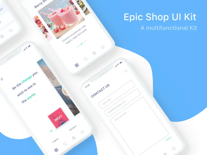
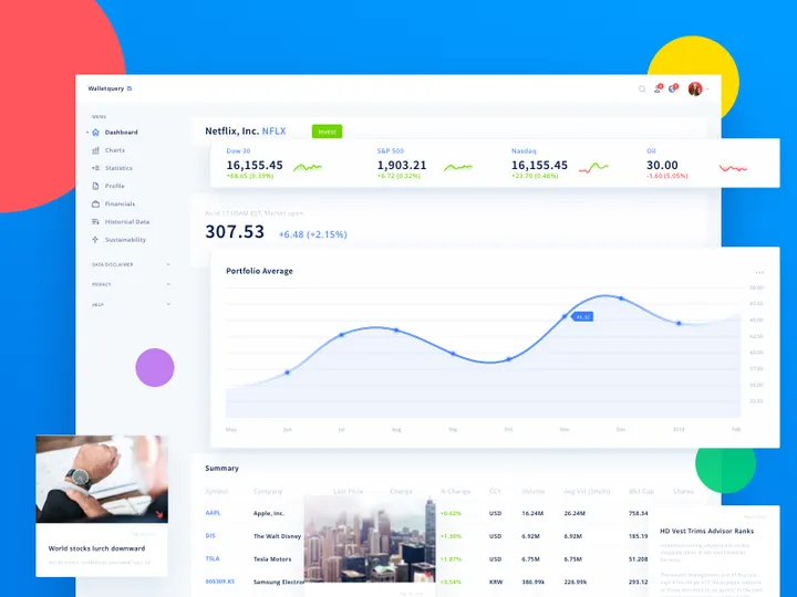
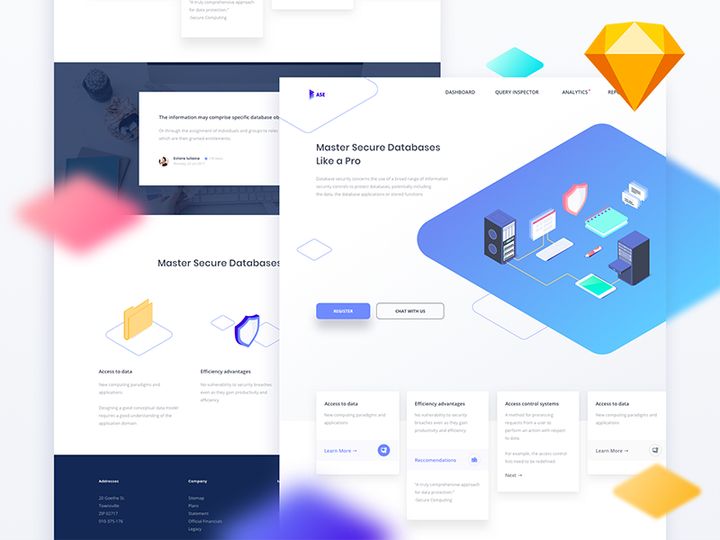
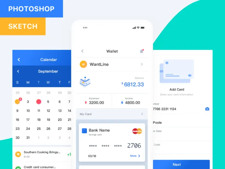
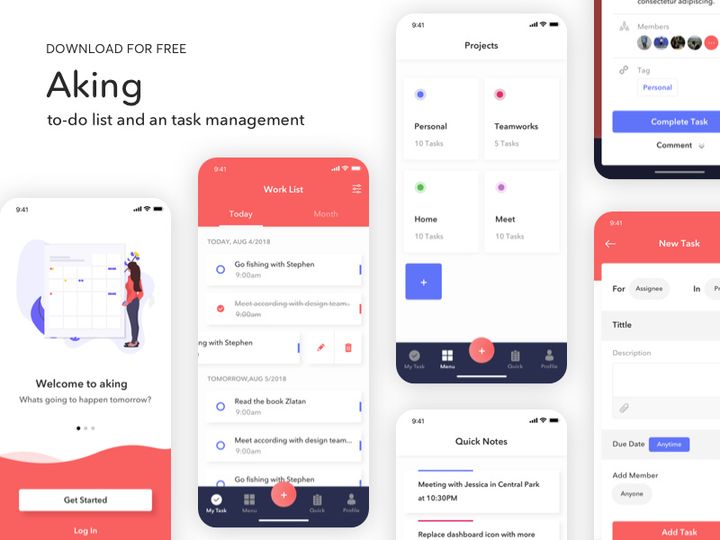
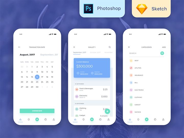
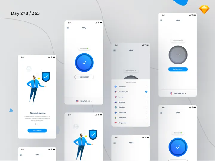
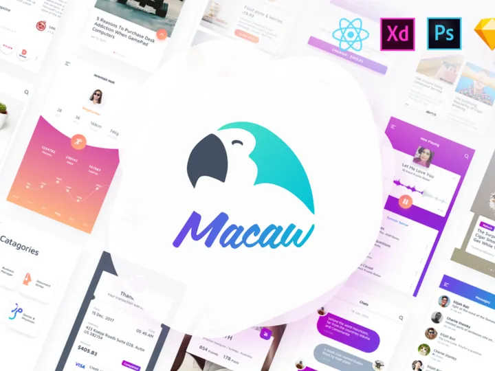
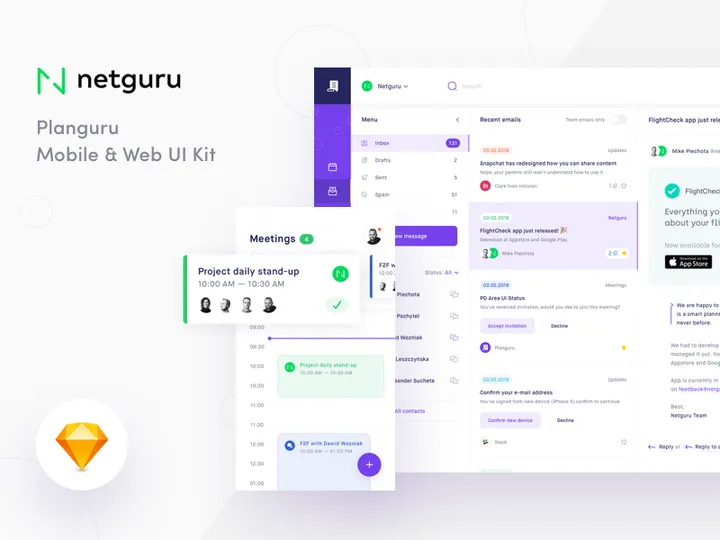
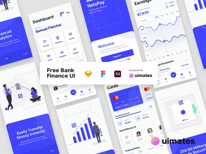
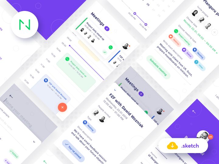
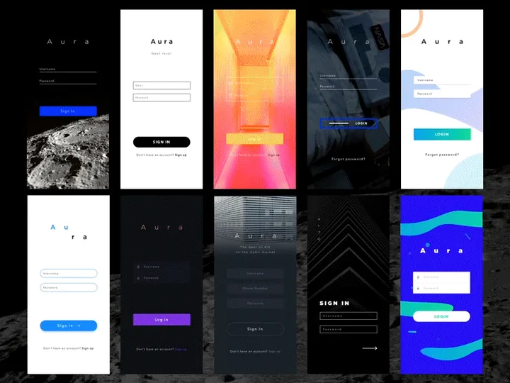
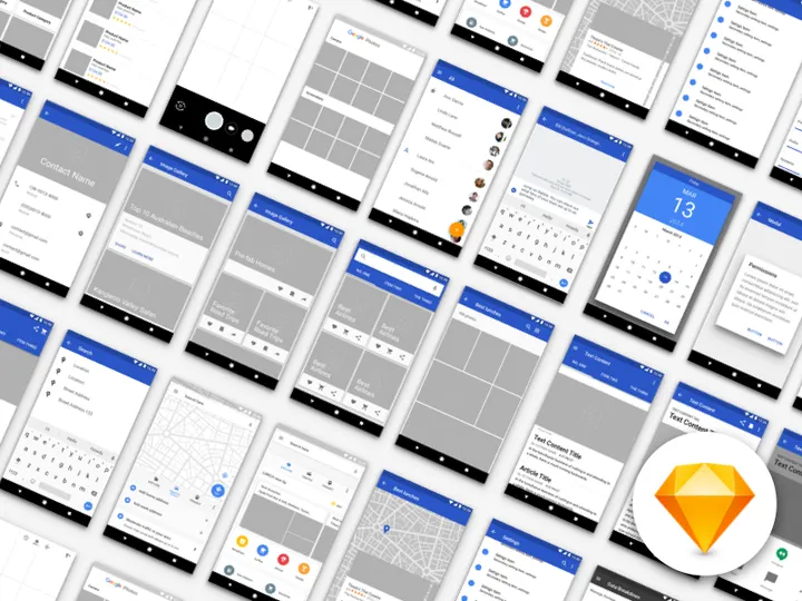
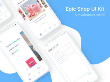
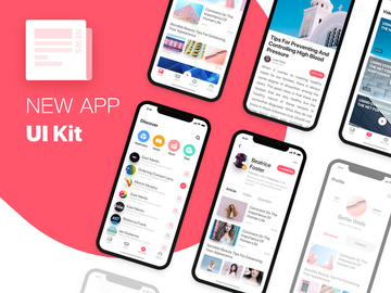
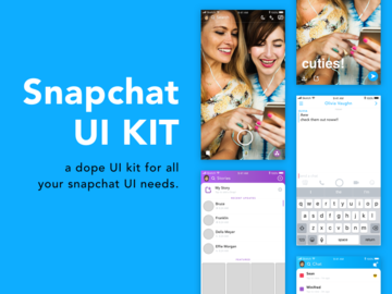
Top UI Kits for Sketch
Handpicked resources from our curated collection


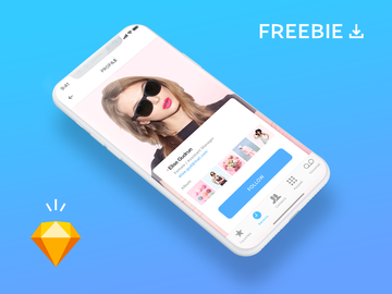
Try Our Free Resources
Download any of these for free - no account required


Why Sketch for UI Kits?
Sketch has become a cornerstone tool for UI designers worldwide, especially when working with UI kits. Its vector-based design environment, lightweight interface, and focus on digital product design make it an ideal platform for leveraging pre-built UI components. Designers turn to Sketch for its intuitive artboard system, reusable symbols, and robust plugin ecosystem—all of which enhance the efficiency and consistency of using UI kits.
One of the standout features of Sketch is its Symbols functionality, which allows designers to create reusable components such as buttons, navigation bars, and form elements. When paired with UI kits, this means changes made to a single symbol automatically update across all instances throughout a project. This dramatically reduces redundancy and ensures design consistency—critical aspects when working on complex interfaces. Additionally, Sketch’s support for shared libraries enables teams to maintain a single source of truth for design assets, making collaboration smoother and more scalable.
Sketch also excels in modular design workflows. With UI kits, designers can quickly drag and drop components to prototype screens, speeding up the design process from concept to mockup. The file structure in Sketch is optimized for clarity, allowing designers to easily navigate layers, groups, and pages. This organization becomes even more powerful when using well-structured UI kits that follow consistent naming conventions and layer hierarchies.
At EpicPxls, we understand the importance of seamless integration between tools and resources. That’s why our curation of over 900+ resources focuses exclusively on high-quality, Sketch-compatible UI kits. Each resource is tested for performance, usability, and adherence to modern design standards. Whether you're building mobile apps, web dashboards, or SaaS platforms, our collection offers ready-to-use components that align perfectly with Sketch’s capabilities. By filtering for compatibility, documentation quality, and design coherence, EpicPxls ensures you spend less time troubleshooting and more time designing.
Top UI Kits Picks for Sketch
With an ever-growing library of over 900+ resources, choosing the right UI kit for your Sketch project can be overwhelming. To help streamline your selection process, we’ve curated standout options based on skill level, functionality, and value. Whether you’re just starting out or leading a high-paced design team, there’s a UI kit tailored to your needs.
Best for Beginners
If you're new to UI design or transitioning into Sketch, beginner-friendly UI kits are essential. These kits typically come with comprehensive documentation, clear layer structures, and intuitive component organization. Look for kits labeled as "starter," "onboarding," or "education-focused." Many include step-by-step setup guides and annotated artboards to help you understand how symbols and styles work together. Popular beginner kits often feature mobile app templates, login flows, and simple dashboards that teach core design patterns without overwhelming complexity. At EpicPxls, we highlight beginner kits that emphasize clarity and ease of use, ensuring a smooth learning curve while building professional-grade interfaces.
Best for Professionals
For experienced designers and design systems teams, advanced UI kits offer deep customization, extensive component libraries, and integration with design tokens. These kits are built for scalability and often include dark mode variants, responsive breakpoints, accessibility annotations, and plugin-ready structures. Professional-grade UI kits may also support variant components (introduced in newer Sketch versions), enabling dynamic toggling between states like loading, disabled, or active. Many are designed to mirror enterprise-level design systems, making them ideal for SaaS products, financial platforms, or health tech applications. Our team at EpicPxls prioritizes professionally developed kits that follow industry standards such as Material Design, Apple’s Human Interface Guidelines, or custom design language frameworks.
Best Free Options
High-quality doesn’t always mean high cost. There are numerous free UI kits for Sketch that deliver exceptional value without compromising on design integrity. These resources are perfect for freelancers on a budget, students, or agencies prototyping early-stage concepts. The best free kits include essential components like cards, modals, icons, and form elements, all thoughtfully organized. While they may lack some of the advanced features found in premium versions, many free options are regularly updated and backed by strong communities. We at EpicPxls rigorously vet these free resources to ensure they meet baseline standards for usability, visual appeal, and Sketch compatibility—so you can trust that even cost-free options from our 900+ resources library are production-ready.
Sketch vs Other Tools for UI Kits
While several design tools support UI kits, Sketch remains a top choice for interface-focused workflows. Unlike general-purpose design software, Sketch was built specifically for digital product design, giving it a natural advantage when working with UI components. Its native support for symbols, styles, and libraries creates a seamless experience for importing and managing UI kits, reducing friction in daily design tasks.
The Sketch ecosystem fosters a rich community of designers and developers who contribute plugins, templates, and open-source design systems. This vibrant environment means that UI kits for Sketch are often more mature, better documented, and frequently updated compared to those for other platforms. Additionally, Sketch’s file format (.sketch) is optimized for speed and collaboration, especially when paired with cloud-based sharing tools and version control integrations.
Another key differentiator is format compatibility. Many UI kits are designed first for Sketch and then exported to other formats, which can result in loss of functionality or structural integrity. When you work directly in Sketch, you retain full access to nested symbols, shared styles, and overrides—features that are critical for efficient UI design. While cross-platform tools have improved, Sketch continues to lead in delivering a tightly integrated, predictable environment for using UI kits. With over 900+ resources available through EpicPxls, designers can rely on a vast, consistently formatted library that maximizes Sketch’s unique capabilities.
Setting Up UI Kits in Sketch
Integrating UI kits into your Sketch workflow is straightforward when you follow a systematic approach. Proper setup ensures that your components are accessible, organized, and ready for immediate use. Here’s a step-by-step guide to help you import, organize, and start leveraging UI kits effectively in Sketch.
- Download the UI kit from a trusted source like EpicPxls. Ensure the file is in .sketch format and includes documentation if available.
- Open the file in Sketch to preview its contents. Check for symbols, text styles, layer organization, and any included instructions or readme files.
- Extract necessary components by copying symbols or artboards you plan to use. Avoid importing the entire file unless you intend to use most of it, as this can bloat your working file.
- Create a local Symbols page in your project file and paste the imported components. Rename them using a consistent naming convention (e.g., “Button/Primary/Default”) to improve discoverability.
- Convert components into reusable Symbols if they aren’t already. Use Sketch’s “Create Symbol” function and ensure you’re using nested symbols for complex components like cards or navigation bars.
- Save as a reusable library (optional) if you plan to use the kit across multiple projects. Go to Sketch > Preferences > Libraries, and add your organized .sketch file as a shared library for easy access.
For designers managing large collections from the 900+ resources available, consider using folder-based organization on your device. Group kits by category—such as e-commerce, healthcare, or dark themes—for faster retrieval. At EpicPxls, we recommend reviewing each kit’s structure before integration to ensure compatibility with your existing design system and workflow.
Sketch Workflow Tips
Maximizing productivity in Sketch goes beyond just using UI kits—it’s about optimizing how you interact with them. A well-structured workflow enhances efficiency, reduces errors, and supports team collaboration. Here are key practices to elevate your Sketch experience when working with curated UI resources.
Organizing UI Kits Libraries
Keep your design environment clutter-free by organizing UI kits into dedicated libraries. Use descriptive names for each library (e.g., “Admin Dashboard UI Kit – v2”) and maintain version control when updates are released. Within Sketch, leverage the Libraries panel to enable or disable kits based on project needs. This prevents symbol conflicts and keeps your Insert menu manageable. At EpicPxls, we recommend tagging or color-coding libraries in your file system to differentiate between personal, team, and third-party kits.
Batch Operations
When working with large UI kits or applying global changes, batch operations save significant time. Use Sketch plugins (like Rename It or Symbols Organizer) to rename multiple symbols at once, update text styles in bulk, or replace colors across artboards. You can also leverage Sketch’s built-in “Detach from Symbol” and “Override” features to make mass edits efficiently. For example, if you need to update all primary buttons across 50 screens, modifying the master symbol instantly reflects the change everywhere. This scalability is one of the core benefits of using well-built UI kits from our 900+ resources collection.
Collaboration Best Practices
Effective collaboration starts with consistency. When working in teams, standardize your use of UI kits by establishing naming conventions, layer structures, and symbol hierarchies. Share libraries via Sketch Cloud or third-party asset managers to ensure everyone accesses the same components. Encourage team members to document customizations and avoid duplicating symbols. Regular sync-ups to review library updates or deprecated components help maintain integrity across projects. By curating only well-documented, team-ready UI kits, EpicPxls supports collaborative workflows where clarity and efficiency go hand-in-hand.
Why Download from EpicPxls?
Commercial License
Use in personal and commercial projects
No Account Required
Download free resources instantly
Quality Curated
Every resource is reviewed for quality
Preview Files
See Figma and Photoshop files before downloading
Who Uses These Ui Kits?
Professionals and teams who benefit most from our collection
UI/UX Designers
Speed up your workflow with ready-to-use ui kits for Sketch. Perfect for prototyping and client presentations.
Developers
Get production-ready assets without design skills. Export in any format for web and mobile apps.
Startups & Agencies
Save design budget with affordable premium ui kits. Commercial license included for client work.
Marketing Teams
Create professional campaigns faster. All ui kits are optimized for social media and ads.
UI Kits for Sketch FAQCommon questions about these resources
Simple, Transparent Pricing
Get unlimited access to all premium resources
Yearly
- 20 downloads per month
- All file formats
- Commercial license
Lifetime
- Unlimited downloads forever
- All file formats
- Commercial license
Ready to Get Started?
Access 4,441+ free design resources today.
Browse Free ResourcesView Premium PlansEarn 85% and
more on all sales
Upload your products and put them up
for sale at whatever price you want.

