What Is a Style Guide? Complete Guide for Designers
EpicPxls offers 66+ curated ui kits, all with a commercial license and editable source files (Figma, Sketch, PSD). A style guide is a pre-made design resource that helps designers work faster. Browse 66+ style guides on EpicPxls for your projects.
Last updated February 12, 2026
Everything you need to know about style guides — definition, types, and how to use them.
Trusted by designers at leading companies
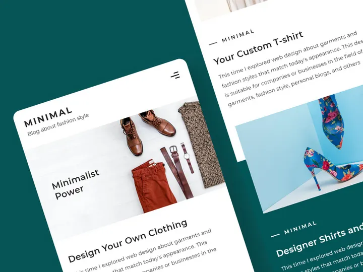
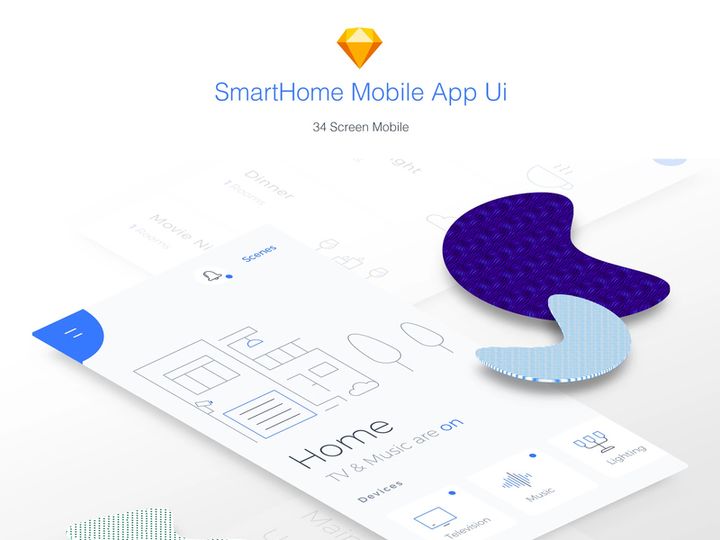
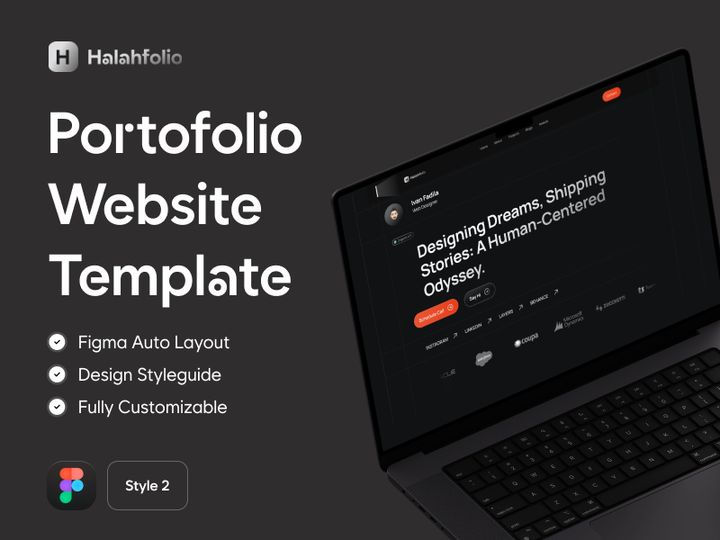
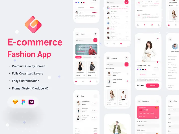
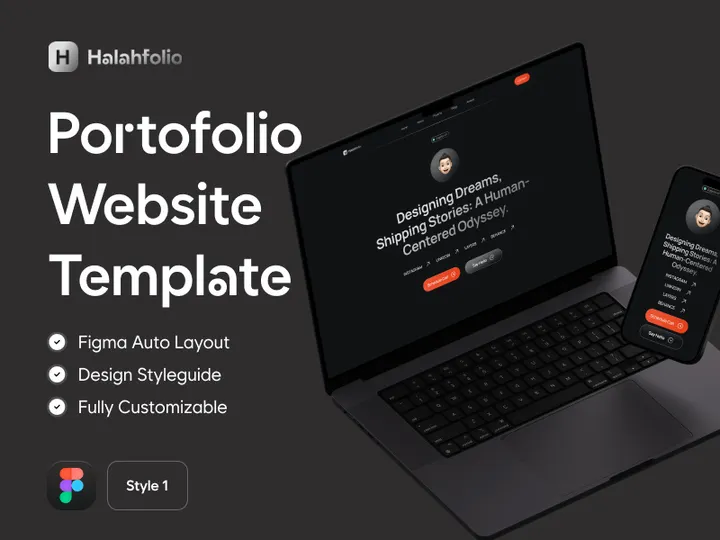
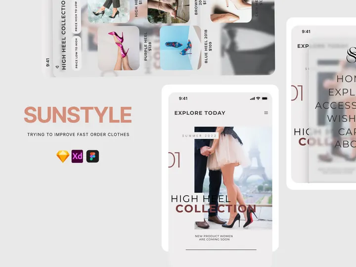
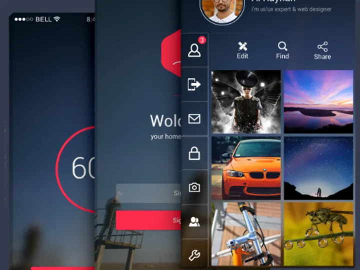
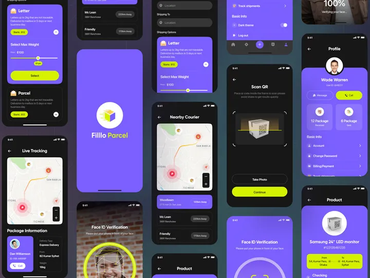
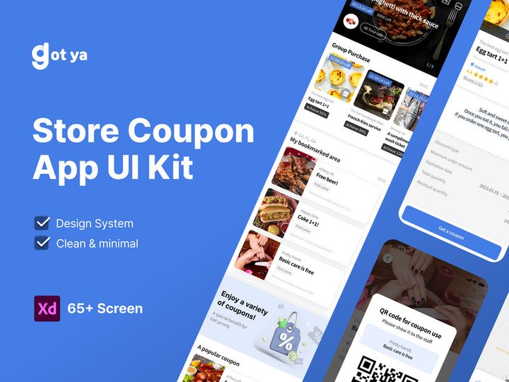
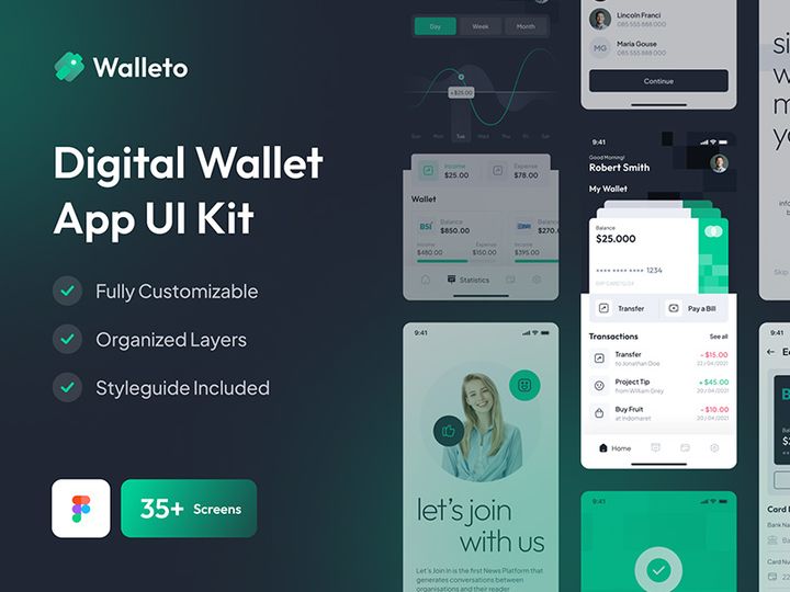
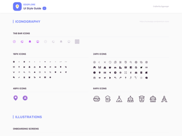
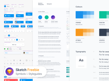
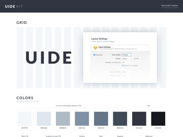
Top UI Kits
Handpicked resources from our curated collection


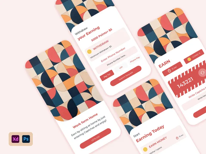


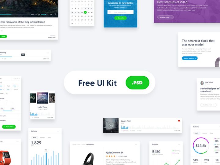
Try Our Free Resources
Download any of these for free - no account required
What Is a Style Guide?
A style guide is a comprehensive document or digital resource that establishes and maintains visual, linguistic, and experiential consistency across a brand, product, or organization. For designers, it serves as a foundational reference that defines everything from color palettes and typography to component behavior, iconography, and tone of voice. Think of it as the blueprint for a cohesive design system—ensuring that every interface, document, or digital experience adheres to a unified standard, regardless of who creates it or when it’s developed.
The concept of style guides dates back to print publishing, where editorial teams relied on style manuals like the Chicago Manual of Style to ensure grammatical and typographic consistency in books and periodicals. As digital design emerged in the late 20th century, the need for visual consistency across websites and software led to the adaptation of these principles into digital form. Today, style guides have evolved into dynamic, living documents—often integrated directly into design tools and development workflows—allowing teams to scale design decisions efficiently and maintain brand integrity across multiple platforms and devices.
In modern design workflows, style guides are essential for collaboration between designers, developers, content creators, and product managers. They reduce ambiguity, minimize redundant decision-making, and streamline onboarding for new team members. Whether you're building a mobile app, designing a marketing website, or launching a SaaS platform, a well-crafted style guide ensures that every pixel and paragraph aligns with the brand’s identity and user experience goals. With the rise of design systems and component-based frameworks, style guides have become even more powerful, enabling teams to maintain consistency at scale—especially when managing complex, multi-product ecosystems.
For UI/UX designers, a style guide is more than just a collection of design rules—it’s a strategic tool that supports creativity within constraints. It empowers teams to innovate confidently, knowing that the core visual language remains intact. Platforms like EpicPxls recognize this importance, curating thousands of professionally designed style guides to help creators jumpstart their projects with consistency and clarity from day one. With access to over 3501+ resources, designers can find tailored solutions that match their industry, aesthetic, and technical needs—making style guides not just a best practice, but a practical necessity in today’s fast-paced design landscape.
Types of Style Guides
By Purpose
Style guides are created for different objectives, depending on the needs of the organization or project. Brand style guides focus on corporate identity, defining logos, color usage, typography, and tone of voice for marketing materials. Editorial style guides govern grammar, punctuation, and writing conventions—ideal for content teams. UI style guides are tailored for digital products, specifying interface elements like buttons, forms, and navigation patterns. Accessibility style guides ensure inclusivity by outlining contrast ratios, text sizes, and screen reader compatibility. Some guides combine multiple purposes, evolving into full-fledged design systems that cover both visual and code implementation.
By Format
The format of a style guide influences how it’s used and updated. PDF documents are static and commonly used for brand guidelines shared with external partners. Web-based style guides are interactive and often hosted on internal sites or public domains, allowing real-time updates and clickable component examples. Figma, Sketch, or Adobe XD files embed style guides directly into design workflows, enabling teams to reuse symbols, components, and text styles. Code-driven style guides, such as those built with Storybook or Zeroheight, link design tokens to front-end code, ensuring perfect alignment between design and development. The format you choose should support collaboration, scalability, and ease of maintenance.
By Complexity
Style guides range from simple to comprehensive, depending on project scope. A basic style guide might include only primary colors, fonts, and logo variations—ideal for small businesses or startups with limited branding needs. In contrast, enterprise-level style guides can span hundreds of pages or screens, detailing everything from micro-interactions and error states to localization rules and responsive breakpoints. Simpler guides are faster to create and easier to adopt, while comprehensive ones offer deeper control and long-term scalability. The key is matching complexity to your team’s size, product maturity, and design maturity. Whether you choose a minimalist approach or a full system, platforms like EpicPxls offer style guides at every complexity level, helping you find the right fit for your project’s stage and ambition.
How to Use Style Guides in Your Projects
- Assess Your Project Needs: Begin by identifying the scope of your project. Are you designing a single app, a suite of products, or a brand campaign? Determine whether you need a visual, editorial, or combined style guide. Understanding your goals helps you select or build the right foundation.
- Choose the Right Style Guide: If starting from scratch isn’t feasible, explore pre-built style guides. Platforms like EpicPxls offer access to over 3501+ resources, including customizable UI kits and brand guides tailored to industries like fintech, healthcare, and e-commerce. Filter by format, complexity, and design language to find a match.
- Customize for Your Brand: Adapt the selected guide to reflect your brand’s unique identity. Replace placeholder colors, fonts, and logos with your own. Update tone of voice examples and ensure accessibility standards meet your user base’s needs. This step transforms a generic template into a powerful, brand-specific tool.
- Integrate Into Design Tools: Import your style guide into Figma, Sketch, or Adobe XD. Set up reusable components, design tokens, and text styles so your entire team can access consistent elements. Use naming conventions that make components easy to find and understand.
- Share and Collaborate: Distribute the style guide to all stakeholders—designers, developers, marketers, and product managers. Host it in a shared workspace or publish it online for easy access. Encourage feedback and establish a process for updates to keep the guide living and relevant.
- Maintain and Evolve: A style guide is not a one-time deliverable. As your product grows, so should your guide. Add new components, document edge cases, and refine patterns based on user testing and team input. Schedule regular audits to ensure accuracy and usability.
To use style guides effectively, adopt best practices like version control, clear documentation, and cross-functional alignment. Leverage tools like Figma’s libraries, Zeplin for handoff, or Notion for documentation to enhance collaboration. By treating your style guide as a living system, you ensure long-term consistency, faster iteration, and a stronger user experience. Whether you're working solo or on a large team, integrating a well-structured style guide into your workflow pays dividends in efficiency and quality.
Style Guide vs Related Concepts
While the term "style guide" is often used interchangeably with related design concepts, key distinctions exist. A style guide primarily focuses on visual and linguistic standards—colors, fonts, spacing, and tone—providing rules for consistent application. In contrast, a pattern library is a curated collection of reusable UI components—like buttons, cards, and modals—with documented usage guidelines. It’s more granular and implementation-focused than a style guide.
A design system encompasses both a style guide and a pattern library but goes further by including design principles, code libraries, accessibility standards, and governance processes. It’s a holistic ecosystem that supports end-to-end product development. Think of it this way: a style guide defines what the design looks like, a pattern library shows how to build it, and a design system explains why and when to use each element.
Another related concept is a UI kit, which is a pre-built set of interface elements—often available as downloadable files in Figma or Sketch. While UI kits may include a basic style guide, they are primarily asset collections rather than documented systems. They’re ideal for rapid prototyping but may lack the depth needed for long-term product scaling.
Knowing when to use each resource is crucial. Start with a style guide when establishing brand consistency. Expand into a pattern library when component reuse becomes essential. Adopt a full design system for large, multi-team products. Meanwhile, UI kits from platforms like EpicPxls offer a practical starting point—many include embedded style guides and are part of the 3501+ resources designed to accelerate your workflow. Used together, these tools create a powerful foundation for professional, scalable design.
Where to Find Quality Style Guides
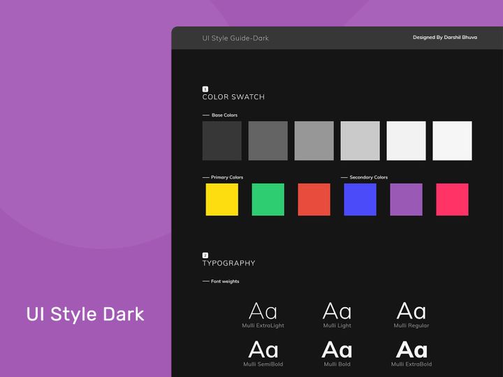
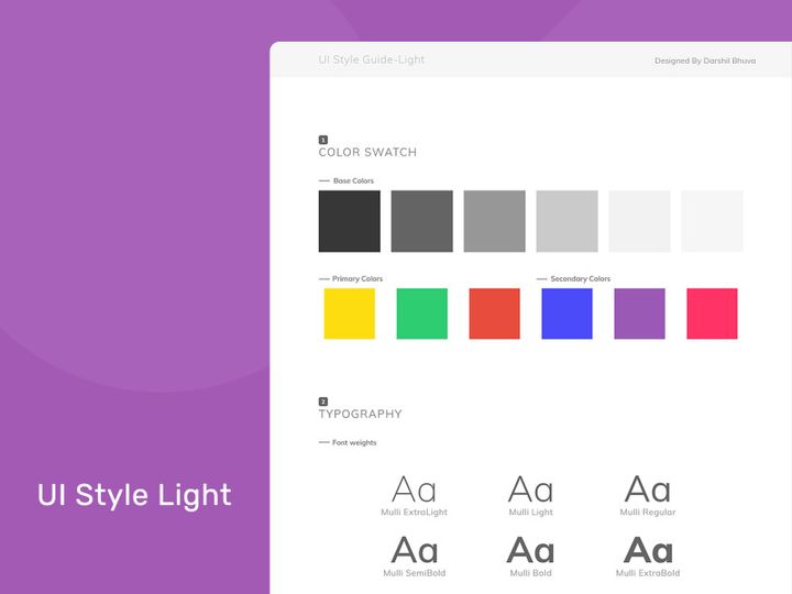
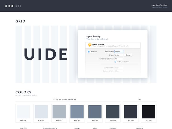
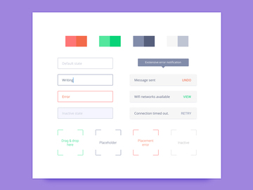
Finding a high-quality style guide starts with knowing what to look for. A professional guide should be well-organized, visually clear, and thoroughly documented. It must include essential elements like color swatches with hex/RGB values, typography scales, spacing systems, icon sets, and component examples. Accessibility considerations—such as contrast ratios and font readability—are also hallmarks of a mature guide. Look for style guides that are customizable, well-structured, and compatible with your preferred design tools (Figma, Sketch, etc.). Bonus points if they include dark mode variants, responsive guidelines, or localization support.
One of the best ways to access professionally crafted style guides is through curated design resource platforms. EpicPxls stands out by offering a vast library of over 3501+ resources, including meticulously designed style guides and UI kits tailored for real-world applications. Each resource is hand-reviewed for quality, consistency, and usability, ensuring that designers don’t waste time sifting through low-effort templates. Whether you're looking for a minimalist guide for a startup or a comprehensive system for an enterprise app, EpicPxls provides options across industries, design languages (Material, iOS, Neumorphism), and complexity levels.
When choosing between free and premium style guides, consider long-term value. Free resources can be useful for learning or small projects, but they often lack depth, support, or licensing clarity. Premium guides typically offer better documentation, regular updates, and commercial licensing—essential for client work or product development. Many premium style guides on EpicPxls come with extended licenses, allowing use across multiple projects and teams without legal concerns. By investing in a high-quality guide, you save time, reduce rework, and elevate the professionalism of your deliverables. With thousands of vetted options available, finding the perfect style guide has never been easier.
Why Download from EpicPxls?
Commercial License
Use in personal and commercial projects
No Account Required
Download free resources instantly
Quality Curated
Every resource is reviewed for quality
Preview Files
See Figma and Photoshop files before downloading
Who Uses These Ui Kits?
Professionals and teams who benefit most from our collection
UI/UX Designers
Speed up your workflow with ready-to-use ui kits for design tools. Perfect for prototyping and client presentations.
Developers
Get production-ready assets without design skills. Export in any format for web and mobile apps.
Startups & Agencies
Save design budget with affordable premium ui kits. Commercial license included for client work.
Marketing Teams
Create professional campaigns faster. All ui kits are optimized for social media and ads.
UI Kits FAQCommon questions about these resources
Simple, Transparent Pricing
Get unlimited access to all premium resources
Yearly
- 20 downloads per month
- All file formats
- Commercial license
Lifetime
- Unlimited downloads forever
- All file formats
- Commercial license
Ready to Get Started?
Access 4,441+ free design resources today.
Browse Free ResourcesView Premium PlansEarn 85% and
more on all sales
Upload your products and put them up
for sale at whatever price you want.

