UI Kits vs Design Systems: What's the Difference?
EpicPxls offers 200+ curated design resources, all with a commercial license and editable source files (Figma, Sketch, PSD). Both have unique strengths. UI Kits and Design Systems serve different needs — read our comparison above to find the best fit for your workflow.
Last updated February 12, 2026
UI Kits or Design Systems? We compare both so you can pick the right resources.
Trusted by designers at leading companies
Featured Resources
Handpicked resources from our curated collection

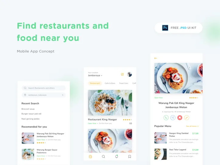
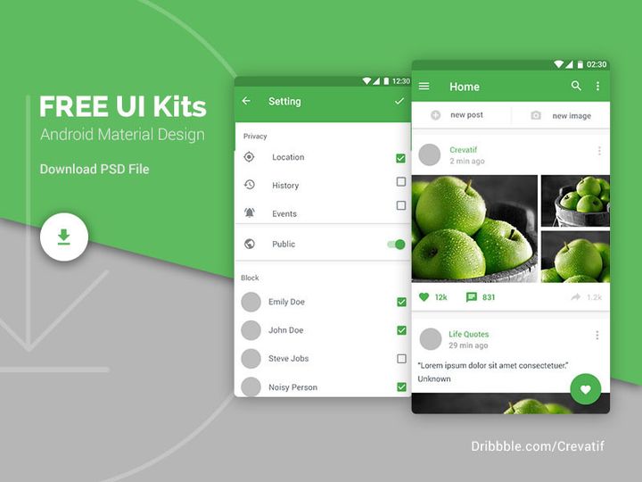

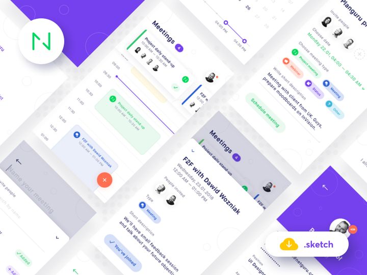
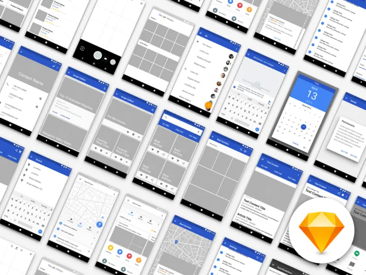
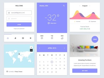
![Material Design Kit [Sketch] preview picture](https://imgproxy.epicpxls.com/25NgiEuwqlJOHx6Nz4RS2GU6a38NeEJY6Ac4cSa1E2M/rs:fill:720:540:0/g:no/aHR0cHM6Ly9pdGVt/cy5lcGljcHhscy5j/b20vdXBsb2Fkcy9w/aG90by9jNGU3MjZi/M2VhY2FmMTNlNjdi/MDFmZmY5OWExZjcz/OS5wbmc.jpg)


Try Our Free Resources
Download any of these for free - no account required


UI Kits vs Design Systems: Quick Overview
For designers shaping digital experiences, choosing the right foundational tools is critical. Two of the most popular resources in modern design workflows are UI Kits and Design Systems. While both aim to streamline the design process and ensure visual consistency, they serve fundamentally different purposes and suit distinct project needs.
A UI Kit (User Interface Kit) is a collection of pre-designed interface elements such as buttons, forms, icons, cards, and navigation bars. These components are typically provided in design file formats like Figma, Sketch, or Adobe XD and are ideal for rapid prototyping or small-scale projects. UI Kits offer visual inspiration and reusable assets but lack the structural rules and scalability of a more comprehensive system.
In contrast, a Design System is a holistic framework that goes far beyond individual components. It includes not only UI elements but also design principles, typography guidelines, color palettes, spacing scales, accessibility standards, voice and tone guidance, and often code documentation. A Design System ensures consistency across platforms, teams, and long-term product evolution.
The key difference lies in scope and intent: UI Kits are component libraries, while Design Systems are governed ecosystems. Designers, product teams, and developers should care about this distinction because it directly impacts collaboration efficiency, scalability, and brand coherence. With over 40837+ resources now available on platforms like EpicPxls, understanding which tool fits your project stage and team structure is more important than ever.
UI Kits: Strengths & Resources
Key Advantages
UI Kits excel in speed and accessibility. They allow designers to jumpstart a project with professionally crafted, visually cohesive components. This is especially valuable during early ideation or when working under tight deadlines. Since most UI Kits are built with popular design tools in mind, integration into existing workflows is seamless.
Another major strength is aesthetic diversity. UI Kits often come with multiple themes, styles, and layout variations, enabling designers to experiment with different visual directions without building from scratch. They're also lightweight, making them easy to share and modify, which is ideal for freelancers or solo designers who need flexibility without overhead.
Best Use Cases
UI Kits are best suited for short-term projects, design mockups, pitch decks, or portfolio work. They’re also excellent for startups validating an MVP (Minimum Viable Product) or agencies creating client prototypes. If you're working on a single platform—like a landing page or mobile app—and don’t anticipate long-term scaling, a UI Kit can save dozens of hours.
Additionally, UI Kits are perfect for learning. Aspiring designers can reverse-engineer professional layouts, understand spacing and hierarchy, and build confidence in UI patterns by working with high-quality kits.
Available Resources
At EpicPxls, designers have access to thousands of meticulously crafted UI Kits tailored for real-world applications. From minimalist dashboard templates to vibrant e-commerce interfaces, the 40837+ resources include responsive components, dark mode variants, and industry-specific kits for fintech, healthcare, and SaaS platforms. These UI Kits are regularly updated, compatible with Figma and other leading tools, and designed with usability in mind. Whether you're building a prototype or refining a concept, EpicPxls offers a robust selection to accelerate your workflow.
Design Systems: Strengths & Resources
Key Advantages
Design Systems stand out for their depth, consistency, and long-term value. Unlike static collections of components, they provide a unified language for design and development teams. Every element—from button states to error message formatting—follows documented rules, ensuring predictable and scalable outcomes.
One of the biggest advantages is cross-functional alignment. With a Design System, designers, developers, product managers, and content strategists all reference the same source of truth. This reduces miscommunication, speeds up development, and improves accessibility and internationalization support. Design Systems also foster brand integrity by enforcing visual and behavioral standards across all touchpoints.
Another key benefit is maintainability. As products grow, a Design System evolves with them. Updates to colors, typography, or components can be propagated across all instances, reducing technical debt and ensuring consistency at scale.
Best Use Cases
Design Systems shine in complex, long-running digital products—especially those developed by large or distributed teams. They are essential for enterprise applications, SaaS platforms, and digital ecosystems spanning web, mobile, and even IoT interfaces.
If your project involves multiple stakeholders, frequent iterations, or strict compliance requirements (like accessibility or security), a Design System is not just beneficial—it’s necessary. They’re also invaluable when onboarding new team members, as they serve as both a design library and a knowledge base.
For organizations aiming to unify customer experiences across regions and platforms, a Design System ensures that every interaction feels cohesive and intentional.
Available Resources
EpicPxls hosts a growing collection of comprehensive Design Systems that go beyond aesthetics to include full documentation, component states, and design tokens. These systems are built with scalability in mind and often include integration guides for developers, making handoff smoother and more efficient.
With the platform’s 40837+ resources, you’ll find Design Systems tailored for dark mode support, RTL (right-to-left) layouts, and accessible interactions. Whether you're launching a new product or overhauling an existing one, EpicPxls offers professional-grade Design Systems that empower teams to build faster and smarter—without sacrificing quality or consistency.
Side-by-Side Comparison
| Criteria | UI Kits | Design Systems |
|---|---|---|
| File format support | Primarily Figma, Sketch, Adobe XD. Optimized for design-only use with limited developer handoff features. | Broad support across Figma, Sketch, and code frameworks (React, Vue, etc.). Includes tokens and exportable code snippets. |
| Ease of customization | Highly customizable for visual changes. Easy to tweak colors, fonts, and layout. However, lacks structural constraints, which can lead to inconsistency. | Customizable within defined parameters. Uses design tokens and variables to ensure changes are consistent and scalable across the system. |
| Community and ecosystem | Large community of designers sharing free and premium kits. Popular on platforms like EpicPxls, with frequent updates and trend-driven releases. | Strong developer and design collaboration. Often backed by organizations with documentation, forums, and version control. Growing presence on EpicPxls. |
| Pricing and licensing | Wide range from free to premium. Most are one-time purchases with permissive licenses for personal and commercial use. | Often more expensive due to depth and documentation. May include team licenses, SaaS models, or enterprise pricing tiers. |
| Best for (use cases) | Rapid prototyping, freelance projects, pitch decks, portfolio work, MVP development, and learning. | Enterprise products, large teams, long-term digital platforms, multi-platform applications, and brand-critical experiences. |
Our Verdict: Which Should You Choose?
The choice between UI Kits and Design Systems ultimately depends on your project’s scope, timeline, and team structure. For quick wins, visual exploration, or solo projects, UI Kits are the clear winner. They offer immediate value with minimal setup, making them ideal for designers who need to move fast and stay agile. With thousands of options available among the 40837+ resources on EpicPxls, you’re likely to find a kit that matches your vision and accelerates your workflow.
However, if you're working on a product that will evolve over time, involve multiple contributors, or require strict brand and accessibility standards, investing in a Design System is the smarter long-term decision. While the initial setup may take more time, the payoff in consistency, efficiency, and scalability is substantial. Design Systems reduce redundancy, improve collaboration, and future-proof your design process.
Interestingly, many professional designers don’t choose one over the other—they use both. A UI Kit might kickstart the design phase, while a Design System takes over once the product enters development. This hybrid approach leverages the speed of kits and the rigor of systems, offering the best of both worlds.
Ultimately, whether you're browsing EpicPxls for a sleek dashboard UI Kit or a fully documented Design System, the goal remains the same: to create better user experiences with less friction. By understanding the strengths and limitations of each tool, you can make informed decisions that align with your goals and elevate your design practice.
Why Download from EpicPxls?
Commercial License
Use in personal and commercial projects
No Account Required
Download free resources instantly
Quality Curated
Every resource is reviewed for quality
Preview Files
See Figma and Photoshop files before downloading
Who Uses These Resources?
Professionals and teams who benefit most from our collection
UI/UX Designers
Speed up your workflow with ready-to-use resources for design tools. Perfect for prototyping and client presentations.
Developers
Get production-ready assets without design skills. Export in any format for web and mobile apps.
Startups & Agencies
Save design budget with affordable premium resources. Commercial license included for client work.
Marketing Teams
Create professional campaigns faster. All resources are optimized for social media and ads.
Frequently Asked QuestionsCommon questions about these resources
Simple, Transparent Pricing
Get unlimited access to all premium resources
Yearly
- 20 downloads per month
- All file formats
- Commercial license
Lifetime
- Unlimited downloads forever
- All file formats
- Commercial license
Ready to Get Started?
Access 4,441+ free design resources today.
Browse Free ResourcesView Premium PlansEarn 85% and
more on all sales
Upload your products and put them up
for sale at whatever price you want.

