UI Kits for Figma: 2222+ Resources
Discover 2222+ handpicked ui kits for Figma.
Trusted by designers at leading companies
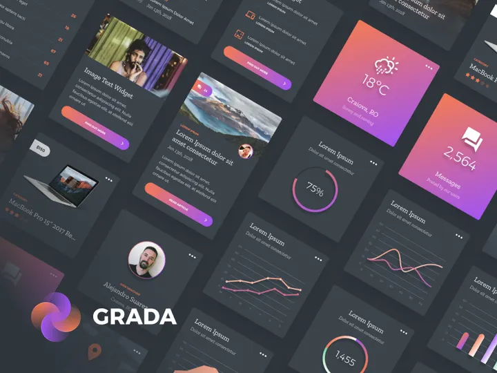
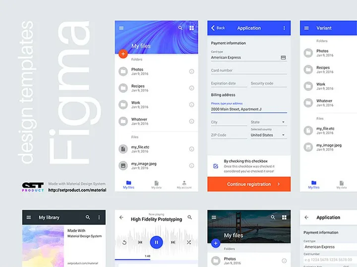
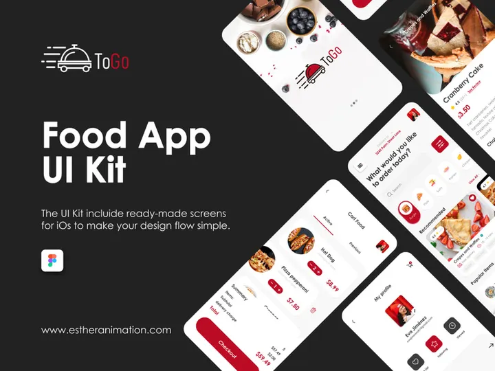
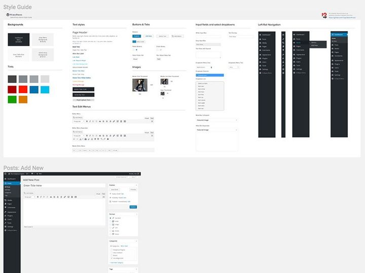
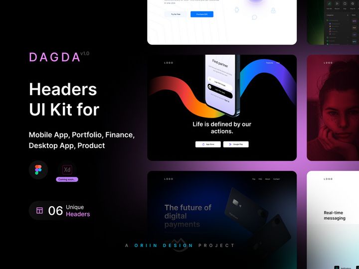
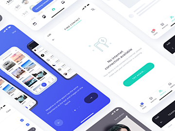
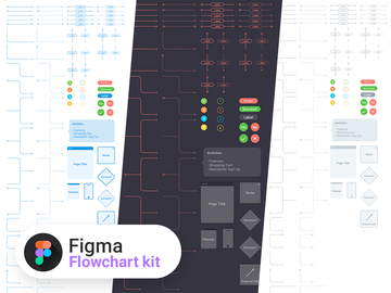
Top UI Kits for Figma
Handpicked resources from our curated collection


Try Our Free Resources
Download any of these for free - no account required


Why Figma for UI Kits?
Figma has emerged as a leading design tool for interface creation, especially when it comes to leveraging UI kits. Its cloud-based, collaborative environment makes it an ideal platform for teams and individuals who need fast, scalable, and consistent design workflows. One of the biggest reasons designers gravitate toward Figma for UI kits is its real-time collaboration feature. Multiple team members can work on the same file simultaneously, making it easier to review, iterate, and finalize designs without the friction of version control issues common in desktop-only tools.
Another standout feature is Figma’s robust component system. UI kits rely heavily on reusable elements—buttons, cards, navigation bars, forms—and Figma’s components and variants allow designers to create dynamic, interactive design systems that update globally. This means a change to a primary button style can instantly reflect across an entire project, drastically reducing design debt and inconsistencies. Additionally, Figma supports auto-layout, enabling elements to resize and reflow based on content, which is crucial for responsive UI kits.
The platform’s plugin ecosystem further enhances the utility of UI kits. From content generators to design inspectors, plugins streamline the integration and customization of pre-built components. With Figma’s open file-sharing model, designers can easily access, duplicate, and adapt UI kits from public projects, accelerating the design process from concept to prototype.
At EpicPxls, we recognize the power of this ecosystem. That’s why we’ve curated over 2222+ resources specifically optimized for Figma. Our team ensures every listed UI kit is up-to-date, well-structured, and compatible with the latest Figma features, so designers can focus on creativity rather than compatibility. Whether you're building a mobile app, a SaaS dashboard, or a responsive website, Figma’s flexibility and the vast library of community-driven tools make it the top choice for modern UI design.
Top UI Kits Picks for Figma
With thousands of UI kits available, selecting the right one can significantly impact your design efficiency and output quality. Whether you're just starting your journey in UI design or you're a seasoned professional, there’s a Figma UI kit tailored to your needs. At EpicPxls, we’ve evaluated hundreds of options to bring you the most practical and visually compelling choices from our collection of 2222+ resources. Below are our top recommendations across key categories to help you make the best choice for your projects.
Best for Beginners
If you're new to UI design or transitioning into Figma, starting with a beginner-friendly UI kit is essential. Look for kits that offer clear documentation, intuitive layer naming, and organized pages for components, styles, and templates. Kits like “Starter UI Kit” and “Minimal Design System” are excellent entry points. They include basic elements such as buttons, input fields, typography grids, and simple navigation layouts, all structured in a way that teaches best practices as you use them. These kits often come with onboarding walkthroughs or video tutorials, helping new users understand how to navigate and customize components effectively.
Best for Professionals
Experienced designers need UI kits that support complex, large-scale projects with advanced functionality. Professional-grade kits typically include comprehensive design tokens, nested components, variant hierarchies, and dark mode support. They’re built with scalability in mind, making them perfect for enterprise applications, design systems, and cross-platform development. Kits like “Enterprise Dashboard UI Kit” and “Design System Pro” offer modular architecture, accessibility compliance, and integration-ready components for developers. These resources save countless hours in prototyping and handoff, ensuring pixel-perfect consistency from design to development.
Best Free Options
High-quality doesn’t have to mean high cost. Many free UI kits for Figma deliver exceptional value without compromising on design integrity. The best free kits are often created by experienced designers who want to contribute to the community or promote their work. They include essential components, well-defined typography, and color systems that align with modern design standards. Examples like “Free Mobile UI Kit” and “Open Source Web Components” are regularly updated and fully compatible with Figma’s latest features. At EpicPxls, we vet each free resource to ensure it meets our standards for usability and structure, so you’re never wasting time on poorly organized files. With over 2222+ resources in our library, including many high-performing free kits, finding the right one has never been easier.
Figma vs Other Tools for UI Kits
When comparing design tools for working with UI kits, Figma consistently stands out due to its unique blend of accessibility, collaboration, and technical capabilities. Unlike traditional desktop-based software, Figma operates entirely in the browser, allowing instant access to UI kits from any device with an internet connection. This eliminates the need for file synchronization and installation, a common hurdle in other platforms.
One of Figma’s most powerful advantages is its real-time collaboration. Designers, developers, and stakeholders can view, comment, and edit UI kits simultaneously, streamlining feedback loops and reducing project timelines. Other tools may offer commenting or version history, but few match Figma’s seamless multi-user experience. This is especially beneficial when working with large UI kits that require team-wide input and standardization.
Figma’s component and style libraries are also more dynamic. With shared libraries, teams can publish and subscribe to UI kits across multiple projects, ensuring design consistency at scale. This ecosystem fosters reuse and reduces duplication—critical for maintaining large design systems. Additionally, Figma supports easy import and export in various formats, though it primarily thrives on its native .fig files. While some tools rely on static assets or limited plugin support, Figma’s open plugin API allows developers to extend UI kit functionality—for example, auto-generating content or syncing with code repositories.
At EpicPxls, we focus exclusively on Figma-compatible resources because we believe in the platform’s long-term viability and community strength. The 2222+ resources we curate are all tested for format integrity and optimized for Figma’s collaborative and component-driven workflow, ensuring you get the most out of your design process.
Setting Up UI Kits in Figma
Integrating a UI kit into your Figma workflow is a straightforward process when you follow a structured approach. Proper setup ensures that your components are accessible, organized, and ready for real-world use. Whether you're importing a single kit or managing multiple libraries, these six steps will help you get started efficiently.
- Download or Duplicate the UI Kit: Start by accessing the UI kit from a trusted source. Many kits are shared via public Figma links—simply click “Duplicate” to add a copy to your Figma account. If downloading a .fig file, open Figma and use “File > Open” to import it.
- Review the File Structure: Open the duplicated file and explore its pages. Most well-designed kits separate components, styles, templates, and documentation. Take a few minutes to understand how the kit is organized to save time later.
- Create a Team or Project Library: If you're working with a team, publish the kit as a shared library. Go to your Figma account settings, create a new team or project, and upload the kit. This allows all team members to access and use the components across different files.
- Enable the Library in Your Design File: Open the Figma file where you want to use the UI kit. In the Assets panel, click “Libraries” and enable the newly added kit. Components and styles will now be available via the component picker and design panel.
- Test Components and Variants: Insert a few key components—like buttons or cards—and test their variants. Ensure auto-layout works as expected and that text and icons resize properly. This step confirms the kit is functioning correctly in your environment.
- Customize and Document: Adapt the kit to your brand by updating colors, typography, or spacing if needed. Consider creating a documentation page that explains usage guidelines, especially if multiple designers will be using the kit.
For those managing multiple kits, consider using naming conventions and tags to keep libraries distinct. With over 2222+ resources available through EpicPxls, staying organized from the start ensures long-term efficiency and consistency across your design system.
Figma Workflow Tips
Maximizing the potential of UI kits in Figma requires more than just importing components—it demands smart organization, efficient operations, and strong collaboration practices. By refining your workflow, you can reduce redundancy, improve design quality, and accelerate project delivery. Here are key strategies to help you get the most out of your Figma experience.
Organizing UI Kits Libraries
A well-organized library is the backbone of an efficient design system. Group components by function—such as navigation, forms, and layout—using clear page titles and section headers. Use Figma’s naming conventions consistently (e.g., “Button/Primary” or “Card/Hero”) to make components easy to find. Consider creating a master “Reference” file that links to all your active UI kits, allowing quick access and version tracking. At EpicPxls, we recommend using descriptive tags and version numbers in file names to avoid confusion, especially when iterating on design systems.
Batch Operations
Figma’s ability to perform batch edits can dramatically speed up your workflow. Use the “Find and Replace” plugin to update text styles or colors across multiple components at once. Auto-layout enables mass resizing and reflow of elements, which is especially useful when adapting a UI kit for different screen sizes. You can also select multiple instances of a component and update their properties simultaneously—ideal for rolling out design changes quickly. For large-scale updates, leverage Figma’s “Style Organizer” plugin to manage and clean up duplicate or unused styles.
Collaboration Best Practices
Effective collaboration starts with clear communication. Use Figma’s commenting feature to provide contextual feedback directly on components or layouts. Set up shared libraries so all team members use the same up-to-date assets, minimizing inconsistencies. Establish naming standards and design guidelines upfront, and store them in a dedicated documentation page within the file. Encourage team members to use version history to track changes and revert when necessary. When working with external stakeholders, use Figma’s presentation mode to showcase UI kits in a clean, interactive format without exposing underlying layers or components.
Why Download from EpicPxls?
Commercial License
Use in personal and commercial projects
No Account Required
Download free resources instantly
Quality Curated
Every resource is reviewed for quality
Preview Files
See Figma and Photoshop files before downloading
Who Uses These Ui Kits?
Professionals and teams who benefit most from our collection
UI/UX Designers
Speed up your workflow with ready-to-use ui kits for Figma. Perfect for prototyping and client presentations.
Developers
Get production-ready assets without design skills. Export in any format for web and mobile apps.
Startups & Agencies
Save design budget with affordable premium ui kits. Commercial license included for client work.
Marketing Teams
Create professional campaigns faster. All ui kits are optimized for social media and ads.
UI Kits for Figma FAQCommon questions about these resources
Simple, Transparent Pricing
Get unlimited access to all premium resources
Yearly
- 20 downloads per month
- All file formats
- Commercial license
Lifetime
- Unlimited downloads forever
- All file formats
- Commercial license
Ready to Get Started?
Access 4,438+ free design resources today.
Browse Free ResourcesView Premium PlansEarn 85% and
more on all sales
Upload your products and put them up
for sale at whatever price you want.

