Flat UI Kits: 58+ Flat Designs
EpicPxls offers 58+ curated ui kits, all with a commercial license and editable source files (Figma, Sketch, PSD). Flat ui kits are characterized by specific visual elements, typography choices, and color palettes that define the flat aesthetic in design.
Last updated February 12, 2026
Discover 58+ curated flat ui kits for your projects.
Trusted by designers at leading companies
Top UI Kits
Handpicked resources from our curated collection


Try Our Free Resources
Download any of these for free - no account required

Flat Design Principles
Flat design is a minimalist approach to user interface and graphic design that emphasizes usability, clarity, and visual efficiency. It strips away heavy textures, gradients, shadows, and other ornamental elements that mimic real-world objects—commonly known as skeuomorphism—opting instead for clean lines, bold colors, and two-dimensional elements. This style emerged as a natural evolution in digital design, driven by the need for faster load times, responsive layouts, and improved readability across a wide range of devices.
At the core of flat design are several key visual elements. Typography plays a central role, with clean sans-serif fonts being the standard choice. These fonts enhance legibility and complement the uncluttered aesthetic. Color palette is another defining feature—flat design relies on vibrant, high-contrast hues that are often used in solid blocks. These colors are not only visually striking but also help to create intuitive navigation and visual hierarchy. Spacing is carefully considered to avoid overcrowding, allowing content to breathe and guiding the user’s eye naturally through the layout. Imagery in flat design tends to be simplified, often using iconography and illustrations that align with the overall two-dimensional theme, avoiding photorealism in favor of symbolic, geometric representations.
The roots of flat design can be traced back to early 20th-century movements like Swiss Design and Bauhaus, both of which championed functionality and simplicity. However, the modern interpretation gained momentum in the early 2010s, particularly with the launch of Microsoft’s Metro design language and Apple’s iOS 7 update. These shifts signaled a broader industry move toward minimalism and digital-first experiences. Over time, flat design has evolved to include subtle enhancements—such as light shadows and micro-interactions—creating what’s now known as "flat design 2.0." This updated version maintains the core principles while improving usability through slight depth cues. Today, flat design remains a dominant force in digital aesthetics, especially within UI kits, where clarity and consistency are paramount. With platforms like EpicPxls offering 58+ resources, designers have access to a rich library of flat-style components that embody these enduring principles.
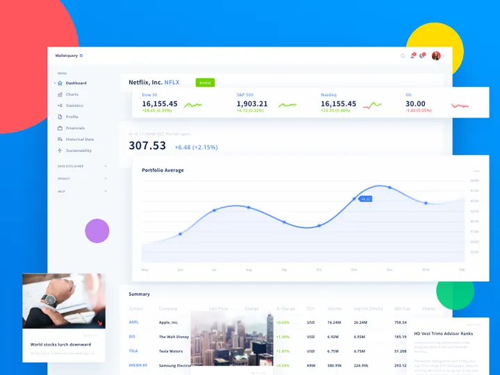
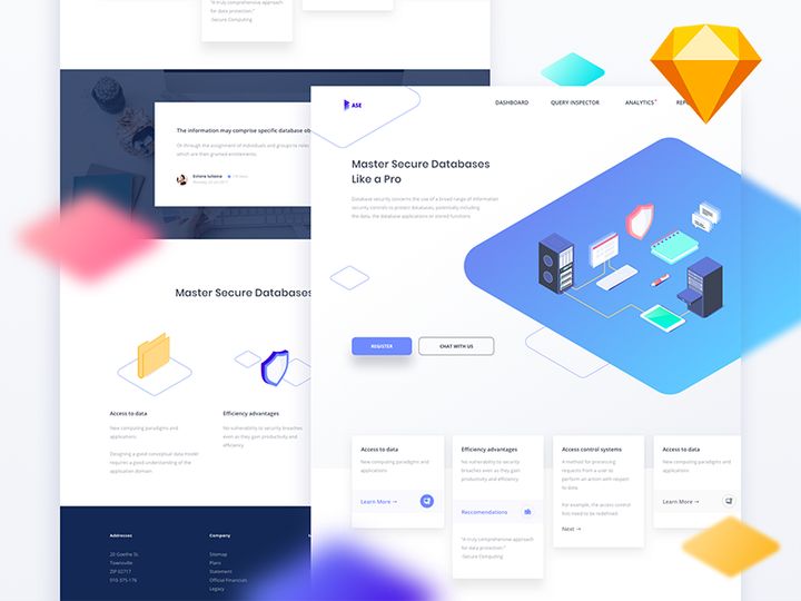
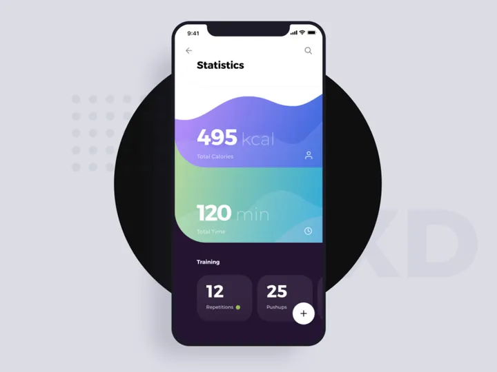
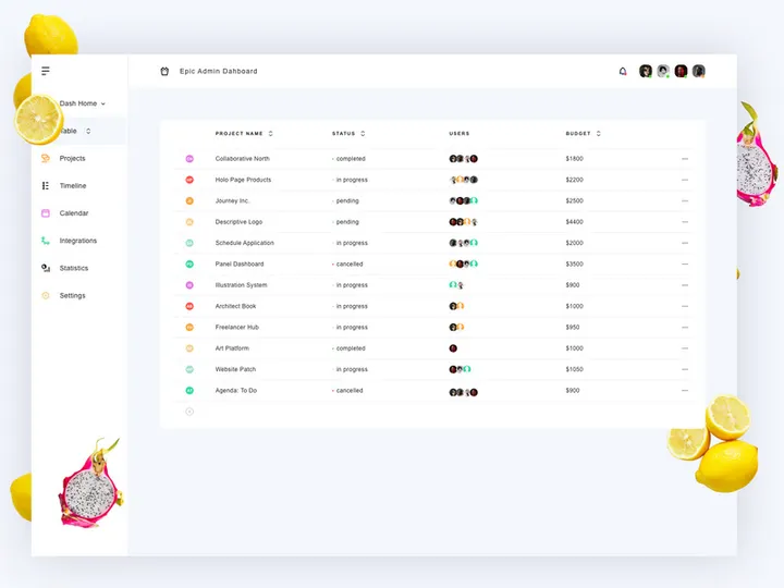
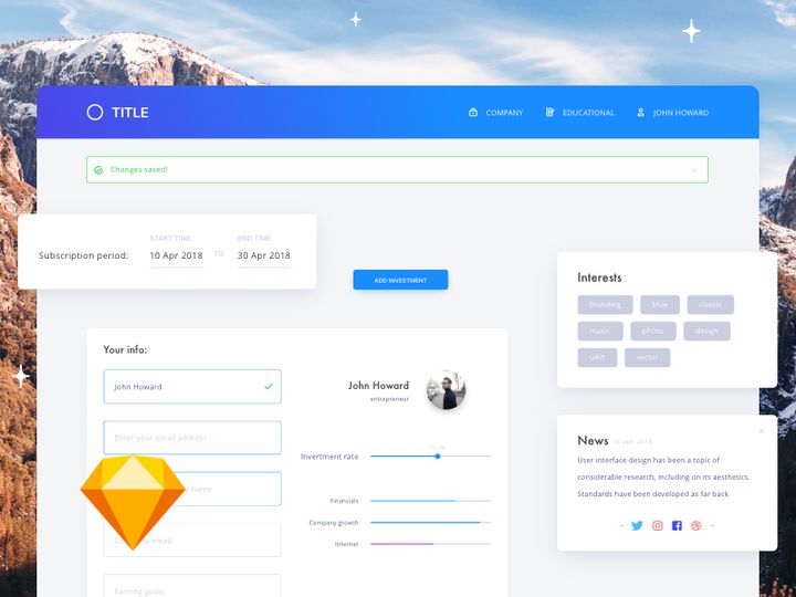
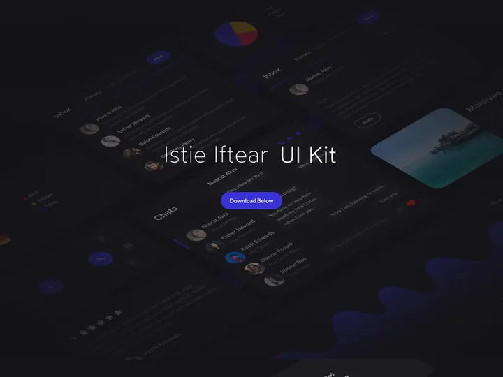
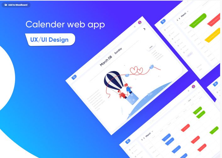
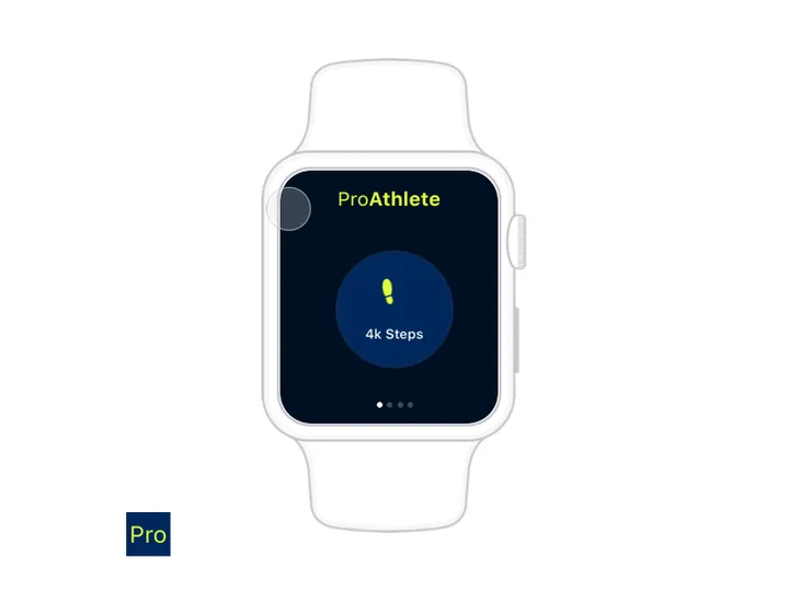
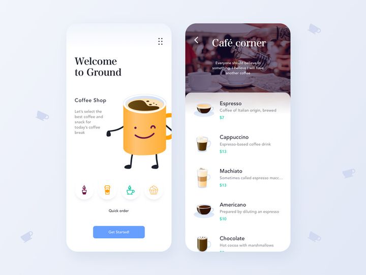
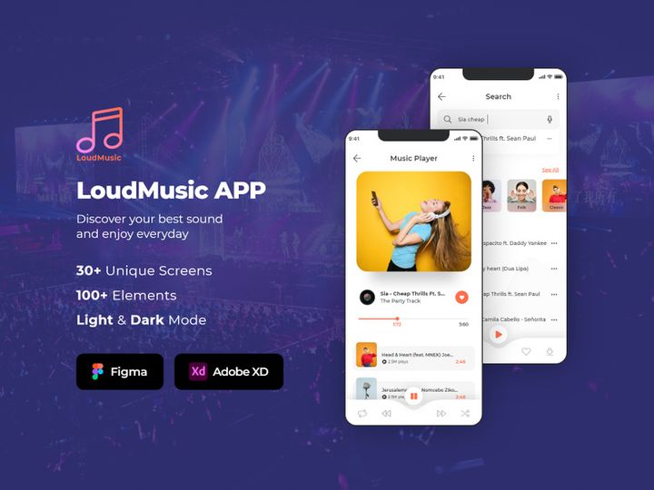
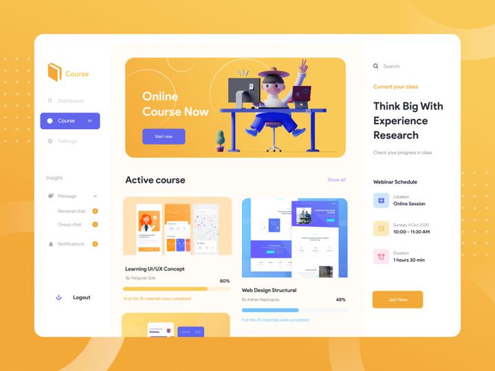
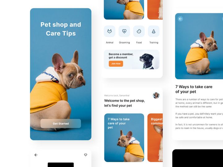
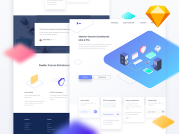
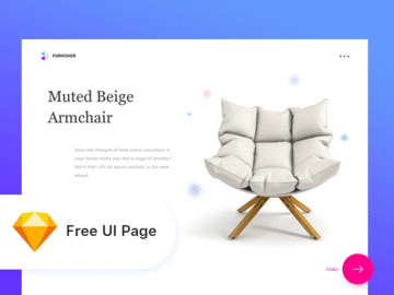
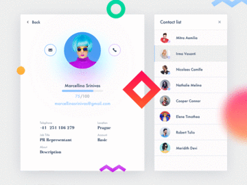
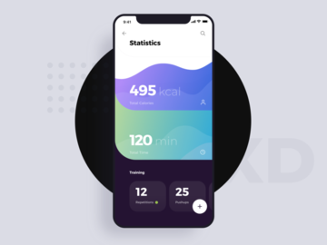
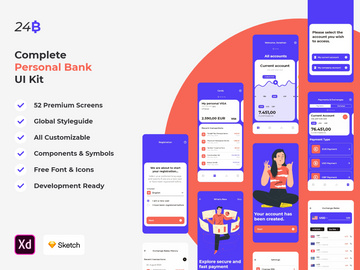
Inspiring Flat UI Kits Examples
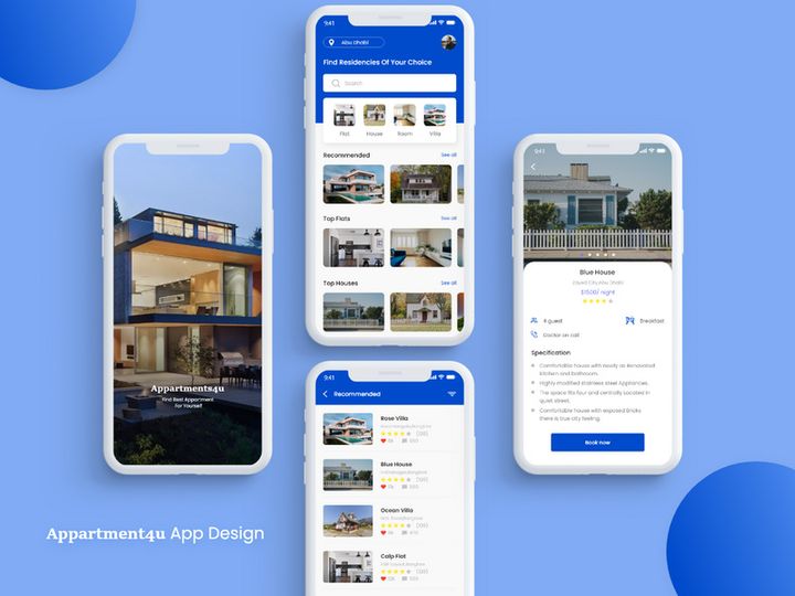
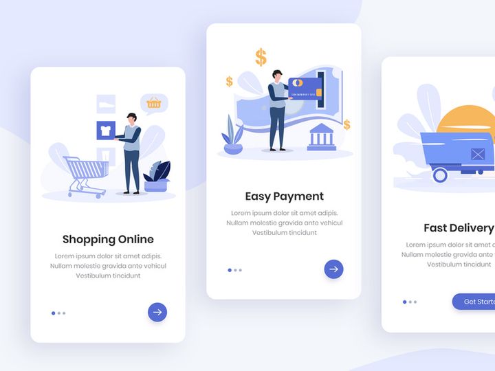
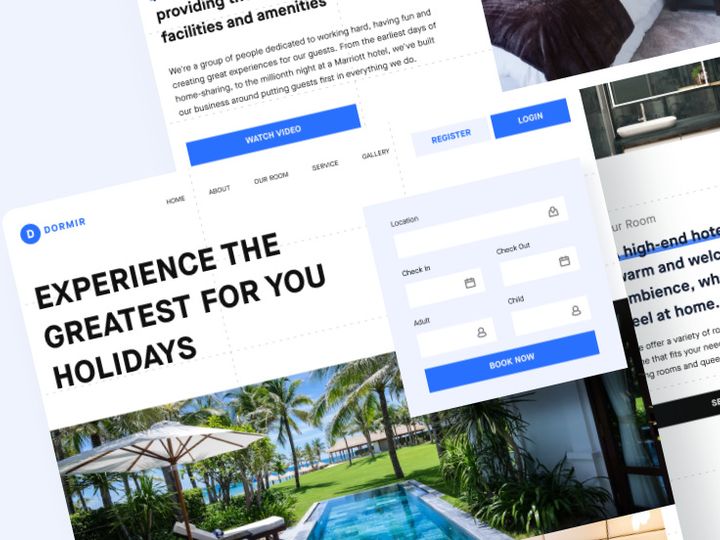
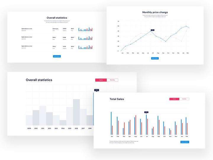
Web & App Design
Flat UI kits are particularly effective in web and mobile app interfaces, where speed, responsiveness, and user experience are critical. By eliminating visual clutter, flat design allows users to focus on core functionality. Buttons, menus, form fields, and navigation elements are rendered in simple shapes and bold colors, improving recognition and interaction. Modern flat UI kits often include responsive grids, scalable icons, and modular components that adapt seamlessly across screen sizes. Designers leverage these kits to create consistent, professional-grade interfaces quickly—whether for SaaS platforms, e-commerce sites, or productivity apps. The availability of 58+ resources at EpicPxls ensures that developers and UI designers can find ready-to-use templates tailored to a wide range of digital products.
Print & Branding
While often associated with digital spaces, the flat aesthetic translates powerfully into print and branding materials. Logos, business cards, brochures, and packaging benefit from the bold, clean visuals of flat design. The use of flat illustrations and geometric patterns creates a modern, approachable brand identity that resonates with contemporary audiences. Flat design in branding often conveys innovation and clarity, making it ideal for tech startups, creative agencies, and lifestyle brands. With well-crafted flat elements, companies can maintain visual consistency across both digital and physical touchpoints, strengthening brand recognition.
Social Media & Marketing
Social media content thrives on quick engagement, and flat design delivers with its eye-catching simplicity. From Instagram story templates to Facebook ad banners, flat UI kits provide designers with pre-styled components that communicate messages clearly and instantly. The use of flat icons, solid color backgrounds, and legible typography ensures content is both scannable and shareable. Marketing campaigns that incorporate flat design often see higher user interaction due to the visual clarity and professional polish these kits provide. Whether launching a new product or promoting a seasonal offer, the flat style enhances message delivery across platforms—making it a go-to choice for modern digital marketers.
How to Apply Flat Style to Your Projects
- Assess your project goals: Before selecting a flat UI kit, define the purpose of your design—be it a mobile app, website, or marketing campaign. Understanding the context helps you choose components that align with your functionality and tone.
- Choose the right flat UI kits from EpicPxls: With over 58+ resources available, you can filter by category, device compatibility, or color scheme to find the perfect match. Look for kits that include essential elements like buttons, cards, navigation bars, and icons.
- Customize with intention: While flat design values simplicity, you can personalize your kit by adjusting colors, icons, or layouts. Ensure changes maintain visual consistency—avoid introducing gradients or heavy shadows that disrupt the flat aesthetic.
- Prioritize usability: Even in minimalist design, user experience is key. Use clear typographic hierarchy, ample white space, and intuitive navigation patterns to guide users naturally through your interface.
- Pair with complementary typography and color: Select fonts and color schemes that enhance readability and reinforce your brand. Stick to sans-serif typefaces and limit your palette to 3–5 core colors for cohesion.
- Test across devices: Flat UI kits are ideal for responsive design. Preview your project on various screen sizes to ensure elements scale properly and maintain their clarity and impact.
By following these steps and leveraging high-quality flat UI kits from EpicPxls, you can streamline your workflow while delivering polished, professional results. The 58+ resources available offer flexibility and creative freedom, making it easier than ever to bring your vision to life with a clean, modern edge.
Flat Pairing Guide
Complementary Styles
While flat design stands strong on its own, it pairs exceptionally well with certain design approaches. Material design, for instance, builds on flat principles by introducing controlled depth through subtle shadows and elevation, enhancing usability without sacrificing minimalism. Neumorphism can also complement flat aesthetics when used sparingly—its soft, extruded forms work best as accents rather than dominant elements. Additionally, flat design integrates seamlessly with illustrative styles, especially geometric or isometric graphics, which maintain the two-dimensional integrity while adding visual interest. When combining styles, the key is balance: ensure that added elements don’t overpower the simplicity that makes flat design effective.
Typography Choices
Typography is a cornerstone of successful flat design. Sans-serif fonts like Inter, Roboto, Montserrat, and Open Sans are ideal due to their clean lines and excellent readability at various sizes. These typefaces align with the modern, no-frills ethos of flat design. For branding or editorial contexts, consider using a bold display font for headlines while maintaining a neutral sans-serif for body text. Avoid script or overly decorative fonts, as they can clash with the minimalist tone. When using flat UI kits from EpicPxls, pay attention to built-in typographic systems—many include predefined font hierarchies that ensure consistency across your project.
Color Palettes
Color is one of the most powerful tools in flat design. Opt for bold, saturated hues that create contrast and guide user attention. Popular palettes often include combinations like teal and coral, navy and mustard, or monochromatic blues with a single accent shade. The use of white space or light gray backgrounds helps colors stand out without overwhelming the user. Tools like color contrast checkers ensure accessibility, especially for text readability. When customizing flat UI kits, maintain a limited palette—typically 3–5 primary colors—to preserve visual harmony. EpicPxls offers kits with pre-defined, aesthetically balanced color schemes, making it easier to stay on-brand while leveraging the vibrancy flat design is known for.
Flat UI Kits Trends in 2026
As we move into 2026, flat UI kits continue to evolve while staying true to their minimalist roots. The trend is shifting toward greater interactivity and adaptability, with designers incorporating subtle animations, hover effects, and micro-interactions that enhance usability without compromising the flat aesthetic. These enhancements, often referred to as "flat design with depth," allow for a more engaging user experience while maintaining the clean, uncluttered look that defines the style.
Another growing trend is the integration of AI-driven customization tools within flat UI kits. Designers can now generate color variants, resize components dynamically, or even auto-generate accessible typography pairings—streamlining workflows and reducing design debt. Additionally, there’s a rising demand for inclusive design, with flat kits increasingly offering dark mode variants, scalable UI elements, and accessibility-ready components. This focus on inclusivity ensures that flat design remains relevant across diverse user bases and global markets.
Flat UI kits are also being used more strategically in cross-platform development. With the rise of design systems and component libraries, teams leverage flat kits to maintain consistency across web, mobile, and desktop applications. The modularity of these resources allows for rapid prototyping and faster time-to-market. As digital products become more complex, the simplicity of flat design provides a much-needed anchor—a visual language that prioritizes clarity and purpose.
Looking ahead, the future of flat design lies in intelligent minimalism—striking the perfect balance between beauty and function. With platforms like EpicPxls curating 58+ resources, designers have everything they need to stay at the forefront of this evolution. Whether you're building a startup dashboard, a personal portfolio, or a global marketing campaign, flat UI kits offer a timeless foundation that adapts to changing technologies and user expectations. As design continues to prioritize speed, accessibility, and emotional resonance, the flat aesthetic remains not just relevant—but essential.
Why Download from EpicPxls?
Commercial License
Use in personal and commercial projects
No Account Required
Download free resources instantly
Quality Curated
Every resource is reviewed for quality
Preview Files
See Figma and Photoshop files before downloading
Who Uses These Ui Kits?
Professionals and teams who benefit most from our collection
UI/UX Designers
Speed up your workflow with ready-to-use ui kits for design tools. Perfect for prototyping and client presentations.
Developers
Get production-ready assets without design skills. Export in any format for web and mobile apps.
Startups & Agencies
Save design budget with affordable premium ui kits. Commercial license included for client work.
Marketing Teams
Create professional campaigns faster. All ui kits are optimized for social media and ads.
UI Kits FAQCommon questions about these resources
Simple, Transparent Pricing
Get unlimited access to all premium resources
Yearly
- 20 downloads per month
- All file formats
- Commercial license
Lifetime
- Unlimited downloads forever
- All file formats
- Commercial license
Ready to Get Started?
Access 4,441+ free design resources today.
Browse Free ResourcesView Premium PlansEarn 85% and
more on all sales
Upload your products and put them up
for sale at whatever price you want.

