What Is a Design System? Complete Guide for Designers
EpicPxls offers 200+ curated ui kits, all with a commercial license and editable source files (Figma, Sketch, PSD). A design system is a pre-made design resource that helps designers work faster. Browse 200+ design systems on EpicPxls for your projects.
Last updated February 12, 2026
Everything you need to know about design systems — definition, types, and how to use them.
Trusted by designers at leading companies
Top UI Kits
Handpicked resources from our curated collection
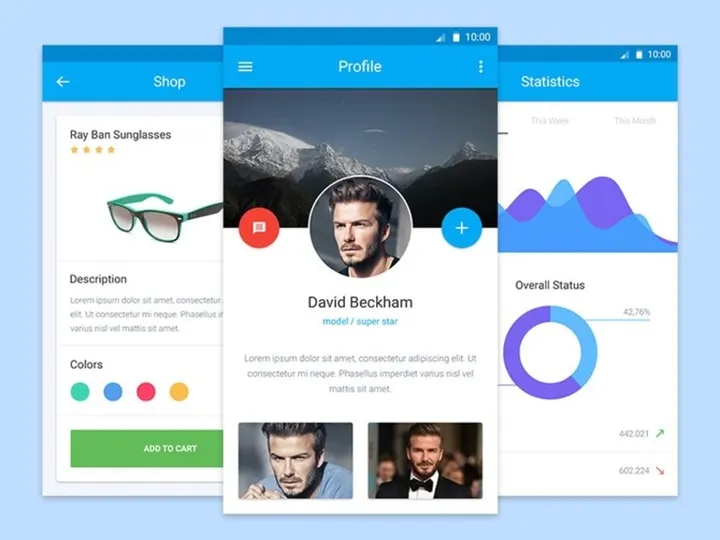


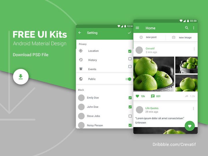
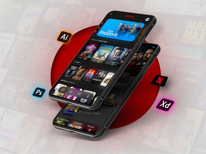
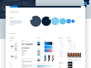
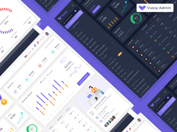
![Zenmotors Design System [Adobe XD] preview picture](https://imgproxy.epicpxls.com/LHztt7-b3ennzUS3azCPrL2iA1HzuiMAi3zKEgqEH-U/rs:fill:720:540:0/g:no/aHR0cHM6Ly9pdGVt/cy5lcGljcHhscy5j/b20vdXBsb2Fkcy9w/aG90by8xNDM0OGE0/YjU3OWEwMWVmOGY3/MDg1YjY3ZjIyNDdj/Mw.jpg)


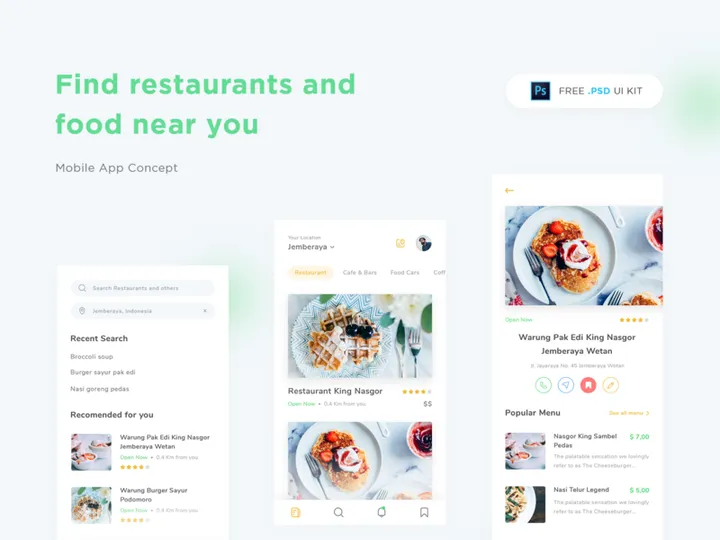


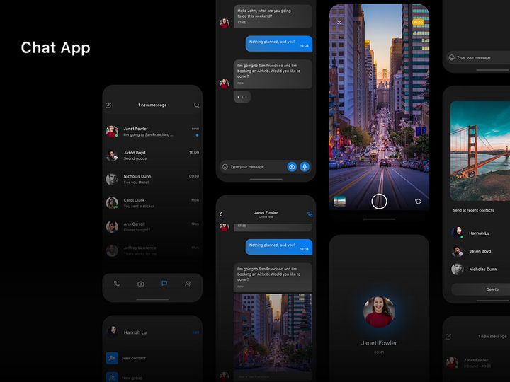
![Online Car Wash - App UI Design - [Figma] preview picture](https://imgproxy.epicpxls.com/0yw0dWa-vCqh3xXWOmIpya581HRt6N2gkDGQ9grjSOQ/rs:fill:720:540:0/g:no/aHR0cHM6Ly9pdGVt/cy5lcGljcHhscy5j/b20vdXBsb2Fkcy9w/aG90by9kM2M0MmM0/MDA0OTcxYWZjODU3/NTVkMjg3NDBjYTNi/MA.jpg)
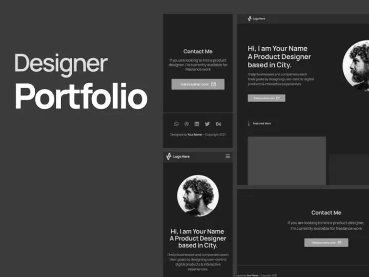
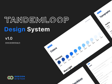
![Material Design Kit [Sketch] preview picture](https://imgproxy.epicpxls.com/25NgiEuwqlJOHx6Nz4RS2GU6a38NeEJY6Ac4cSa1E2M/rs:fill:720:540:0/g:no/aHR0cHM6Ly9pdGVt/cy5lcGljcHhscy5j/b20vdXBsb2Fkcy9w/aG90by9jNGU3MjZi/M2VhY2FmMTNlNjdi/MDFmZmY5OWExZjcz/OS5wbmc.jpg)
Try Our Free Resources
Download any of these for free - no account required

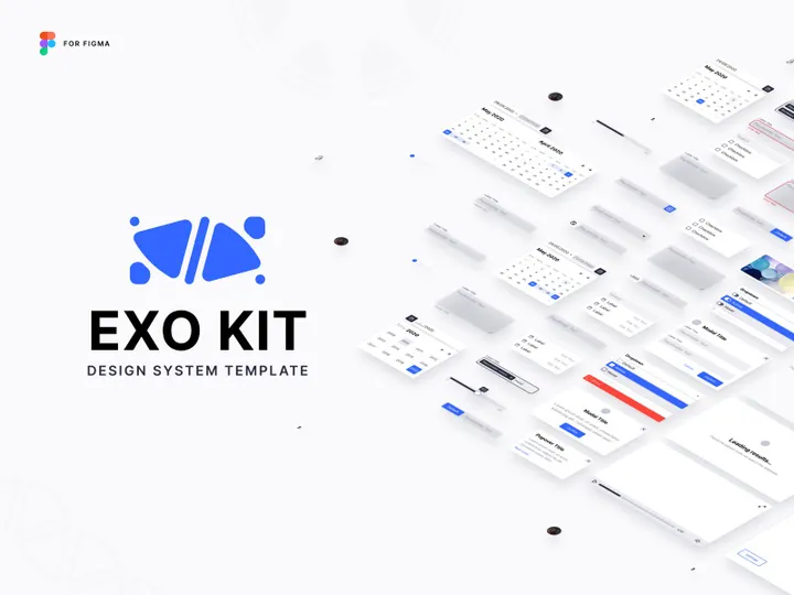
![Zenmotors Design System [Adobe XD]](https://items.epicpxls.com/uploads/photo/ea8adf6dc48ef1015b3a2abaddc89b69)
What Is a Design System?
A design system is a comprehensive collection of reusable components, guided by clear standards, that teams use to create consistent and cohesive digital products. More than just a set of UI elements, a design system serves as a single source of truth for design and development, encompassing everything from color palettes and typography to code snippets, interaction patterns, and design principles. It functions as both a practical toolkit and a strategic framework, ensuring that every user experience—whether on mobile, web, or desktop—feels unified and intentional.
The concept of a design system evolved from earlier design practices such as style guides and pattern libraries. In the early days of digital design, teams relied on static documents to define visual consistency. As products grew in complexity and teams became distributed across time zones, the limitations of these static references became apparent. The need for scalable, collaborative, and maintainable design processes gave rise to modern design systems. Companies like Google with Material Design and Salesforce with Lightning Design System were among the pioneers, demonstrating how structured design language could accelerate product development while improving user experience.
Today, design systems are essential in modern design workflows. They reduce redundancy, increase efficiency, and ensure brand consistency across platforms and teams. For designers, a robust design system means less time reinventing basic components and more time solving complex user problems. For developers, it means faster implementation with fewer discrepancies between design and code. For organizations, it fosters alignment across departments and streamlines onboarding for new team members.
With the growing number of digital touchpoints and the demand for faster product delivery, design systems have become a strategic asset. They empower teams to scale design efforts sustainably, maintain quality, and deliver seamless experiences. Whether you're working on a startup MVP or a global enterprise platform, a well-crafted design system provides the foundation for design excellence. Platforms like EpicPxls offer access to over 36454+ design system resources, making it easier than ever to find, learn from, and implement proven systems in your own projects.
Types of Design Systems
By Purpose
Design systems are built with specific goals in mind, and their purpose often determines their structure and content. Some are tailored for enterprise-level applications, focusing on accessibility, scalability, and compliance. Others are designed for startups or agile teams, prioritizing speed and flexibility. Brand-focused design systems emphasize visual identity—colors, logos, tone of voice—ensuring every customer interaction reflects the company’s values. Product-specific systems serve a single application, like a banking app or e-commerce platform, while platform-wide systems support multiple products under one ecosystem, such as a suite of SaaS tools.
Open-source design systems are built for public use and community collaboration, encouraging contributions and adaptations. Internal design systems, on the other hand, are proprietary and customized to an organization’s unique needs. Some systems are created primarily for developers, including detailed API documentation and component libraries, while others are designer-first, featuring extensive Figma or Sketch files with intuitive component structures.
By Format
The format of a design system determines how it is accessed and used. Most modern design systems come in digital formats compatible with design tools like Figma, Sketch, and Adobe XD. These often include downloadable files or cloud-based libraries that integrate directly into design workflows. Code-based design systems are delivered as npm packages, GitHub repositories, or design language frameworks such as React, Vue, or Angular components.
Documentation is typically hosted on web-based platforms using tools like Storybook, Zeroheight, or Notion, where teams can view usage guidelines, accessibility standards, and code examples. Some systems combine multiple formats—offering Figma files for designers, React components for developers, and comprehensive documentation for cross-functional teams. The rise of design-dev collaboration tools has made format interoperability a key feature of high-quality systems.
By Complexity
Design systems vary widely in scope and depth. At the simpler end are lightweight systems—often called starter kits or UI kits—that include basic components like buttons, forms, and cards. These are ideal for small projects, prototypes, or teams just beginning to adopt design consistency.
Mid-tier systems add more structure, introducing design tokens (for colors, spacing, typography), responsive grids, and interaction guidelines. They may include dark mode support, accessibility compliance, and multi-language considerations. These are suitable for growing products with multiple contributors.
At the high end are comprehensive, enterprise-grade design systems. These include not only UI components and code libraries but also detailed design principles, content strategy, motion design guidelines, and governance models. They are maintained by dedicated design ops teams and evolve over time through version control and feedback loops. Whether simple or complex, the right system depends on your project’s scale, team size, and long-term goals. With 36454+ resources available across categories like UI kits and design systems, platforms like EpicPxls make it easy to find a system that matches your needs.
How to Use Design Systems in Your Projects
- Assess Your Project Needs: Before selecting a design system, evaluate your project’s scope, target audience, and technical requirements. Consider whether you need a general-purpose system or one tailored to a specific industry, such as healthcare or finance.
- Choose the Right Design System: Look for systems that align with your brand aesthetic, support your preferred design and development tools, and include comprehensive documentation. Prioritize systems with active maintenance and community support to ensure longevity.
- Integrate Into Your Design Tool: Most design systems come with Figma, Sketch, or Adobe XD files. Import the library into your workspace and set up component styles, color variables, and text styles to ensure consistency across screens.
- Customize for Brand Alignment: Adapt the system to reflect your brand identity. Update colors, typography, and iconography while preserving core component functionality. Use design tokens to maintain scalability and make future updates easier.
- Collaborate with Developers: Share the design system with your development team and ensure they have access to corresponding code components. Use tools that support design-to-code handoff, such as Figma plugins or integrated documentation sites.
- Iterate and Contribute: Treat the design system as a living document. Gather feedback from users and team members, and refine components over time. If using an open-source system, consider contributing improvements back to the community.
Best practices for using design systems include establishing naming conventions, documenting usage rules, and conducting regular audits to remove outdated components. Avoid the temptation to deviate from the system without justification—consistency is key to user trust and team efficiency.
Common tools for working with design systems include Figma for collaborative design, Storybook for component documentation, and Zeroheight or Notion for publishing guidelines. Version control platforms like GitHub help manage updates, while design token managers like Style Dictionary ensure consistency across platforms.
When implemented thoughtfully, a design system becomes more than a collection of parts—it becomes a shared language for your team. By leveraging existing systems, you can accelerate your workflow and focus on innovation rather than repetition. With EpicPxls hosting 36454+ design system resources, you have instant access to professionally curated systems that can jumpstart your next project.
Design System vs Related Concepts
While often used interchangeably, terms like design system, style guide, pattern library, and UI kit refer to distinct—but related—concepts. Understanding the differences helps you choose the right resource for your needs.
A style guide is a static document that defines visual standards—such as logo usage, color codes, and typography—but lacks interactive components or code. A pattern library goes a step further by cataloging reusable UI patterns like navigation menus or modals, often with basic usage notes. However, it may not include design principles or governance structures.
A UI kit is a collection of pre-designed interface elements—buttons, cards, forms—typically available as design files. While useful for prototyping, UI kits often lack documentation, accessibility guidance, or code integration.
In contrast, a design system unifies all these elements into a dynamic, evolving ecosystem. It includes not only visual styles and components but also design principles, content strategy, code libraries, accessibility standards, and tools for collaboration. It’s maintained over time and governed by a team or process.
That said, these concepts complement each other. A UI kit can be part of a larger design system, and a style guide may form the foundation of one. When starting out, a UI kit from a platform like EpicPxls can serve as a stepping stone toward building a full-fledged design system. The key is understanding when to use each: choose a UI kit for rapid prototyping, a pattern library for component consistency, and a full design system for long-term, scalable product development.
Where to Find Quality Design Systems
Finding a high-quality design system starts with knowing what to look for. A professional design system should include well-organized components, clear documentation, design tokens, accessibility compliance, and support for multiple devices. It should be actively maintained, with version updates and community or team backing. The best systems also provide real-world usage examples, design rationale, and guidance on customization.
When evaluating design systems, consider compatibility with your tools—Figma, Sketch, or Adobe XD for designers; React, Vue, or Angular for developers. Look for systems that offer both visual and code components, ensuring smooth collaboration across disciplines. Open-source systems often come with public repositories and contribution guidelines, while enterprise systems may include licensing agreements and support services.
For designers seeking trusted, ready-to-use resources, EpicPxls offers a curated collection of over 36454+ design system resources. These include everything from minimalist UI kits to comprehensive enterprise design languages, all vetted for quality, usability, and design integrity. The platform categorizes resources by tool, industry, and complexity, making it easy to find the perfect fit for your project.
You’ll find both free and premium design systems on EpicPxls, each with clear licensing terms. Free systems are excellent for learning, prototyping, or small projects, while premium options often include advanced features, extended support, and commercial use rights. Whether you’re building a personal portfolio or launching a startup, access to well-crafted systems can dramatically reduce development time and elevate your design quality.
Why Download from EpicPxls?
Commercial License
Use in personal and commercial projects
No Account Required
Download free resources instantly
Quality Curated
Every resource is reviewed for quality
Preview Files
See Figma and Photoshop files before downloading
Who Uses These Ui Kits?
Professionals and teams who benefit most from our collection
UI/UX Designers
Speed up your workflow with ready-to-use ui kits for design tools. Perfect for prototyping and client presentations.
Developers
Get production-ready assets without design skills. Export in any format for web and mobile apps.
Startups & Agencies
Save design budget with affordable premium ui kits. Commercial license included for client work.
Marketing Teams
Create professional campaigns faster. All ui kits are optimized for social media and ads.
UI Kits FAQCommon questions about these resources
Simple, Transparent Pricing
Get unlimited access to all premium resources
Yearly
- 20 downloads per month
- All file formats
- Commercial license
Lifetime
- Unlimited downloads forever
- All file formats
- Commercial license
Ready to Get Started?
Access 4,441+ free design resources today.
Browse Free ResourcesView Premium PlansEarn 85% and
more on all sales
Upload your products and put them up
for sale at whatever price you want.

