46009+ Icon Design Examples & Inspiration
EpicPxls offers 200+ curated icons, all with a commercial license and editable source files (Figma, Sketch, PSD). EpicPxls has 200+ icon design resources you can browse for inspiration and download for your projects.
Last updated February 12, 2026
Get inspired with 46009+ handpicked icon design examples from top designers.
Trusted by designers at leading companies
Top Icons
Handpicked resources from our curated collection


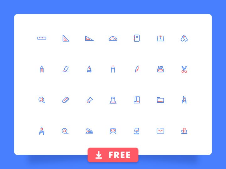
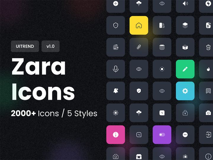
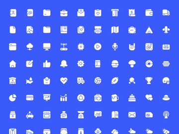
![Photoshop Icon Pack [Free SVG,PNG] preview picture](https://imgproxy.epicpxls.com/J-z-x9Sjo5KH35FFUojQEsF0BqZjGvGgFkaTfPN_7b8/rs:fill:720:540:0/g:no/aHR0cHM6Ly9pdGVt/cy5lcGljcHhscy5j/b20vdXBsb2Fkcy9w/aG90by8yYzI0ZWM3/ZjNhYjhhYWJiNzU3/YzAxM2Y2NWI1MmQ1/ZA.jpg)


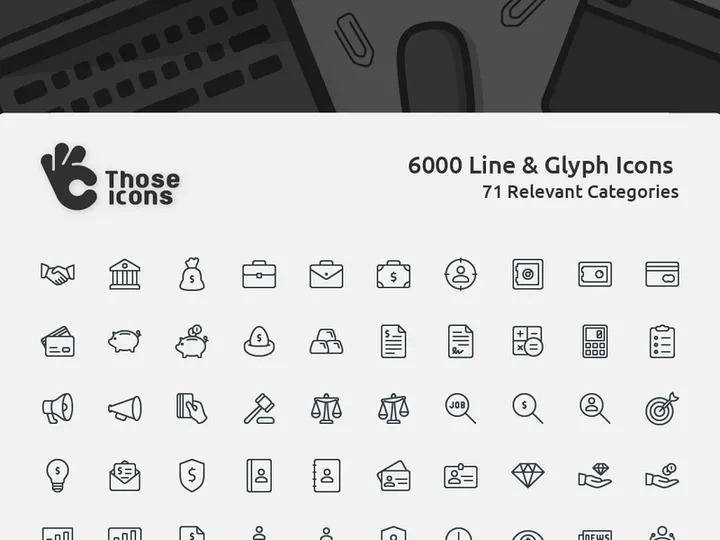
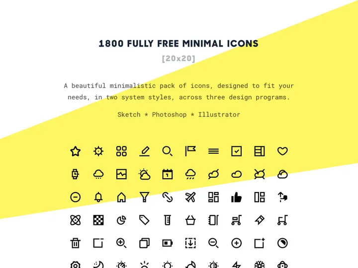
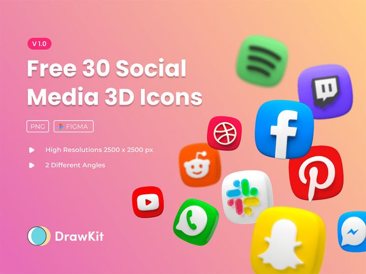
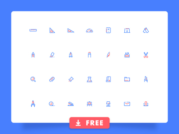
![Free 6000+ Icons [Figma] preview picture](https://imgproxy.epicpxls.com/uUauXZtLPZN2gyuKVtsZYdkCDcjSdp5MDFoNQBy3Q30/rs:fill:720:540:0/g:no/aHR0cHM6Ly9pdGVt/cy5lcGljcHhscy5j/b20vdXBsb2Fkcy9w/aG90by9kNmFhZjJm/MzQzMzk2OWI5MDFk/OWNjZjA1MGYwMDA5/Yw.jpg)


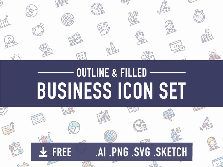
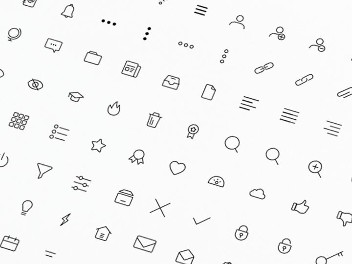
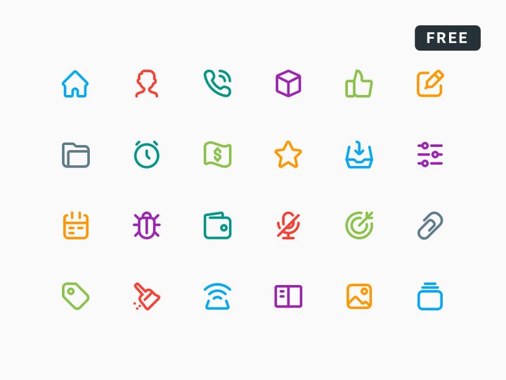
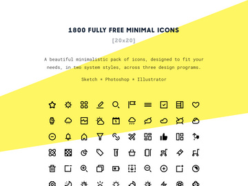
![Business Icon Set [AI, SVG, EPS] preview picture](https://imgproxy.epicpxls.com/9yu2oEZ7M_OuzuHWV7T3APytZWbcczAzPEjc6ZbYBss/rs:fill:720:540:0/g:no/aHR0cHM6Ly9pdGVt/cy5lcGljcHhscy5j/b20vdXBsb2Fkcy9w/aG90by8yMzFkMTQz/NTEwNzBiYzQxYzcw/Njk5YzUzYmVkNjll/Yi5wbmc.jpg)


Try Our Free Resources
Download any of these for free - no account required
Best Icon Design Examples in 2026
As we move deeper into 2026, icon design continues to evolve with a strong emphasis on clarity, expressiveness, and adaptability. The best icon design examples today reflect a fusion of minimalism and meaningful detail, striking the perfect balance between aesthetic appeal and functional purpose. Designers are increasingly embracing subtle textures, soft gradients, and refined strokes that enhance visual interest without compromising usability. One of the most notable trends is the rise of dynamic icons—icons that subtly change based on user interaction or system state, offering a more engaging and intuitive experience.
What makes these examples truly stand out is their attention to context. Leading icons are no longer just decorative elements; they are integral components of user interfaces that communicate actions, categories, and emotions with near-instant recognition. For instance, modern app icons often use bold geometric shapes paired with vibrant yet harmonious color palettes to ensure visibility across various screen sizes and resolutions. Additionally, accessibility considerations are now baked into high-quality icon sets, with thoughtful contrast ratios and scalable vector formats that maintain integrity on all devices.
Current design trends such as neumorphism, glassmorphism, and isometric illustration are making significant impacts on iconography. Neumorphic icons use soft shadows and light to create a gentle, almost tactile appearance, ideal for interfaces aiming for a calm and modern feel. Glassmorphic designs leverage transparency and blur effects to produce depth and layering, particularly effective in dashboard and mobile UIs. Meanwhile, isometric icons are gaining popularity in gaming, education, and data visualization for their ability to depict complex ideas in a visually engaging 3D-like format.
With over 46009+ icon design examples available today, inspiration is more accessible than ever. Platforms like EpicPxls curate high-quality, trend-forward icons that empower designers to stay ahead of the curve while maintaining brand consistency and usability. Whether you're designing for web, mobile, or desktop applications, studying these standout examples provides invaluable insight into what works—and why.
What Makes Great Icon Design?
Exceptional icon design goes beyond visual appeal—it combines form, function, and user psychology to deliver instant comprehension and seamless interaction. A great icon communicates its purpose at a glance, fits cohesively within a broader design system, and remains effective across diverse contexts and screen sizes. At its core, great iconography is both intuitive and timeless, avoiding fleeting trends that may date quickly. With thousands of options available—including the extensive collection of 46009+ resources on EpicPxls—understanding the foundational principles helps designers select or create icons that truly elevate their projects.
Visual Hierarchy
Effective icons rely on strong visual hierarchy to guide attention and prioritize information. This means using size, weight, spacing, and alignment strategically to ensure that the most important elements stand out. For example, primary action icons in an app should be larger and more detailed than secondary ones, while maintaining a consistent grid structure. A well-composed icon uses negative space wisely, avoids clutter, and aligns with the overall interface layout to support intuitive navigation.
Color and Typography
Color plays a crucial role in icon recognition and emotional response. High-contrast color schemes improve visibility, while brand-aligned palettes reinforce identity. In 2026, duotone and gradient icons are widely used to add depth and vibrancy without overwhelming the user. When combined with typography—especially in logo-style or wordmark icons—the choice of font must complement the icon’s style. Sans-serif fonts paired with modern flat icons, for instance, create a clean, contemporary look ideal for tech and SaaS platforms.
User Experience
Ultimately, an icon’s success is measured by its usability. Great icons are accessible, scalable, and culturally universal. They follow platform-specific guidelines (iOS, Android, web) to ensure familiarity and reduce cognitive load. Features like alt text, proper labeling for screen readers, and consistent behavior across devices make icons inclusive. Designers using resources from EpicPxls benefit from pre-optimized icons that meet modern accessibility standards, saving time and ensuring compliance.
Icon Design Trends & Patterns
Icon design in 2026 is shaped by both technological advancements and shifting user expectations. As interfaces become more immersive and interactive, icons are evolving from static symbols into dynamic, responsive elements. Designers are exploring new ways to integrate motion, depth, and context-aware behavior into their iconography, making digital experiences more intuitive and engaging. With a vast library of 46009+ icon design examples, platforms like EpicPxls make it easier than ever to explore and adopt these cutting-edge trends.
Current Design Movements
Flat design remains a staple, but it's now enhanced with micro-interactions and subtle depth cues. Glassmorphism, characterized by translucent layers and frosted effects, is particularly popular in dashboard and productivity apps, where icons need to stand out without disrupting the background. Neumorphism, though less dominant than in previous years, still finds use in wellness and lifestyle apps for its soft, organic feel. Additionally, line icons with variable stroke weights offer flexibility across light and dark modes, making them a favorite among UI/UX designers.
Industry-Specific Approaches
Different industries demand distinct visual languages. Healthcare apps favor clear, universally recognized symbols with high contrast for quick comprehension under pressure. Financial platforms use sleek, monochrome icons to convey trust and professionalism. In contrast, entertainment and gaming industries embrace bold colors, playful shapes, and animated elements to reflect energy and creativity. Educational tools often incorporate isometric or character-based icons to make learning more engaging, especially for younger audiences.
Emerging Innovations
Technology is pushing the boundaries of what icons can do. AI-assisted design tools now suggest icon variations based on context or brand guidelines, accelerating the creation process. Adaptive icons—those that change appearance based on device theme or user preferences—are becoming standard in mobile ecosystems. Additionally, SVG animations and Lottie integrations allow icons to respond to gestures, loading states, or notifications, transforming them from static images into living parts of the interface. Designers exploring these innovations can find forward-thinking examples among the curated collections on EpicPxls.
How to Create Your Own Icon Design
Creating custom icons allows brands and designers to establish a unique visual identity while ensuring perfect alignment with their interface goals. Whether you're starting from scratch or customizing existing assets, a structured approach leads to professional, scalable results. With inspiration and resources drawn from vast libraries like the 46009+ icon design examples on EpicPxls, the process becomes more efficient and creative.
- Define the Purpose and Context: Begin by identifying what the icon needs to communicate and where it will be used—mobile app, website, dashboard, etc. Understanding the user’s environment ensures the icon is both functional and appropriate.
- Research and Gather Inspiration: Explore existing designs, including popular trends and industry standards. Platforms like EpicPxls offer a wealth of high-quality examples that can spark ideas and reveal effective patterns.
- Sketch Concepts: Start with rough hand-drawn or digital sketches to explore different visual interpretations. Focus on simplicity and clarity, eliminating unnecessary details.
- Build in Vector Software: Use tools like Adobe Illustrator, Figma, or Sketch to create clean, scalable vector versions. Stick to a consistent grid (e.g., 24x24 or 48x48px) and use precise strokes and shapes.
- Apply Color and Effects: Choose a color palette that aligns with your brand and ensures accessibility. Consider how the icon will appear in dark mode, grayscale, or small sizes. Add gradients or shadows only if they enhance readability.
- Test and Iterate: Preview your icons in real-world scenarios—on different devices, backgrounds, and screen resolutions. Gather feedback and refine for clarity, consistency, and performance.
Even when designing custom icons, leveraging pre-made resources as a foundation can save time and ensure technical quality. Many designers begin with professional templates or SVG kits from EpicPxls, then modify shapes, colors, or strokes to create something uniquely tailored.
Icon Design Resources on EpicPxls
Finding the right icon design resources can dramatically accelerate your workflow while maintaining a high standard of quality. EpicPxls offers an expansive library of over 46009+ icon design examples and assets, carefully curated to meet the needs of modern designers across industries. From minimalist line icons to richly detailed isometric sets, the platform provides versatile options for websites, mobile apps, presentations, and branding projects. Whether you're a seasoned professional or just starting out, having access to such a comprehensive collection empowers you to find the perfect visual solution—fast.
Navigating the vast array of choices is made simple through intuitive filtering by style, category, format, and use case. Need a set of social media icons in a flat design? Looking for medical symbols with high accessibility standards? EpicPxls organizes its resources to help you pinpoint exactly what you need, reducing search time and boosting productivity. Each icon is available in multiple formats—including SVG, PNG, and EPS—ensuring compatibility across design tools and development environments.
One of the standout features of EpicPxls is the balance between free and premium content. Designers can explore high-quality free icons to test styles or complete small projects, while premium collections offer extended licensing, additional customization options, and exclusive designs ideal for commercial work. With new icons added regularly to reflect emerging trends, EpicPxls remains a go-to destination for inspiration and execution in the ever-evolving world of icon design. Whether you're drawing from the 46009+ resources for direct use or as a springboard for original creations, the platform supports creativity at every stage.
Why Download from EpicPxls?
Commercial License
Use in personal and commercial projects
No Account Required
Download free resources instantly
Quality Curated
Every resource is reviewed for quality
Preview Files
See Figma and Photoshop files before downloading
Who Uses These Icons?
Professionals and teams who benefit most from our collection
UI/UX Designers
Speed up your workflow with ready-to-use icons for design tools. Perfect for prototyping and client presentations.
Developers
Get production-ready assets without design skills. Export in any format for web and mobile apps.
Startups & Agencies
Save design budget with affordable premium icons. Commercial license included for client work.
Marketing Teams
Create professional campaigns faster. All icons are optimized for social media and ads.
Icons FAQCommon questions about these resources
Simple, Transparent Pricing
Get unlimited access to all premium resources
Yearly
- 20 downloads per month
- All file formats
- Commercial license
Lifetime
- Unlimited downloads forever
- All file formats
- Commercial license
Ready to Get Started?
Access 4,441+ free design resources today.
Browse Free ResourcesView Premium PlansEarn 85% and
more on all sales
Upload your products and put them up
for sale at whatever price you want.

