UI Kits for Apps: 2689+ Resources
EpicPxls offers 200+ curated ui kits, all with a commercial license and editable source files (Figma, Sketch, PSD). Purpose-built ui kits for app projects save time and ensure professional results with design elements tailored to app requirements.
Last updated February 12, 2026
Discover 2689+ ui kits ideal for app design projects.
Trusted by designers at leading companies
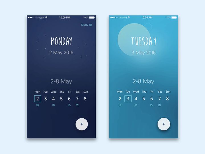
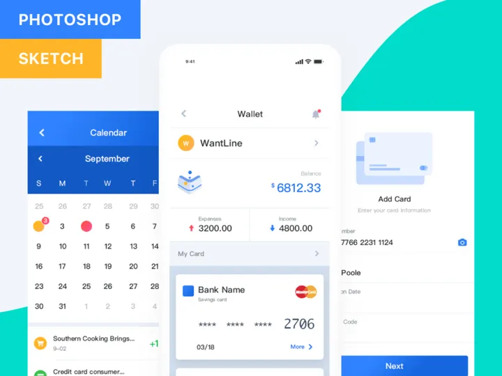
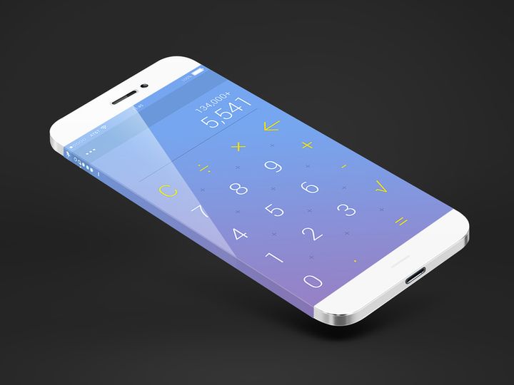
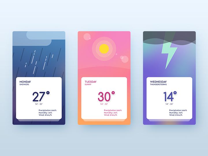
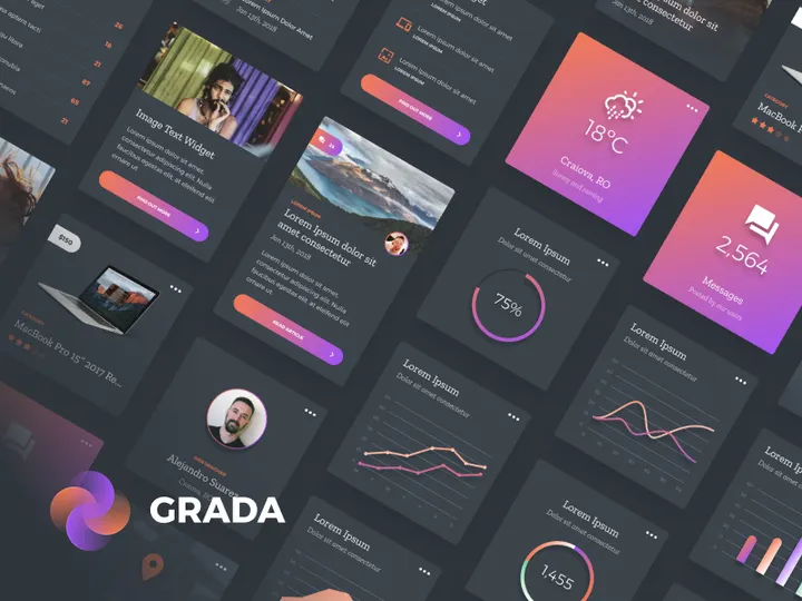
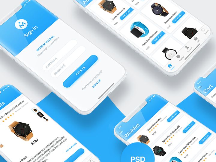
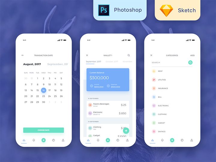
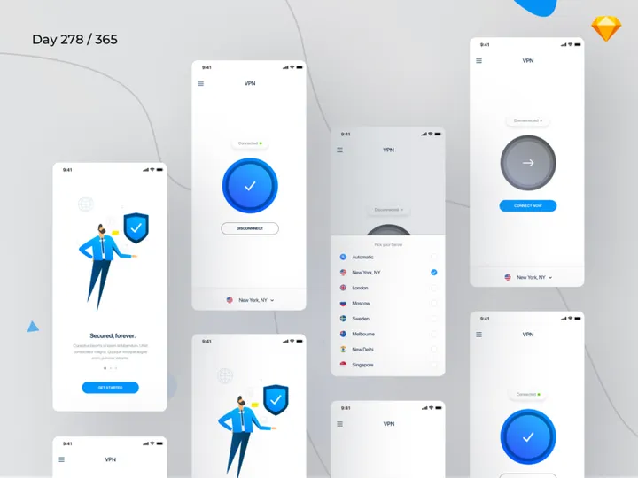
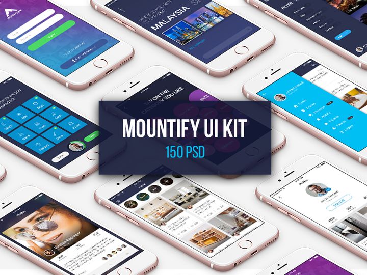
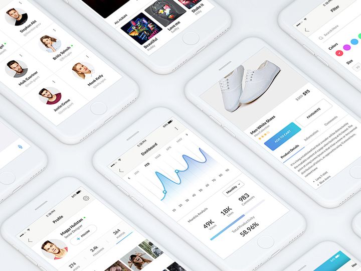
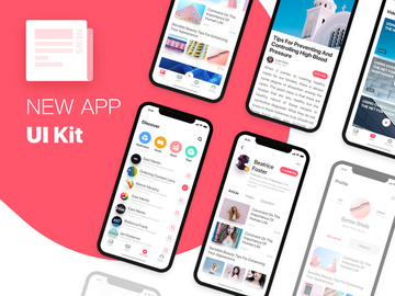
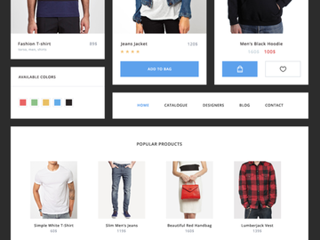
Top UI Kits
Handpicked resources from our curated collection


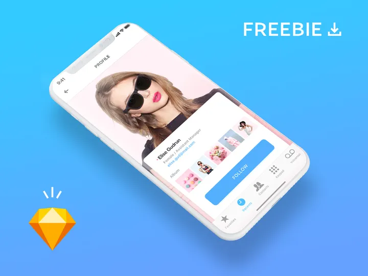
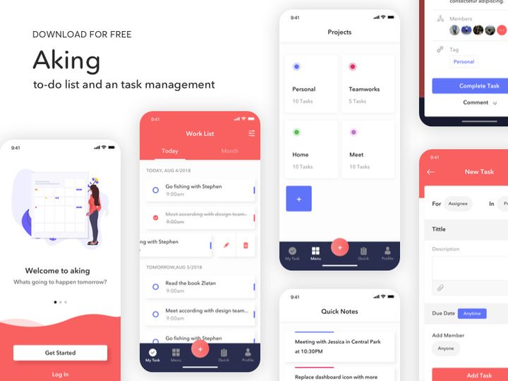
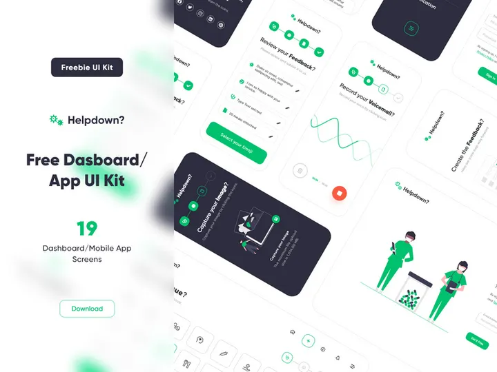
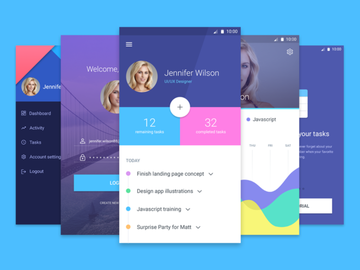
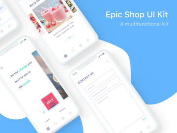
Try Our Free Resources
Download any of these for free - no account required


Why UI Kits for App Projects?
Designing a mobile or web application from scratch is a time-intensive process that requires meticulous attention to layout, usability, and visual consistency. This is where UI kits become an essential asset for modern app designers. A well-crafted UI kit provides a comprehensive collection of pre-designed interface elements—such as buttons, forms, navigation bars, cards, and icons—that are ready to use and fully customizable. By leveraging these pre-made components, designers can dramatically accelerate their workflow, reduce repetitive tasks, and focus more on user experience and innovation rather than reinventing basic design elements.
App design comes with a unique set of requirements: responsiveness across multiple screen sizes, adherence to platform-specific guidelines (iOS, Android), and the need for intuitive user flows. UI kits tailored for app projects address these needs by offering cohesive, scalable components that follow design system principles. Whether building a fitness tracker, social media platform, or finance management tool, having access to consistent, professional-grade assets streamlines the entire design phase.
At EpicPxls, we understand the demands of real-world app development. That’s why our library delivers over 2689+ app-ready UI kits, each hand-selected for relevance, quality, and usability. Our curation process ensures that every resource supports modern design tools like Figma, Sketch, and Adobe XD, and aligns with current design standards. From minimalist dashboards to vibrant onboarding screens, EpicPxls offers the depth and variety needed to support any app concept—helping designers move from idea to prototype faster than ever before.
What App Designers Need
Essential UI Kits Types
Not all UI kits are created equal—especially when it comes to app design. The most effective kits are purpose-built for specific app categories and user interactions. Common types include mobile dashboard kits, e-commerce UI sets, social media templates, healthcare app components, and productivity tool interfaces. Designers also benefit from specialized kits like onboarding flows, login screens, and settings panels, which address recurring patterns in app navigation. For complex applications, modular design systems that offer component variants and state-based interactions (like pressed buttons or error forms) are invaluable.
Additionally, dark mode UI kits, accessibility-focused designs, and multilingual layout support are becoming increasingly important as apps serve global audiences. Kits that include micro-interaction suggestions or animated transitions further enhance prototyping capabilities, allowing designers to present dynamic experiences during client reviews.
Format Requirements
The usability of a UI kit heavily depends on its file format and compatibility with industry-standard tools. Figma files are currently the most popular due to their collaborative features and robust component libraries. Sketch remains a favorite among macOS-based designers, while Adobe XD is preferred for its integration with other Adobe Creative Cloud apps. The best app-ready UI kits come with organized layers, named components, and smart objects that allow for quick editing and scaling.
Designers should look for kits that include symbols, reusable components, auto-layout features, and grid systems. These elements ensure that the kit integrates smoothly into existing workflows and supports rapid iteration. Export options for assets in multiple resolutions (1x, 2x, 3x) are also crucial for delivering production-ready designs to developers.
Quality Standards
High-quality UI kits should meet strict visual and functional standards. First, they must be pixel-perfect with consistent spacing, typography, and color palettes. A professional kit uses a defined design language—such as Material Design or Human Interface Guidelines—to ensure platform compliance. Components should be logically grouped, easy to navigate, and well-documented.
At EpicPxls, we prioritize kits that are not only visually appealing but also practical. Our 2689+ resources are reviewed for resolution accuracy, layer organization, and ease of customization. We emphasize scalability and responsiveness, ensuring that each kit supports adaptive layouts for different screen sizes. Whether you're working on a startup MVP or an enterprise-level application, selecting UI kits that meet these quality benchmarks ensures a smoother, more professional design process.
App Design Project Walkthrough
- Define Your App’s Core Features: Begin by outlining the main functionality of your app—what problem it solves, who the target users are, and what screens are needed (e.g., home, profile, search, checkout). This helps narrow down which UI kits will be most relevant.
- Select Appropriate UI Kits from EpicPxls: Browse the curated collection of over 2689+ resources to find kits that match your app’s theme and functionality. For example, choose a finance-themed kit for a budgeting app or a social media kit for a community platform.
- Download and Import into Your Design Tool: Once selected, download the kit in your preferred format (Figma, Sketch, or Adobe XD) and import it into your workspace. Ensure layers are organized and components are accessible before starting design work.
- Customize Components for Brand Identity: Adapt colors, typography, and iconography to align with your brand. Replace placeholder text and images with real content. Use auto-layout and constraints to maintain responsiveness across devices.
- Assemble Screens and Create User Flows: Combine elements from multiple UI kits to build complete screens. Link them using prototyping tools to simulate navigation and interactions. This step transforms static designs into interactive mockups.
- Review, Test, and Export: Conduct usability testing with stakeholders or team members. Refine based on feedback, then export assets and specifications for developers. Use design handoff tools to share spacing, fonts, and component behaviors accurately.
Combining multiple UI kits effectively requires a strategic approach. While mixing kits can enhance creativity, it’s essential to maintain visual harmony. Stick to a unified color scheme, consistent icon style, and uniform corner radii or shadow depths. EpicPxls simplifies this process by offering kits within shared design systems or thematic families, making cross-kit integration seamless and efficient.
App Design Workflow Tips
Speed Up Your Process
Time is one of the most valuable resources in app design, and pre-made UI kits are one of the best tools for conserving it. Instead of creating buttons, input fields, or navigation bars from scratch, simply drag and drop ready-made components into your canvas. This accelerates wireframing, prototyping, and even high-fidelity design stages. Use keyboard shortcuts and component libraries within Figma or Sketch to insert elements with a single click. For recurring patterns like modals or alerts, save customized versions as master components to reuse across projects.
EpicPxls empowers designers to work faster by offering instantly downloadable, well-structured kits. With over 2689+ resources available on-demand, you can find exactly what you need—whether it’s a dark mode login screen or a sleek onboarding sequence—without spending hours searching or building manually.
Maintain Consistency
Consistency is key to creating professional, trustworthy app experiences. When using multiple UI kits, it’s easy for designs to become visually disjointed if not managed carefully. Establish a base design system early: define primary and secondary colors, typography hierarchy, spacing metrics, and corner radius values. Apply these rules across all screens, even when pulling components from different kits.
Use style guides or design tokens within your tool to enforce consistency. In Figma, create shared styles for text and color. In Sketch, leverage symbol overrides. This ensures that a button from one kit looks harmonious alongside a card from another. By maintaining a unified visual language, your app feels cohesive and polished—no matter how many resources you combine.
Client Presentation
How you present your app design impacts client perception and approval speed. Use interactive prototypes to demonstrate user flows, transitions, and micro-interactions. High-fidelity mockups built from premium UI kits convey professionalism and attention to detail. Annotate key features and explain design decisions to align stakeholders with your vision.
When delivering work, organize files clearly and export assets in developer-friendly formats. Include documentation on component usage, spacing rules, and responsive behaviors. Clients appreciate clarity and precision—qualities that are easier to achieve when starting with well-structured, app-ready UI kits from trusted sources like EpicPxls.
App Design Inspiration
Staying inspired is crucial for creating innovative and engaging app experiences. Current trends in app design emphasize minimalism, bold typography, glassmorphism, neumorphism (used selectively), and micro-interactions that delight users. Dark mode interfaces continue to grow in popularity, offering improved readability and battery efficiency. Designers are also embracing larger tap targets, accessible color contrasts, and inclusive imagery to support diverse user bases.
Top designers approach app projects with a user-first mindset, combining data-driven insights with creative expression. They often start with low-fidelity wireframes to validate concepts before investing in high-detail UI. Many leverage design systems to ensure scalability, especially when working on apps that will evolve over time. Inspiration can come from observing leading apps like Notion, Spotify, or Headspace—studying their navigation patterns, feedback mechanisms, and visual storytelling.
To elevate your own app design work, explore curated collections that reflect these trends. EpicPxls offers a constantly updated library of modern, trend-aligned UI kits—each designed to spark creativity and solve real design challenges. With access to 2689+ resources, you’re never far from a fresh idea or a time-saving solution. Whether you're refining an existing app or launching a new concept, the right inspiration can transform good designs into exceptional ones.
Why Download from EpicPxls?
Commercial License
Use in personal and commercial projects
No Account Required
Download free resources instantly
Quality Curated
Every resource is reviewed for quality
Preview Files
See Figma and Photoshop files before downloading
Who Uses These Ui Kits?
Professionals and teams who benefit most from our collection
UI/UX Designers
Speed up your workflow with ready-to-use ui kits for design tools. Perfect for prototyping and client presentations.
Developers
Get production-ready assets without design skills. Export in any format for web and mobile apps.
Startups & Agencies
Save design budget with affordable premium ui kits. Commercial license included for client work.
Marketing Teams
Create professional campaigns faster. All ui kits are optimized for social media and ads.
UI Kits FAQCommon questions about these resources
Simple, Transparent Pricing
Get unlimited access to all premium resources
Yearly
- 20 downloads per month
- All file formats
- Commercial license
Lifetime
- Unlimited downloads forever
- All file formats
- Commercial license
Ready to Get Started?
Access 4,441+ free design resources today.
Browse Free ResourcesView Premium PlansEarn 85% and
more on all sales
Upload your products and put them up
for sale at whatever price you want.

