Bold Fonts: 368+ Bold Designs
EpicPxls offers 200+ curated fonts, all with a commercial license and editable source files (Figma, Sketch, PSD). Bold fonts are characterized by specific visual elements, typography choices, and color palettes that define the bold aesthetic in design.
Last updated February 12, 2026
Discover 368+ curated bold fonts for your projects.
Trusted by designers at leading companies
Top Fonts
Handpicked resources from our curated collection
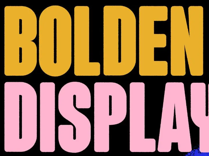


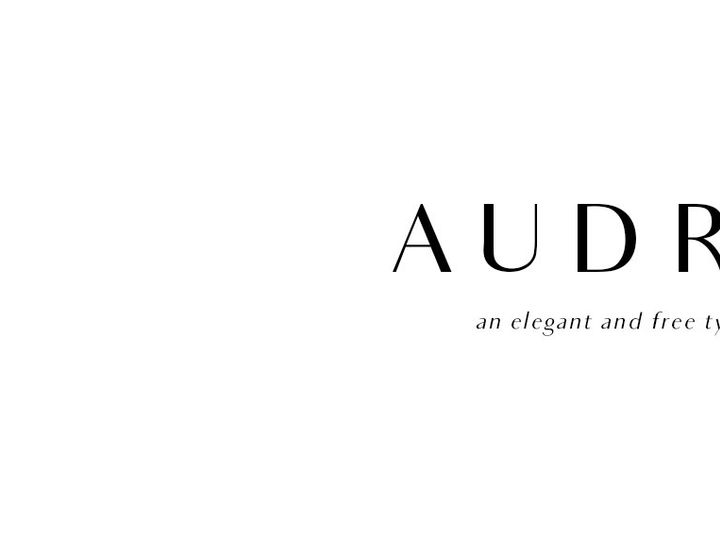

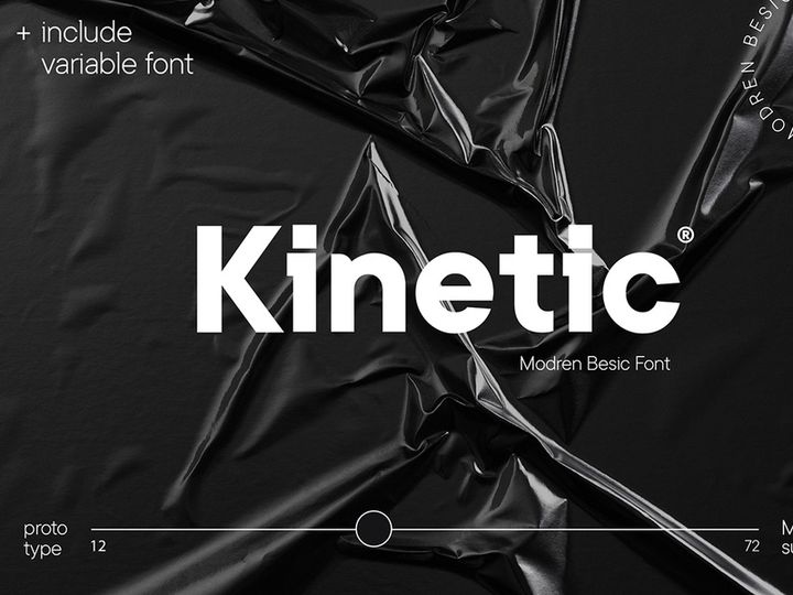
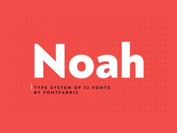
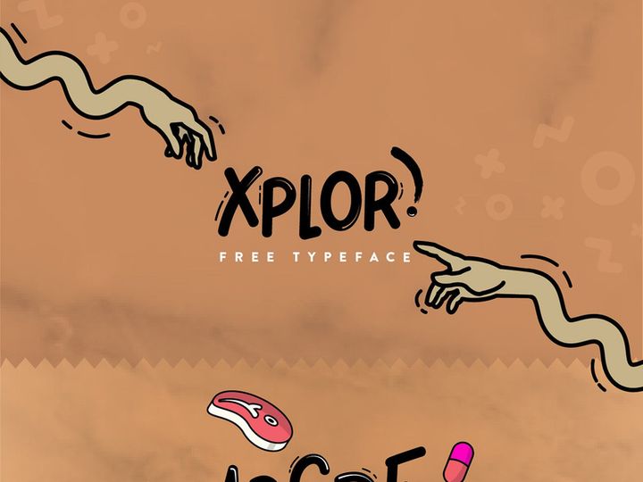
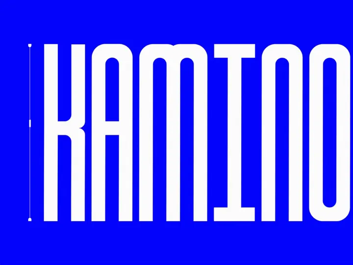
![Batangas Typeface [Free] preview picture](https://imgproxy.epicpxls.com/SGjfhl8PX-sHNmI1L0mO7wVmCTYYJkqucc44A-I3Fss/rs:fill:720:540:0/g:no/aHR0cHM6Ly9pdGVt/cy5lcGljcHhscy5j/b20vdXBsb2Fkcy9w/aG90by8wZjI4ZDFj/NDg4ZThiZjZlMjZj/NWE0NTM2NzdkMWEx/NQ.jpg)


Try Our Free Resources
Download any of these for free - no account required

Bold Design Principles
Bold fonts are more than just a heavier weight of standard typefaces—they represent a powerful design philosophy that prioritizes visibility, impact, and confidence. At its core, bold design is about making a statement. It’s the visual equivalent of speaking with authority, capturing attention instantly in a world saturated with content. What sets bold design apart is its deliberate use of strong typographic elements, high contrast, and assertive composition. Whether applied in digital or print media, bold design commands attention without apology.
The defining characteristic of bold fonts is their increased stroke thickness, which enhances legibility and creates visual weight. This thickness allows text to stand out, even when placed over dynamic backgrounds or in small formats. Beyond typography, bold design relies heavily on strategic use of color, spacing, and imagery. High-contrast color palettes—such as black on white, neon on dark backgrounds, or metallics against matte surfaces—amplify the bold effect. Generous spacing, or negative space, plays a crucial role by giving bold elements room to breathe, preventing the design from feeling cluttered despite its intensity.
Imagery in bold design often complements the typography by maintaining a minimalist yet impactful aesthetic. Overly detailed graphics can compete with bold text, so designers typically opt for clean lines, abstract shapes, or focused photography that doesn’t distract from the message. This balance ensures that the bold font remains the centerpiece.
Historically, bold typography emerged in the early 20th century with the rise of advertising and poster art. The Art Deco and Bauhaus movements embraced strong geometric forms and sans-serif bold fonts to convey modernity and efficiency. In the 1960s and 70s, pop art and psychedelic design pushed bold aesthetics further with vibrant colors and exaggerated letterforms. Today, the bold design continues to evolve, influenced by digital technology and user experience needs. With platforms like EpicPxls offering 368+ bold font resources, designers have unprecedented access to diverse, high-quality options that cater to contemporary and timeless applications alike. From vintage-inspired slab serifs to ultra-modern geometric sans-serifs, the evolution of bold design reflects both cultural shifts and technological advancements.
Inspiring Bold Fonts Examples
Web & App Design
In the digital landscape, bold fonts play a critical role in enhancing user experience and guiding attention. Modern web and app interfaces leverage bold typography to highlight key actions such as “Sign Up,” “Buy Now,” or “Get Started.” These calls to action stand out more effectively when rendered in bold type, improving conversion rates and usability. Responsive design also benefits from bold fonts, as their clarity remains intact even on smaller screens. Designers often pair bold headings with lighter body text to create a clear visual hierarchy, ensuring content is both scannable and engaging. With 368+ bold font choices available at EpicPxls, developers and UI/UX designers can find the perfect match for everything from minimalist SaaS platforms to dynamic e-commerce sites.
Print & Branding
Bold fonts are a cornerstone of strong brand identity. Logos, packaging, and promotional materials that use bold typography project confidence, reliability, and modernity. Iconic brands like Nike, Coca-Cola, and Netflix have all leveraged bold fonts to create instantly recognizable visual identities. In print, bold type excels in headlines, posters, and magazine covers where immediate impact is essential. The physical presence of bold lettering on paper or packaging adds a tactile sense of importance, making products feel premium and trustworthy. Designers often customize bold fonts by modifying kerning, adding outlines, or integrating them with bold graphic elements to create a unique brand voice.
Social Media & Marketing
Social media thrives on fast, eye-catching content—and bold fonts deliver exactly that. From Instagram carousels to TikTok overlays, bold typography ensures messages are readable within seconds. Marketers use bold fonts to emphasize offers, quotes, and slogans, often layering them over vibrant or motion-filled backgrounds. Animated text with bold fonts is especially effective in video ads and stories, where clarity and impact are paramount. The trend toward short-form video has elevated the importance of bold design in digital marketing, with brands using oversized text to convey messages without sound. With the right selection from EpicPxls’ 368+ bold font library, content creators can maintain consistency across platforms while maximizing engagement.
How to Apply Bold Style to Your Projects
- Assess your project’s purpose and audience. Before selecting a bold font, consider the message you want to convey. Is it energetic, luxurious, or authoritative? Different bold fonts evoke different emotions—some are playful and rounded, while others are sharp and industrial.
- Choose the right bold fonts from EpicPxls. With over 368+ bold font designs available, you can explore a wide range of styles—from classic serifs to futuristic display fonts. Use filters to narrow down by category, language support, or license type to find the best fit.
- Test readability across devices. Ensure your bold font remains legible on mobile, tablet, and desktop screens. Avoid overly decorative bold fonts for body text; reserve them for headlines and accents.
- Customize while preserving integrity. You can adjust letter spacing, weight, or add effects like shadows or gradients, but avoid distorting the font to the point where it loses its bold character. Subtle enhancements can elevate the design without compromising clarity.
- Pair with appropriate colors. Bold fonts work best with high-contrast color schemes. For example, white text on a deep navy background or black on a bright yellow creates strong visual impact. Avoid low-contrast combinations that dilute the bold effect.
- Maintain visual hierarchy. Use bold fonts selectively for headings, key messages, or calls to action. Pair them with lighter weights or simpler fonts for body text to create balance and guide the viewer’s eye naturally through the content.
Bold Pairing Guide
Complementary Styles
Bold design thrives when paired with styles that enhance rather than compete with its strength. Minimalism is a natural companion, as clean layouts and uncluttered spaces allow bold fonts to dominate the visual field. Geometric shapes, monochrome photography, and flat design elements all support a bold aesthetic by maintaining focus on the typography. Conversely, pairing bold fonts with overly ornate patterns or competing visual elements can create chaos. Instead, opt for subtle textures or gradients that add depth without distraction. Brutalist design, with its raw, unpolished look, also complements bold typography by embracing honesty and impact.
Typography Choices
When using bold fonts, pairing them with contrasting typefaces creates dynamic compositions. A bold sans-serif headline works beautifully with a light serif body font, offering both strength and readability. For a modern, tech-forward look, combine a geometric bold font with a narrow, minimalist sans-serif. Script or handwritten fonts can be used sparingly as accents to soften the intensity of bold text, but should never overpower it. EpicPxls provides a diverse selection of bold and complementary fonts, making it easy to build cohesive typographic systems. Consider using bold condensed fonts for tight spaces or extended bold styles for wide banners and hero sections.
Color Palettes
Color is a powerful amplifier of bold design. Monochromatic schemes—especially black and white—deliver timeless sophistication and maximum contrast. For more vibrancy, consider bold fonts in primary colors like red, cobalt blue, or bright yellow set against dark or neutral backgrounds. Neon-on-black combinations are particularly effective in digital and youth-oriented branding. Metallic finishes like gold, silver, or copper add a touch of luxury when applied to bold lettering in print or motion graphics. Avoid overly busy backgrounds; instead, use solid fills or soft gradients to keep the focus on the text. With the right color strategy, even a simple bold font can become a centerpiece of visual storytelling.
Bold Fonts Trends in 2026
As we move deeper into the digital-first era, bold fonts are evolving to meet the demands of immersive experiences, accessibility, and brand differentiation. In 2026, one of the most prominent trends is the rise of variable bold fonts—typefaces that allow designers to adjust weight, width, and slant dynamically. This flexibility enables responsive typography that adapts seamlessly across devices and contexts, all while retaining the powerful presence of bold design. Designers are also embracing bolder, more expressive letterforms in custom logotypes, combining thick strokes with unique ligatures and alternate characters to create distinctive brand marks.
Another growing trend is the integration of bold fonts with motion design. Animated bold text—such as letters that expand, shift color, or assemble in real time—adds drama and engagement to digital content. This is especially popular in streaming platforms, gaming interfaces, and promotional videos where immediate impact is crucial. Additionally, inclusivity is shaping bold font development, with increased emphasis on legibility for users with visual impairments. High-contrast bold fonts with open counters and generous spacing are becoming standard in accessible design frameworks.
Looking ahead, the bold aesthetic is shifting toward intentional minimalism—using fewer elements, but making them bolder and more meaningful. Designers are moving away from cluttered compositions and instead focusing on single, powerful statements delivered through oversized bold typography. This trend is evident in everything from website hero sections to billboard advertising. With platforms like EpicPxls continuously updating their library of 368+ bold font resources, creators have the tools to stay ahead of the curve. Whether for branding, editorial design, or digital campaigns, bold fonts in 2026 are not just a stylistic choice—they are a strategic tool for cutting through the noise and making lasting impressions.
Why Download from EpicPxls?
Commercial License
Use in personal and commercial projects
No Account Required
Download free resources instantly
Quality Curated
Every resource is reviewed for quality
Preview Files
See Figma and Photoshop files before downloading
Who Uses These Fonts?
Professionals and teams who benefit most from our collection
UI/UX Designers
Speed up your workflow with ready-to-use fonts for design tools. Perfect for prototyping and client presentations.
Developers
Get production-ready assets without design skills. Export in any format for web and mobile apps.
Startups & Agencies
Save design budget with affordable premium fonts. Commercial license included for client work.
Marketing Teams
Create professional campaigns faster. All fonts are optimized for social media and ads.
Fonts FAQCommon questions about these resources
Simple, Transparent Pricing
Get unlimited access to all premium resources
Yearly
- 20 downloads per month
- All file formats
- Commercial license
Lifetime
- Unlimited downloads forever
- All file formats
- Commercial license
Ready to Get Started?
Access 4,441+ free design resources today.
Browse Free ResourcesView Premium PlansEarn 85% and
more on all sales
Upload your products and put them up
for sale at whatever price you want.

