Free UI Kits: 875+ Interface Designs
Discover 875+ handpicked free ui kits ready for your projects.
Trusted by designers at leading companies
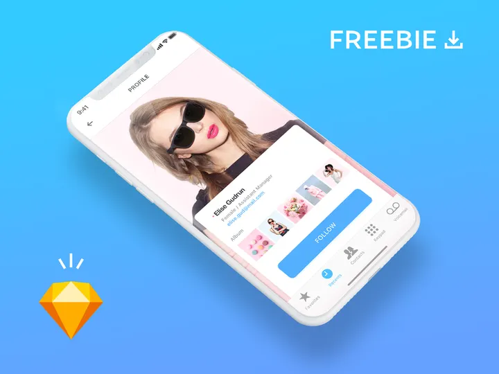
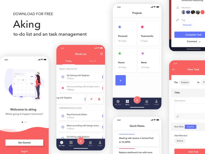
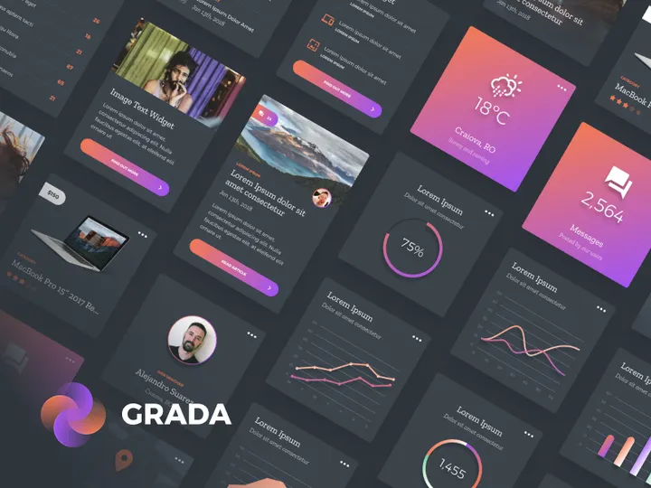
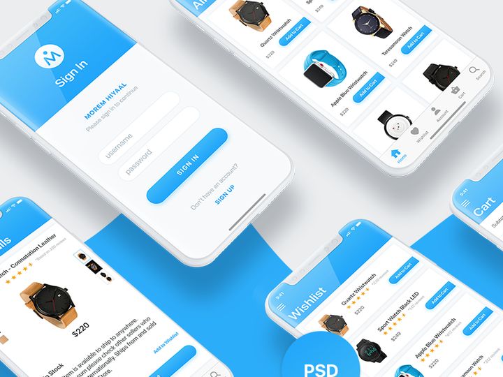
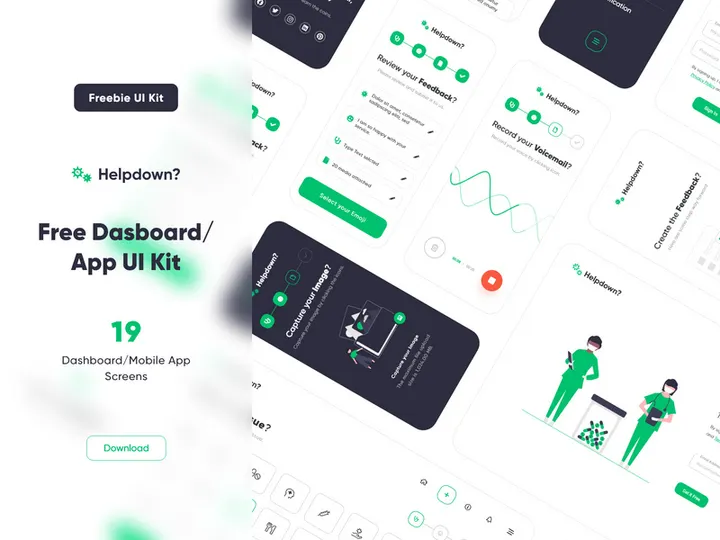
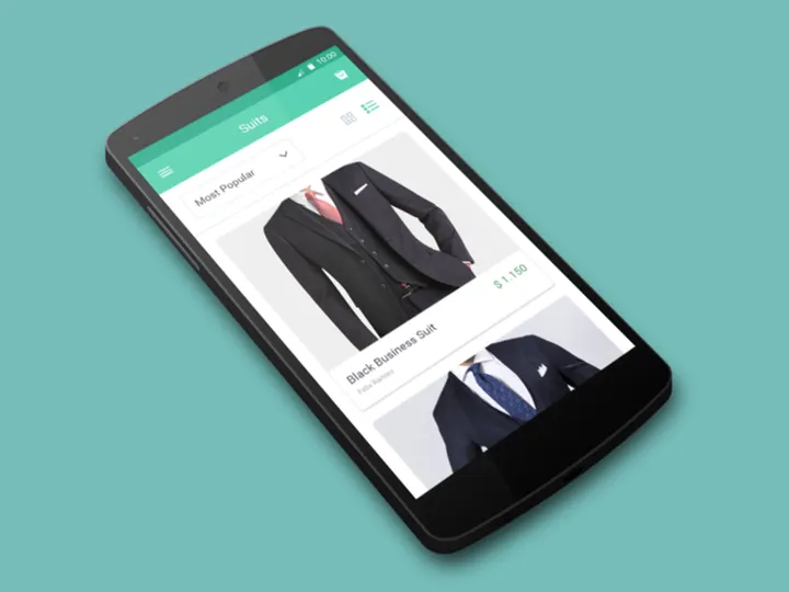
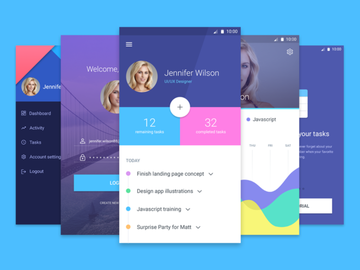
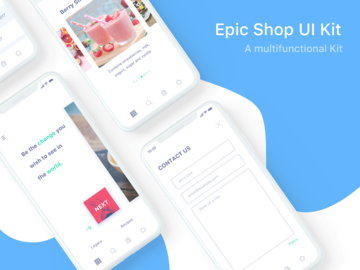
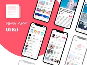
Top UI Kits
Handpicked resources from our curated collection


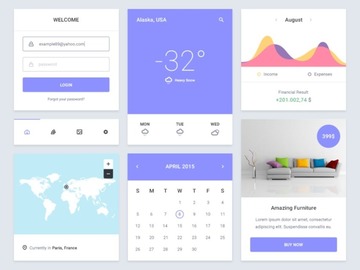
Try Our Free Resources
Download any of these for free - no account required


What Are UI Kits?
UI kits, short for User Interface kits, are comprehensive collections of pre-designed interface elements that streamline the digital design process. These kits typically include components such as buttons, forms, icons, navigation bars, cards, and complete screen templates, all crafted with consistency in mind. In today’s fast-paced design environment, UI kits are invaluable tools for both beginners and experienced designers. They eliminate the need to build every element from scratch, allowing teams to focus more on user experience, interaction design, and innovation rather than repetitive layout tasks.
Designers turn to pre-made UI resources to accelerate prototyping, maintain visual harmony across platforms, and ensure design systems align with current trends. Whether you're working on a mobile app, a responsive website, or a web application dashboard, using a well-structured UI kit can significantly reduce development time and improve design accuracy. These kits are especially useful during brainstorming, pitch presentations, or client demos where speed and clarity are crucial.
At EpicPxls, we understand the importance of high-quality, ready-to-use design assets. That’s why we’ve curated an extensive library of over 875+ free UI kits—each thoughtfully selected for usability, modern aesthetics, and compatibility across popular design tools. From minimalist interfaces to complex admin panels, our collection spans a wide range of styles and functionalities, empowering designers to bring their ideas to life efficiently. Whether you're building a startup MVP or refining a corporate platform, leveraging free UI kits from trusted sources like EpicPxls gives you a solid foundation to create polished, professional designs without starting from zero.
Types Available
By Style
UI kits come in a variety of visual styles to match different brand identities and project goals. Choosing the right style ensures your interface feels cohesive and on-trend. Here are some of the most popular categories:
- Minimalist: Clean lines, generous whitespace, and simple typography. Ideal for modern web and mobile apps focused on usability.
- Material Design: Inspired by Google’s design language, these kits use shadows, depth, and responsive animations to create tactile experiences.
- Flat Design: Characterized by two-dimensional elements, bright colors, and no gradients or shadows—perfect for fast-loading applications.
- Neumorphism: A softer, more realistic approach blending elements into the background with subtle shadows and light effects.
- Dark Mode: Designed specifically for low-light environments, these kits emphasize contrast, readability, and reduced eye strain.
By Use Case
UI kits are also categorized based on the types of projects they support. Selecting a kit tailored to your use case saves time and ensures relevant components are readily available. Common use cases include:
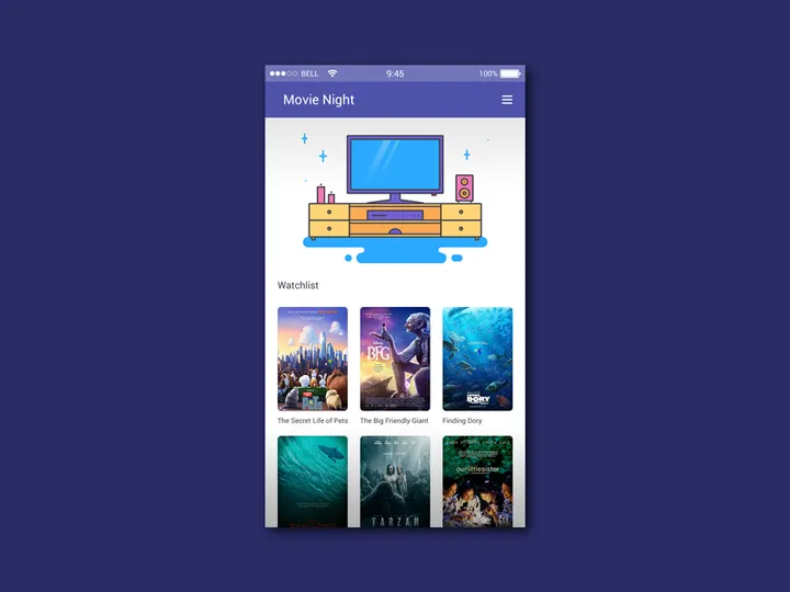
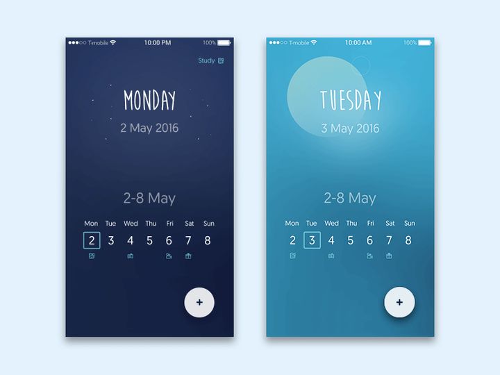
- Mobile Apps: Optimized for iOS and Android, featuring native navigation patterns and device-specific components.
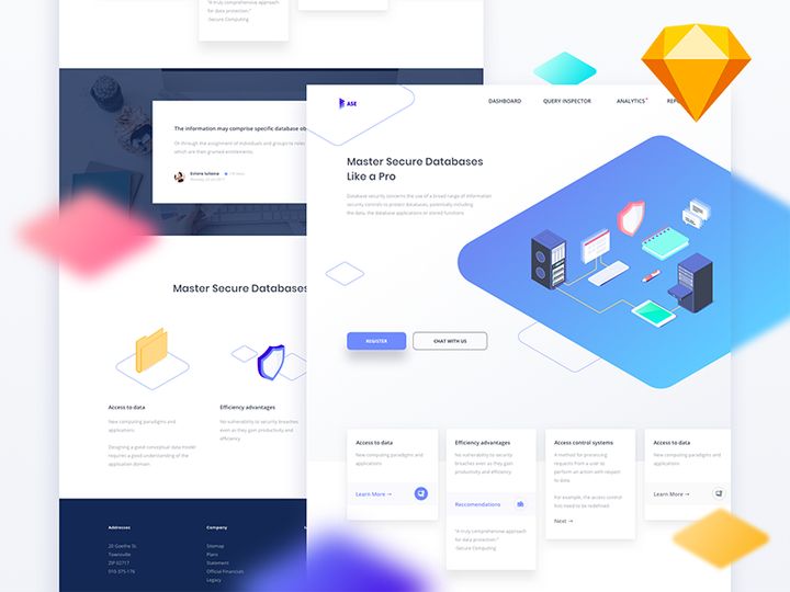
- Web Dashboards: Includes data tables, charts, filters, and admin panels—ideal for SaaS platforms and business tools.
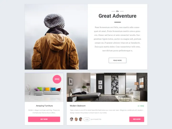
- E-commerce Interfaces: Product grids, shopping carts, checkout flows, and promotional banners tailored for online stores.
- Landing Pages: Pre-built sections like hero banners, testimonials, pricing tables, and call-to-action blocks.
- Onboarding Flows: Step-by-step screens, welcome modals, and tutorial overlays to guide new users.
Free vs Premium
While both free and premium UI kits serve the same fundamental purpose, they differ in depth, flexibility, and support. Free kits, like the 875+ resources available at EpicPxls, are excellent for personal projects, learning, and rapid prototyping. They often include core components and follow current design trends but may have limited customization options or fewer screens.
Premium kits, on the other hand, usually offer more comprehensive libraries, advanced interactions, developer handoff support, and dedicated customer service. They often come with extended licensing for commercial use and are updated regularly to reflect platform changes. However, for many designers—especially students, freelancers, and startups—free UI kits provide a cost-effective way to access high-quality assets without compromising on design integrity. The growing availability of free, open-source, and community-driven kits has made professional-grade design more accessible than ever.
How to Choose
Quality Indicators
Selecting a high-quality UI kit is essential to ensure your project starts on the right foot. Here are key criteria to evaluate before downloading:
- Consistency: Elements should follow a unified design language—typography, spacing, and color schemes must align across all components.
- Layer Organization: Well-structured layers and grouped elements make it easy to navigate and modify the design files.
- Component Variants: Look for kits that include multiple states (e.g., hover, active, disabled) for interactive elements.
- Grid & Alignment: A solid underlying grid system ensures responsiveness and layout precision.
- Up-to-Date Design: The kit should reflect current platform guidelines (e.g., iOS 17, Android 14) and modern UX best practices.
- User Reviews or Ratings: Community feedback can highlight reliability, ease of use, and potential issues.
File Formats
UI kits are typically available in various file formats depending on the design software used. The most common include:
- Figma (.fig): Ideal for collaboration and real-time editing. Figma files are increasingly popular due to their cloud-based nature and robust component system.
- Sketch (.sketch): Widely used by macOS designers, Sketch files offer excellent vector editing and plugin support.
- Adobe XD (.xd): Great for prototyping and integrating with other Adobe Creative Cloud tools.
- Photoshop (.psd): Best for pixel-perfect mockups and detailed visual design, though less efficient for component-based workflows.
- Illustrator (.ai): Useful for scalable vector assets, especially icons and illustrations within a UI kit.
Choose the format that aligns with your team’s workflow and toolstack. Many kits, including those on EpicPxls, offer multi-format support to maximize accessibility.
Licensing
Understanding licensing is crucial when using free UI kits, especially for client work or commercial products. Most free kits are released under permissive licenses such as MIT, Creative Commons (CC0 or CC-BY), or custom personal-use terms. Always check whether the license allows for:
- Commercial use (e.g., in a paid app or client website)
- Redistribution or resale
- Modification and derivative works
- Use in team or agency environments
Some free resources may require attribution to the original designer. Others, like the curated selection at EpicPxls, are vetted to ensure clear, business-friendly licensing—so you can use them confidently in professional projects. When in doubt, review the included license file or contact the provider directly to avoid legal complications.
Getting Started
Using a free UI kit effectively begins with proper setup and integration into your design workflow. Follow these six steps to get started quickly and efficiently:
- Define Your Project Scope: Identify the type of interface you're building—mobile app, dashboard, e-commerce site—and choose a kit that matches your use case.
- Browse and Download: Visit a trusted source like EpicPxls and filter the 875+ resources by style, format, or category to find the best fit.
- Verify File Integrity: After downloading, extract the files and open them in your design tool to ensure layers, fonts, and assets load correctly.
- Familiarize Yourself with Components: Explore the artboards, symbols, and style guides included in the kit. Take note of color palettes, typography settings, and reusable elements.
- Customize to Match Your Brand: Replace placeholder text, adjust colors, and modify components to align with your brand identity and user needs.
- Begin Prototyping: Assemble screens using the kit’s components, create user flows, and link interactive elements to build a clickable prototype for testing or presentation.
By following this structured approach, you’ll maximize the value of your chosen UI kit and lay a strong foundation for your design project.
Best Practices
Organization
One of the most overlooked aspects of using UI kits is file organization. A well-organized design file improves collaboration, speeds up editing, and reduces errors. Always rename layers meaningfully, group related elements, and use color labels or section markers to distinguish between different parts of the interface. Maintain a dedicated “Components” or “Symbols” page to store reusable elements like buttons, headers, and footers. This makes updates easier—if you modify a master button style, all instances update automatically. Additionally, keep unused artboards or alternate versions in a separate folder rather than deleting them immediately; they may be useful later for A/B testing or client revisions.
Customization
While UI kits provide a strong starting point, they should never be used as-is without tailoring to your specific project. Customization is key to creating a unique and effective user experience. Adjust spacing to improve readability, refine color contrasts for accessibility, and ensure typography supports your content hierarchy. Replace generic icons with ones that better reflect your brand’s tone. If the kit includes placeholder images, swap them with real content early to avoid layout issues down the line. Remember, a UI kit is a toolkit—not a final product. The best designs emerge when you treat the kit as a springboard for creativity rather than a constraint.
Common Mistakes
Even experienced designers can fall into traps when using pre-made UI kits. Avoid these common pitfalls to maintain design integrity and efficiency:
- Over-reliance on default layouts: Using screens exactly as provided can result in generic, unoriginal interfaces. Always adapt layouts to your user journey.
- Ignoring responsiveness: Not all kits are optimized for multiple screen sizes. Test your designs on different breakpoints and adjust grids accordingly.
- Poor color adaptation: Changing a single color without updating related elements (like hover states or borders) creates visual inconsistency.
- Using outdated components: Some kits may include deprecated UI patterns (e.g., hamburger menus on desktop). Stay current with platform design guidelines.
- Skipping accessibility checks: Ensure text contrast meets WCAG standards, interactive elements are large enough to tap, and screen reader labels are present.
By being mindful of these issues, you’ll create interfaces that are not only visually appealing but also functional and inclusive. With the right approach, the 875+ free UI kits available through EpicPxls become more than just templates—they become powerful catalysts for innovation in your design process.
Why Download from EpicPxls?
Commercial License
Use in personal and commercial projects
No Account Required
Download free resources instantly
Quality Curated
Every resource is reviewed for quality
Preview Files
See Figma and Photoshop files before downloading
Who Uses These Ui Kits?
Professionals and teams who benefit most from our collection
UI/UX Designers
Speed up your workflow with ready-to-use ui kits for design tools. Perfect for prototyping and client presentations.
Developers
Get production-ready assets without design skills. Export in any format for web and mobile apps.
Startups & Agencies
Save design budget with affordable premium ui kits. Commercial license included for client work.
Marketing Teams
Create professional campaigns faster. All ui kits are optimized for social media and ads.
UI Kits FAQCommon questions about these resources
Simple, Transparent Pricing
Get unlimited access to all premium resources
Yearly
- 20 downloads per month
- All file formats
- Commercial license
Lifetime
- Unlimited downloads forever
- All file formats
- Commercial license
Ready to Get Started?
Access 4,436+ free design resources today.
Browse Free ResourcesView Premium PlansEarn 85% and
more on all sales
Upload your products and put them up
for sale at whatever price you want.

