Modern UI Kits: 171+ Modern Designs
Discover 171+ curated modern ui kits for your projects.
Trusted by designers at leading companies
Top UI Kits
Handpicked resources from our curated collection


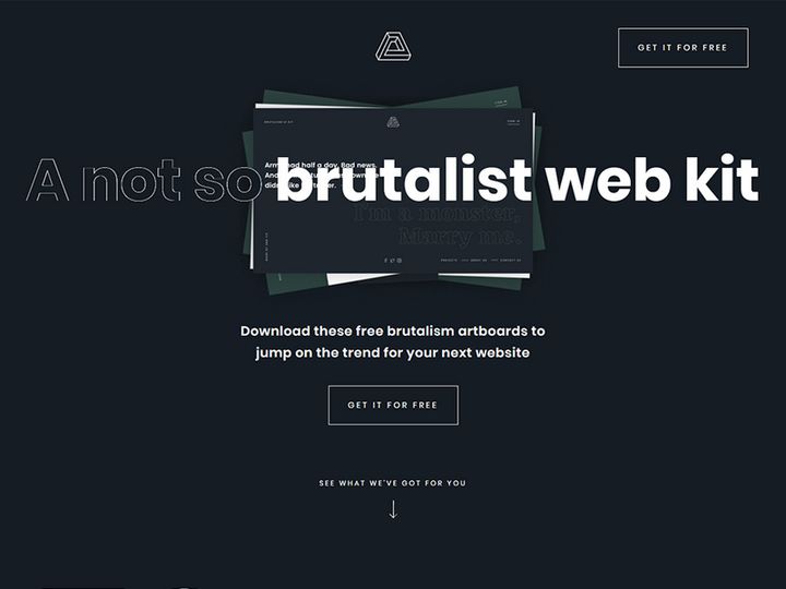

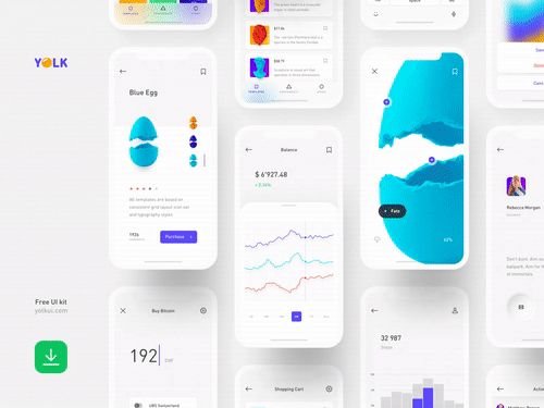
![Lugar 🏡 | Real Estate Landing Page [Freebie] preview picture](https://imgproxy.epicpxls.com/Er6Qkll9ehYIgth_Q6HRUNWml8ZRD4m_8Vmbeea3tvA/rs:fill:720:540:0/g:no/aHR0cHM6Ly9pdGVt/cy5lcGljcHhscy5j/b20vdXBsb2Fkcy9w/aG90by82ODk5NDQ5/ZDY1OTQ0NzRkMjZj/MjkzZGViY2RhYjZl/ZA.jpg)


Try Our Free Resources
Download any of these for free - no account required


What Are UI Kits?
Modern UI kits are comprehensive collections of pre-designed user interface elements that help designers streamline the creation of digital products. These kits typically include buttons, forms, navigation bars, cards, icons, typography styles, and other reusable components, all unified under a consistent design language. In the fast-paced world of digital design, where speed, consistency, and usability are paramount, UI kits serve as essential tools that reduce repetitive work and help maintain visual harmony across platforms.
Designers turn to UI kits not only to accelerate their workflow but also to ensure their interfaces meet current aesthetic and functional standards. A well-crafted UI kit reflects modern design principles such as minimalism, responsive layouts, accessibility, and dark mode compatibility. Whether building a mobile app, a SaaS dashboard, or an e-commerce website, having access to a cohesive set of components allows for faster prototyping and smoother collaboration with developers.
At EpicPxls, we understand the importance of high-quality, up-to-date design resources. That’s why we’ve curated a diverse library of over 171+ modern UI kits, each thoughtfully designed to meet the evolving needs of today’s designers. From sleek flat designs to immersive glassmorphism and neumorphic styles, our collection spans a broad spectrum of visual trends and technical capabilities. Whether you’re a solo designer or part of a larger team, these 171+ resources provide the foundation to build beautiful, functional interfaces without starting from scratch.
Types Available
By Style
UI kits come in a variety of design styles, each suited to different aesthetic preferences and project requirements. Understanding these styles helps designers choose the right kit for their vision.
- Flat Design: Characterized by simplicity, bold colors, and minimal effects, flat design emphasizes usability and clarity. It’s ideal for applications where content needs to take center stage without visual distractions.
- Material Design: Developed by Google, this style uses depth, shadows, and motion to create intuitive, tactile interfaces. Material-based UI kits often include responsive animations and structured layouts.
- Neumorphism: A softer, more futuristic style that blends elements of skeuomorphism with minimalism. Neumorphic kits use subtle shadows and light effects to make elements appear embedded in the background.
- Dark Mode: With increasing demand for low-light usability, dark mode UI kits offer sleek, high-contrast interfaces that reduce eye strain and enhance visual hierarchy.
- Glassmorphism: This trend uses translucent layers, blur effects, and light overlays to create a frosted-glass appearance. It adds depth and sophistication, commonly seen in modern dashboards and mobile apps.
By Use Case
UI kits are also categorized by their intended application, ensuring relevance and functionality across industries.
- Mobile App Kits: Optimized for iOS and Android, these kits include screen-sized components, gesture-based navigation, and platform-specific design guidelines.
- Dashboard & Admin Panels: Designed for data-heavy environments, these kits feature charts, tables, filters, and analytics widgets with clean, scannable layouts.
- E-commerce Interfaces: Focused on product displays, shopping carts, and checkout flows, these kits prioritize conversion and user experience.
- Landing Page Templates: Built for marketing and lead generation, they include hero sections, call-to-action buttons, testimonials, and responsive grids.
- Social Media & Community Apps: Tailored for engagement, these kits include feed layouts, comment sections, profile cards, and real-time notifications.
Free vs Premium
While free UI kits offer an accessible entry point, premium options often deliver greater value in terms of quality, support, and customization. Free kits may lack consistency, have limited components, or use outdated design patterns. Premium kits, like many available through EpicPxls, are typically created by professional designers, follow strict design systems, and include extensive documentation. They also tend to offer broader licensing, regular updates, and compatibility with multiple design tools. For teams working on commercial projects, investing in premium UI kits can save time, reduce revisions, and ensure a polished final product. With over 171+ resources to choose from, EpicPxls bridges the gap between affordability and professional-grade design.
How to Choose
Quality Indicators
Selecting the right UI kit requires careful evaluation. High-quality kits not only look good but also function effectively within your design ecosystem. Here are key criteria to consider:
- Consistency: All elements should follow the same spacing, typography, color palette, and corner radius to ensure visual harmony.
- Completeness: A robust kit includes a full range of components—buttons, inputs, modals, loaders, and error states—reducing the need for custom design.
- Responsiveness: Look for kits that offer mobile, tablet, and desktop variants, or use flexible grids that adapt to different screen sizes.
- Accessibility: The best kits consider contrast ratios, font sizes, and keyboard navigation to support inclusive design.
- Documentation: Clear labeling, component descriptions, and usage guidelines help teams onboard quickly and maintain consistency.
- Update Frequency: Regularly updated kits reflect new design trends, fix bugs, and add new components, ensuring long-term usability.
File Formats
UI kits are available in various file formats, each suited to different design tools and workflows. The most common formats include .Figma, .Sketch, .XD (Adobe XD), and sometimes .PSD or .AI. Figma has become the industry standard due to its collaborative features, cloud-based access, and robust component libraries. Sketch remains popular among macOS users, especially in design agencies. Adobe XD integrates well with other Creative Cloud apps but has a smaller plugin ecosystem. When choosing a kit, ensure it’s compatible with your primary design tool. Many kits from EpicPxls are available in multiple formats, giving designers flexibility and ease of integration.
Licensing
Understanding licensing is crucial, especially for commercial projects. Free UI kits often come with restrictive licenses that prohibit resale, redistribution, or use in client work without attribution. Premium kits typically offer extended or commercial licenses, allowing use in apps, websites, and SaaS products without limitations. Some licenses also cover team usage, which is vital for agencies or in-house design teams. Always review the license terms before downloading. At EpicPxls, every premium UI kit includes clear commercial licensing, so you can confidently use our 171+ resources in professional environments without legal concerns.
Getting Started
Integrating a modern UI kit into your design workflow is straightforward when you follow a structured approach. Here’s a six-step guide to help you get started quickly and effectively:
- Define Your Project Scope: Identify the type of product you’re building—mobile app, dashboard, landing page—and the core user flows it will support.
- Browse and Select a Kit: Visit a trusted source like EpicPxls and filter by style, use case, or tool compatibility. Preview the kit to assess its quality and relevance.
- Download and Import: Once selected, download the kit in your preferred format (e.g., Figma or Sketch) and import it into your design file.
- Review Components and Styles: Explore the included symbols, layers, and style guides. Familiarize yourself with naming conventions and how components are structured.
- Customize for Brand Alignment: Update colors, typography, and icons to match your brand identity. Use the kit as a foundation, not a constraint.
- Begin Prototyping: Start assembling screens using the kit’s components. Focus on key user journeys first, then refine interactions and transitions.
By following these steps, you’ll leverage the full potential of modern UI kits while maintaining creative control over your project’s direction. With access to 171+ resources, EpicPxls makes it easy to find the perfect starting point for any design challenge.
Best Practices
Organization
One of the most overlooked aspects of using UI kits is file organization. A well-structured design file improves collaboration, speeds up iteration, and reduces errors. When importing a kit, create clear layer groups, use consistent naming (e.g., “Button/Primary/Default”), and organize components into sections like “Forms,” “Navigation,” and “Modals.” Utilize design system features such as component variants in Figma to manage different states (hover, disabled, loading) efficiently. This level of organization ensures that your team can quickly locate and reuse elements, maintaining consistency across screens and projects.
Customization
While UI kits offer ready-made solutions, they should be treated as starting points—not final products. Customization is key to creating a unique and brand-aligned experience. Modify colors to reflect your brand palette, adjust typography scales for better readability, and tweak component spacing to suit your layout. Avoid over-customizing to the point of breaking consistency; instead, enhance the kit with small, intentional changes. For example, adding custom illustrations or micro-interactions can elevate the design without compromising usability. The 171+ resources available at EpicPxls are designed with flexibility in mind, making it easier to adapt them to your specific needs while preserving their core integrity.
Common Mistakes
Even experienced designers can fall into traps when using UI kits. Being aware of these pitfalls helps you avoid costly redesigns and maintain a high standard of quality.
- Using a Kit Without Review: Blindly dropping components into a design without understanding their structure can lead to inconsistencies and technical issues.
- Ignoring Responsiveness: Failing to test how components behave on different screen sizes can result in broken layouts and poor user experiences.
- Overloading with Effects: Adding excessive shadows, gradients, or animations to a minimalist kit can disrupt visual balance and slow down performance.
- Skipping Accessibility Checks: Not verifying color contrast or screen reader compatibility can exclude users and violate best practices.
- Not Updating Components: If the original kit receives updates, failing to incorporate them can lead to outdated designs or missed improvements.
By staying mindful of these common mistakes, you can maximize the value of any UI kit and deliver polished, professional results. Whether you're exploring free options or investing in premium collections from EpicPxls, thoughtful implementation is what transforms a good design into a great one.
Why Download from EpicPxls?
Commercial License
Use in personal and commercial projects
No Account Required
Download free resources instantly
Quality Curated
Every resource is reviewed for quality
Preview Files
See Figma and Photoshop files before downloading
Who Uses These Ui Kits?
Professionals and teams who benefit most from our collection
UI/UX Designers
Speed up your workflow with ready-to-use ui kits for design tools. Perfect for prototyping and client presentations.
Developers
Get production-ready assets without design skills. Export in any format for web and mobile apps.
Startups & Agencies
Save design budget with affordable premium ui kits. Commercial license included for client work.
Marketing Teams
Create professional campaigns faster. All ui kits are optimized for social media and ads.
UI Kits FAQCommon questions about these resources
Simple, Transparent Pricing
Get unlimited access to all premium resources
Yearly
- 20 downloads per month
- All file formats
- Commercial license
Lifetime
- Unlimited downloads forever
- All file formats
- Commercial license
Ready to Get Started?
Access 4,436+ free design resources today.
Browse Free ResourcesView Premium PlansEarn 85% and
more on all sales
Upload your products and put them up
for sale at whatever price you want.

