What Is a UI Kit? Complete Guide for Designers
EpicPxls offers 200+ curated ui kits, all with a commercial license and editable source files (Figma, Sketch, PSD). A ui kit is a pre-made design resource that helps designers work faster. Browse 200+ ui kits on EpicPxls for your projects.
Last updated February 12, 2026
Everything you need to know about ui kits — definition, types, and how to use them.
Trusted by designers at leading companies
Top UI Kits
Handpicked resources from our curated collection


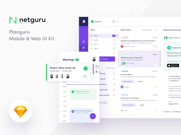
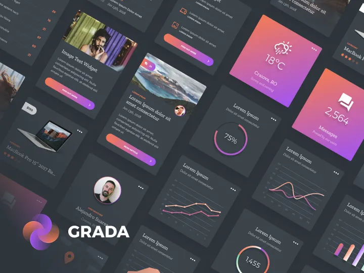
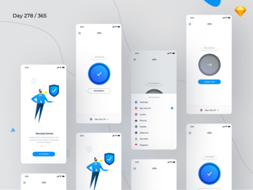
![Material Design Kit [Sketch] preview picture](https://imgproxy.epicpxls.com/25NgiEuwqlJOHx6Nz4RS2GU6a38NeEJY6Ac4cSa1E2M/rs:fill:720:540:0/g:no/aHR0cHM6Ly9pdGVt/cy5lcGljcHhscy5j/b20vdXBsb2Fkcy9w/aG90by9jNGU3MjZi/M2VhY2FmMTNlNjdi/MDFmZmY5OWExZjcz/OS5wbmc.jpg)


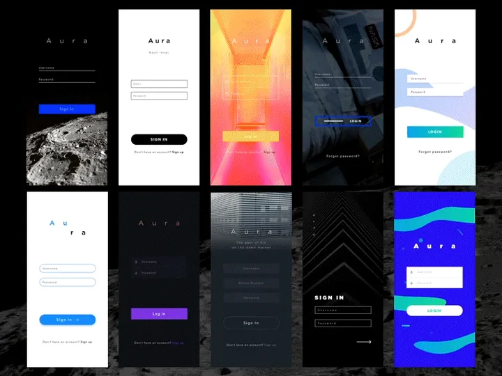

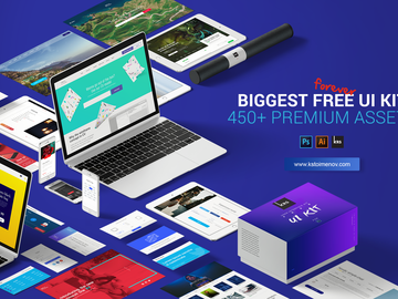
![Lando UI Kit [Sketch] preview picture](https://imgproxy.epicpxls.com/1z_2PFUSd9bZB7_0mno1S2SiGmGuXQHHXN3jebj98b4/rs:fill:720:540:0/g:no/aHR0cHM6Ly9pdGVt/cy5lcGljcHhscy5j/b20vdXBsb2Fkcy9w/aG90by9iNzM2NjYy/NzYwM2Q3ZWMzNDM3/NGRlNzczNTA5MTUz/Ny5qcGc.jpg)

Try Our Free Resources
Download any of these for free - no account required


What Is a UI Kit?
A UI Kit, or User Interface Kit, is a comprehensive collection of pre-designed interface elements that designers use to create digital products such as websites, mobile apps, and web applications. Think of it as a ready-made toolbox filled with common components like buttons, input fields, icons, navigation bars, cards, modals, and typography styles—all pre-styled and consistent in design. These reusable components allow designers to build interfaces faster, maintain visual harmony, and ensure a professional, polished outcome without starting from scratch.
The concept of a UI Kit evolved alongside the growth of digital design and the increasing demand for streamlined workflows. In the early days of web and app development, designers created every UI element manually, which was time-consuming and often led to inconsistencies across screens. As design systems and component-based thinking gained traction—especially with the rise of platforms like iOS and Material Design—UI Kits emerged as a practical solution for maintaining consistency and accelerating the design process. They became foundational tools in both product and agency environments, where rapid prototyping and scalable design are essential.
Today, UI Kits are more than just convenience tools—they're strategic assets in modern design workflows. They help teams maintain brand consistency, reduce design debt, and align with development requirements by offering components that are often built with real-world implementation in mind. Whether you're a solo designer working on a personal project or part of a large team building enterprise software, a well-crafted UI Kit saves time, reduces errors, and ensures your interface adheres to established design principles and style guidelines.
With the availability of thousands of professionally designed UI Kits—such as the 38283+ resources curated by EpicPxls—designers now have access to high-quality, ready-to-use assets across a wide range of styles, platforms, and industries. From minimalistic dashboards to bold e-commerce layouts, these kits provide immediate inspiration and functional value, making them indispensable in the toolkit of any modern UI designer.
Types of UI Kits
By Purpose
UI Kits are often categorized by their intended use or application. General-purpose UI Kits are designed to be flexible and are suitable for a wide variety of projects. They typically include a broad range of components and follow neutral design principles, making them ideal for designers who need a solid foundation without a specific theme. On the other hand, niche-specific UI Kits are tailored for particular industries or functions—such as healthcare, finance, education, or e-commerce. These kits incorporate elements and layouts that reflect the conventions and user expectations of their domain, helping designers create more contextually appropriate experiences.
Another category includes platform-specific UI Kits, which follow the design language of iOS, Android, or web platforms like Material Design or Fluent Design. These ensure that the final product feels native to the user’s device. There are also prototype-focused UI Kits optimized for rapid wireframing and user testing, often emphasizing speed and usability over pixel-perfect visuals.
By Format
The format of a UI Kit determines how it's used and integrated into design tools. The most common formats are Figma, Sketch, Adobe XD, and Photoshop files. Figma has become especially popular due to its collaborative features and component-based system, making it ideal for team-based design workflows. Some UI Kits are delivered as design tokens or code-based systems (like React or Vue components), bridging the gap between design and development. Others may come in SVG or PNG sprite sheets for direct use in web development.
Additionally, modern UI Kits are increasingly available as cloud libraries or plugin integrations, allowing designers to access components directly within their design environment. This reduces friction and enhances consistency across projects.
By Complexity
UI Kits vary significantly in scope and depth. Basic UI Kits include only essential components such as buttons, form fields, and typography. They're perfect for small projects, quick mockups, or designers who prefer a minimalist starting point. In contrast, comprehensive UI Kits offer hundreds of elements, including advanced components like data tables, charts, onboarding flows, and dark mode variants. These often come with full design systems, complete with spacing guidelines, color palettes, icon sets, and component states (hover, active, disabled).
High-complexity kits are especially useful for large-scale applications or when working within a design system framework. They often include responsive layouts and accessibility considerations, ensuring broader usability. Whether you need a lightweight starter pack or an enterprise-grade toolkit, the 38283+ resources available through platforms like EpicPxls cater to every level of design need and expertise.
How to Use UI Kits in Your Projects
- Define Your Project Requirements: Before selecting a UI Kit, clarify your project’s goals, target audience, and platform (web, mobile, desktop). This helps narrow down kits that match your design language and functionality needs. For example, a fintech app will benefit from a kit with data visualization components and secure form elements.
- Choose the Right UI Kit: Explore curated collections—such as the 38283+ options on EpicPxls—to find a kit that aligns with your project. Look for well-organized layers, clear naming conventions, and compatibility with your design tool. Check if the kit includes dark mode, responsive grids, or multilingual support if those are relevant.
- Import and Set Up the Kit: Once downloaded, import the UI Kit into your design tool (e.g., Figma or Sketch). Many kits come with documentation or style guides. Take time to explore the component library, understand the design tokens (like colors and typography), and set up your artboard grid system for consistency.
- Customize for Your Brand: While UI Kits provide a strong foundation, they should reflect your brand identity. Adjust colors, fonts, and spacing to match your brand guidelines. Replace placeholder icons and images with your own assets. Use the kit’s components as a base, but tailor them to ensure uniqueness and brand alignment.
- Build Screens Using Components: Start assembling your interface by dragging and dropping components from the kit. Use symbols, components, or variants (depending on your tool) to maintain consistency. For example, if you modify a button style, ensure the change propagates across all instances to avoid visual discrepancies.
- Test and Iterate: Share your designs with stakeholders or users to gather feedback. Use the flexibility of the UI Kit to quickly iterate on layouts, component behavior, and user flows. Many kits include interactive prototypes or hotspot links, which can accelerate usability testing.
To get the most out of your UI Kit, follow best practices such as maintaining a clean layer structure, using auto-layout features (in Figma or XD), and documenting your design decisions. Tools like EpicPxls make it easy to filter and preview UI Kits based on style, format, and functionality, helping you find the perfect match for your workflow. Whether you're building a landing page, app dashboard, or admin panel, leveraging a well-structured UI Kit enhances efficiency and design quality.
UI Kit vs Related Concepts
While the term "UI Kit" is often used interchangeably with other design resources, it’s important to understand how it differs from similar concepts like design systems, style guides, and component libraries. A UI Kit is primarily a collection of visual elements—focused on the "what" of interface design. It provides ready-to-use components but may not include the underlying principles, usage guidelines, or code documentation that define a full design system.
A design system is broader and more strategic. It encompasses not only UI components but also design principles, accessibility standards, content guidelines, and often developer documentation. Think of a design system as the complete rulebook, while a UI Kit is one of the tools within that system. Similarly, a style guide outlines visual rules such as color palettes, typography scales, and spacing systems but may not include interactive components or layout templates.
Component libraries, especially in development contexts, refer to coded versions of UI elements (e.g., React components). These are functional and interactive, whereas UI Kits are typically static or semi-interactive design assets. However, the best UI Kits are designed to mirror their coded counterparts, enabling smoother handoff between designers and developers.
In practice, these concepts complement each other. A designer might start with a UI Kit for rapid prototyping, then evolve it into a custom design system as the product grows. For teams adopting agile workflows, using a UI Kit as a starting point accelerates alignment across design and development, especially when the kit is part of a larger ecosystem. Platforms like EpicPxls offer UI Kits that are designed with scalability in mind, making it easier to transition from prototype to production.
Where to Find Quality UI Kits
Finding a high-quality UI Kit starts with knowing what to look for. A professional-grade kit should be well-organized, visually consistent, and compatible with modern design tools. Look for features like reusable components, auto-layout support, responsive grids, and accessibility considerations. The best kits include documentation, variant options (e.g., button states), and are regularly updated to reflect design trends and tool improvements.
One of the most reliable ways to discover top-tier UI Kits is through curated marketplaces. EpicPxls, for instance, offers access to 38283+ meticulously reviewed UI Kit resources, ensuring that every download meets high standards for usability and design integrity. These kits span diverse categories—from mobile app interfaces to admin dashboards—and are tagged by format, style, and use case, making it easy to find exactly what you need.
When choosing between free and premium UI Kits, consider your project’s scope and timeline. Free kits are great for learning or small personal projects, but they may lack depth, support, or licensing clarity. Premium kits, while requiring an investment, typically offer superior quality, comprehensive component sets, and commercial usage rights. Many premium kits also include future updates and customer support, adding long-term value.
Licensing is another critical factor. Always verify whether a UI Kit allows personal, commercial, or extended use. Some kits require attribution, while others offer royalty-free licenses for unlimited projects. EpicPxls ensures that all 38283+ resources come with clear usage terms, so designers can use them confidently in client work or product development. Whether you're sourcing a minimalist wireframe kit or a full-fledged dashboard template, choosing a reliable platform streamlines your workflow and elevates your design output.
Why Download from EpicPxls?
Commercial License
Use in personal and commercial projects
No Account Required
Download free resources instantly
Quality Curated
Every resource is reviewed for quality
Preview Files
See Figma and Photoshop files before downloading
Who Uses These Ui Kits?
Professionals and teams who benefit most from our collection
UI/UX Designers
Speed up your workflow with ready-to-use ui kits for design tools. Perfect for prototyping and client presentations.
Developers
Get production-ready assets without design skills. Export in any format for web and mobile apps.
Startups & Agencies
Save design budget with affordable premium ui kits. Commercial license included for client work.
Marketing Teams
Create professional campaigns faster. All ui kits are optimized for social media and ads.
UI Kits FAQCommon questions about these resources
Simple, Transparent Pricing
Get unlimited access to all premium resources
Yearly
- 20 downloads per month
- All file formats
- Commercial license
Lifetime
- Unlimited downloads forever
- All file formats
- Commercial license
Ready to Get Started?
Access 4,441+ free design resources today.
Browse Free ResourcesView Premium PlansEarn 85% and
more on all sales
Upload your products and put them up
for sale at whatever price you want.

