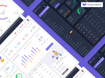
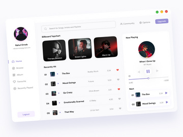
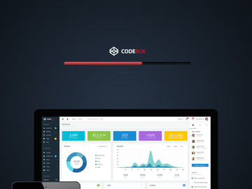
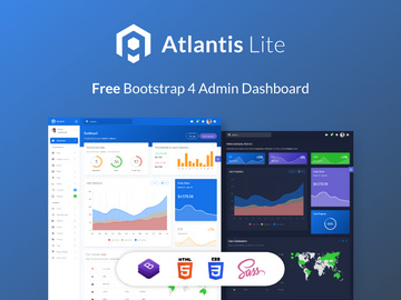
1018+ Dashboard Design Examples & Inspiration
EpicPxls offers 200+ curated ui kits, all with a commercial license and editable source files (Figma, Sketch, PSD). EpicPxls has 200+ dashboard design resources you can browse for inspiration and download for your projects.
Last updated February 12, 2026
Get inspired with 1018+ handpicked dashboard design examples from top designers.
Trusted by designers at leading companies
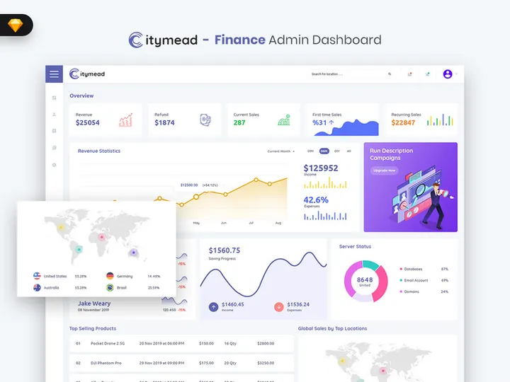
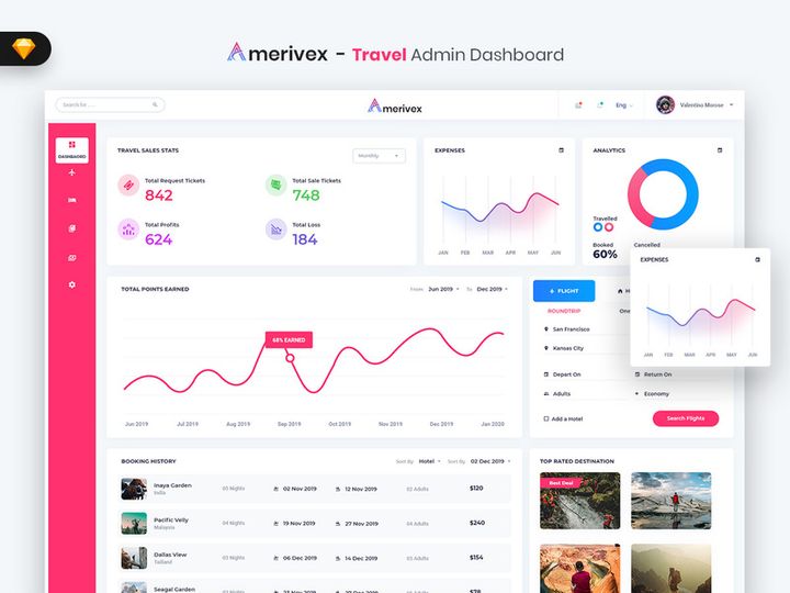
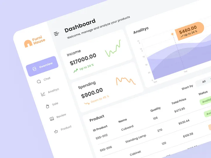
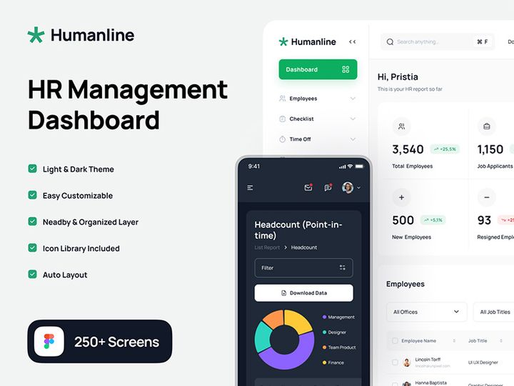
Top UI Kits
Handpicked resources from our curated collection


Try Our Free Resources
Download any of these for free - no account required
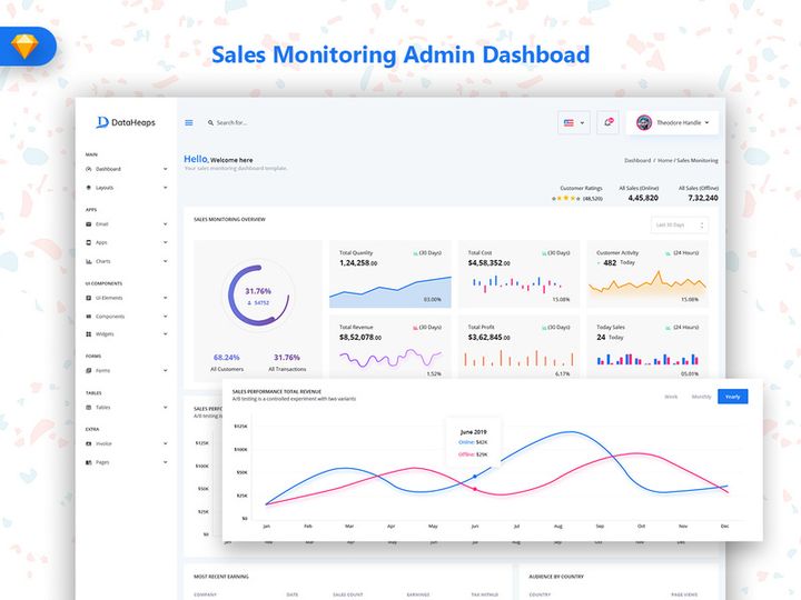
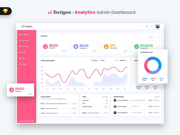
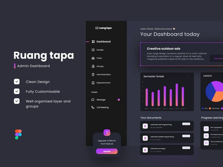
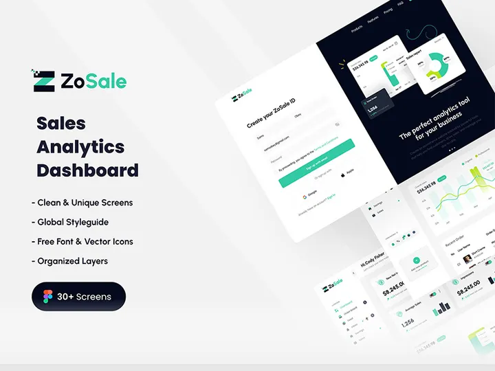
Best Dashboard Design Examples in 2026
As digital interfaces evolve, dashboard design continues to play a pivotal role in how users interact with data. In 2026, the most compelling dashboard design examples blend aesthetics with functionality, offering intuitive navigation, real-time insights, and visually engaging layouts. These designs go beyond mere data presentation—they tell stories, guide decisions, and enhance user productivity across industries such as finance, healthcare, marketing, and SaaS platforms.
What sets today’s best dashboard designs apart is their intelligent use of whitespace, micro-interactions, and responsive behavior. Designers are prioritizing clarity over clutter, using modular grid systems that adapt seamlessly across devices. Dark mode interfaces have become mainstream, reducing eye strain during extended use, while glassmorphism and subtle gradients add depth without sacrificing readability. Data visualization elements like dynamic charts, progress rings, and animated KPIs are integrated with purpose, ensuring users can grasp insights at a glance.
Another standout trend is personalization. Leading dashboards now feature customizable widgets, drag-and-drop layouts, and role-based views that allow users to tailor their experience. This shift reflects a broader movement toward human-centered design, where usability and user intent drive every layout decision. Additionally, AI-powered insights—such as anomaly detection or predictive analytics—are being surfaced directly within the dashboard interface, making them not just reporting tools but intelligent assistants.
Many of these cutting-edge examples are part of the 1018+ dashboard design resources available on EpicPxls, where designers can explore real-world applications of these trends. From minimalist admin panels to complex enterprise analytics suites, these examples provide a rich source of inspiration for anyone looking to build modern, effective dashboards.
What Makes Great Dashboard Design?
Visual Hierarchy
At the core of every exceptional dashboard is a well-thought-out visual hierarchy. This principle ensures that the most important information captures attention first. Designers achieve this through strategic placement, sizing, and spacing of elements. Typically, high-priority metrics such as key performance indicators (KPIs) are positioned in the top-left area—the natural starting point for reading in most cultures. Grouping related data into clearly defined sections with cards or containers also enhances scannability and reduces cognitive load.
Grid-based layouts are widely used to maintain alignment and consistency across components. These grids help create balance while allowing flexibility for different screen sizes. Moreover, the use of visual weight—through contrast in size, color, or typography—guides the user’s eye through the dashboard in a logical flow, from primary insights to supporting details.
Color and Typography
Color and typography are not just decorative elements—they are functional tools in dashboard design. Effective color schemes enhance data interpretation while maintaining accessibility. For example, using a consistent color palette where green indicates growth and red signals decline helps users make quick associations. However, designers must also consider colorblind-friendly combinations and ensure sufficient contrast between text and background.
Typography plays an equally critical role. Sans-serif fonts like Inter, Roboto, or Open Sans dominate modern dashboards due to their clean, legible appearance. Font weights and sizes are carefully chosen to distinguish headings from body text and labels. Limiting the number of typefaces (ideally one or two) ensures visual harmony and professionalism across the interface.
User Experience
User experience is the foundation of great dashboard design. A dashboard may be visually stunning, but if it’s difficult to navigate or interpret, its value diminishes. Usability hinges on intuitive navigation, clear labeling, and responsive interactions. Features like tooltips, collapsible menus, and interactive filters empower users to explore data without feeling overwhelmed.
Accessibility is another non-negotiable aspect. This includes supporting keyboard navigation, screen reader compatibility, and ensuring all interactive elements meet WCAG standards. Thoughtful UX also considers load times and performance—especially for data-heavy dashboards—by optimizing assets and leveraging lazy loading techniques. Ultimately, a successful dashboard feels effortless to use, enabling users to focus on insights rather than interface friction.
Dashboard Design Trends & Patterns
Current Design Movements
In 2026, dashboard design is shaped by several influential trends. Minimalism remains dominant, with clean layouts that eliminate unnecessary elements and prioritize content. Glassmorphism—the use of frosted glass effects with blur and transparency—is seeing increased adoption, particularly in dark-themed dashboards, adding a sense of depth and modernity. Neumorphism, while less common now due to accessibility concerns, has evolved into subtler forms that maintain soft shadows without compromising contrast.
Another significant trend is the integration of motion design. Subtle animations during loading, filtering, or data updates provide feedback and improve perceived performance. Micro-interactions, such as hover effects on buttons or smooth transitions between views, enhance engagement without distracting from core functionality.
Industry-Specific Approaches
Different industries demand different dashboard solutions, leading to specialized design patterns. For instance, financial dashboards often emphasize security, precision, and real-time data, featuring muted color schemes and dense but organized information layouts. In contrast, marketing analytics platforms lean toward vibrant visuals, social media integrations, and campaign performance timelines that are easy to share and present.
Healthcare dashboards prioritize patient privacy and clarity, using standardized icons and large, legible fonts to support quick decision-making in high-pressure environments. Meanwhile, e-commerce platforms focus on conversion metrics, inventory tracking, and customer behavior heatmaps, often incorporating A/B testing results directly into the UI. These industry-specific nuances highlight the importance of tailoring dashboard design to user needs and operational contexts.
Emerging Innovations
Technology is pushing dashboard design into new frontiers. Voice-enabled dashboards, though still emerging, allow users to request data summaries hands-free—ideal for field workers or executives on the go. Augmented reality (AR) interfaces are being tested in industrial and logistics settings, overlaying real-time metrics onto physical machinery via smart glasses.
AI-driven personalization engines are becoming standard, automatically rearranging dashboard components based on user behavior or highlighting anomalies in data streams. Natural language processing (NLP) enables conversational data queries, letting users ask, “Show me last month’s sales by region,” and receive instant visual responses. These innovations, while advanced, are increasingly accessible through pre-built components available in modern UI kits, including those found among the 1018+ resources on EpicPxls.
How to Create Your Own Dashboard Design
- Define Your Purpose and Audience: Begin by identifying the primary goal of your dashboard—whether it’s monitoring performance, tracking progress, or supporting decision-making. Understand who will use it (executives, analysts, customers) and what data matters most to them.
- Map Key Metrics and Data Sources: List the essential KPIs and metrics you need to display. Determine how data will be collected and updated—real-time, daily, or manually. This step ensures your dashboard delivers actionable insights.
- Sketch a Wireframe: Create low-fidelity sketches or digital wireframes to plan the layout. Focus on grouping related information, establishing visual hierarchy, and ensuring logical flow. Tools like Figma or Sketch work well for this stage.
- Choose a Design System or UI Kit: Leverage pre-designed components from trusted sources like EpicPxls to accelerate development. With over 1018+ dashboard design examples available, you can find templates that match your industry and style preferences.
- Design High-Fidelity Mockups: Apply your brand colors, typography, and interactive elements to build polished prototypes. Test readability, color contrast, and responsiveness across devices during this phase.
- Test, Iterate, and Implement: Share your design with real users for feedback. Observe how they interact with the dashboard and refine based on usability insights. Once validated, hand off to developers with clear design specifications and assets.
By following this structured approach, you can transform inspiration into a functional, user-centered dashboard. Starting with proven design patterns and adapting them to your unique requirements ensures both efficiency and quality in your final product.
Dashboard Design Resources on EpicPxls
For designers and developers seeking high-quality, ready-to-use solutions, EpicPxls offers an extensive collection of dashboard design resources. With over 1018+ professionally crafted templates, UI kits, and component libraries, it’s a go-to destination for anyone looking to build modern, responsive dashboards efficiently.
Whether you're working on a startup analytics platform or an enterprise resource planning system, you’ll find designs tailored to various industries and technical stacks. The library includes Figma, Sketch, and Adobe XD files, making integration into existing workflows seamless. Each resource is designed with best practices in mind—featuring accessible color schemes, scalable vector assets, and modular layouts that support customization.
One of the key advantages of using EpicPxls is the ability to jumpstart your project with a polished foundation. Instead of building from scratch, you can select a template that aligns with your vision and adapt it to your brand and data needs. Both free and premium options are available, ensuring flexibility for teams with varying budgets. With detailed documentation and regular updates, these resources not only save time but also ensure your dashboard remains current with evolving design standards.
Exploring the 1018+ dashboard design examples on EpicPxls is more than just browsing templates—it’s an opportunity to learn from real-world applications, discover new techniques, and bring professional-grade results to your next project.
Why Download from EpicPxls?
Commercial License
Use in personal and commercial projects
No Account Required
Download free resources instantly
Quality Curated
Every resource is reviewed for quality
Preview Files
See Figma and Photoshop files before downloading
Who Uses These Ui Kits?
Professionals and teams who benefit most from our collection
UI/UX Designers
Speed up your workflow with ready-to-use ui kits for design tools. Perfect for prototyping and client presentations.
Developers
Get production-ready assets without design skills. Export in any format for web and mobile apps.
Startups & Agencies
Save design budget with affordable premium ui kits. Commercial license included for client work.
Marketing Teams
Create professional campaigns faster. All ui kits are optimized for social media and ads.
UI Kits FAQCommon questions about these resources
Simple, Transparent Pricing
Get unlimited access to all premium resources
Yearly
- 20 downloads per month
- All file formats
- Commercial license
Lifetime
- Unlimited downloads forever
- All file formats
- Commercial license
Ready to Get Started?
Access 4,441+ free design resources today.
Browse Free ResourcesView Premium PlansEarn 85% and
more on all sales
Upload your products and put them up
for sale at whatever price you want.

