620+ Presentation Design Examples & Inspiration
EpicPxls offers 200+ curated templates, all with a commercial license and editable source files (Figma, Sketch, PSD). EpicPxls has 200+ presentation design resources you can browse for inspiration and download for your projects.
Last updated February 12, 2026
Get inspired with 620+ handpicked presentation design examples from top designers.
Trusted by designers at leading companies
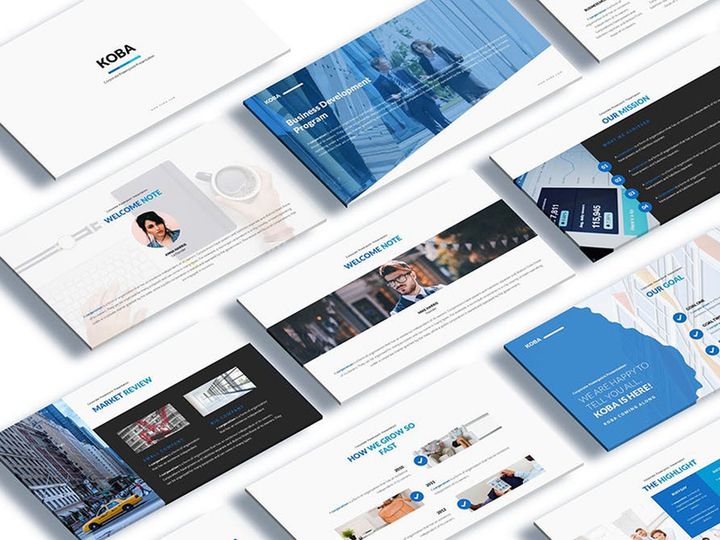
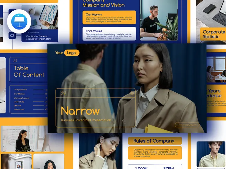
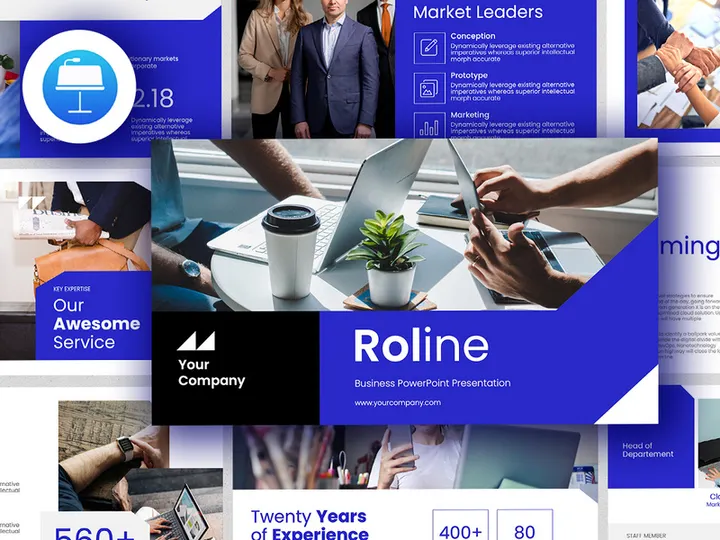
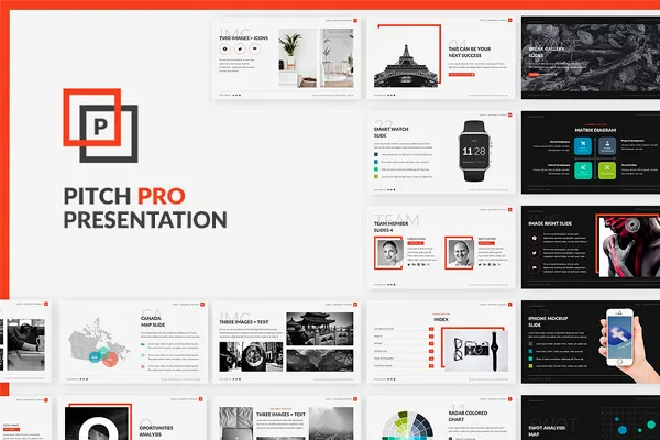
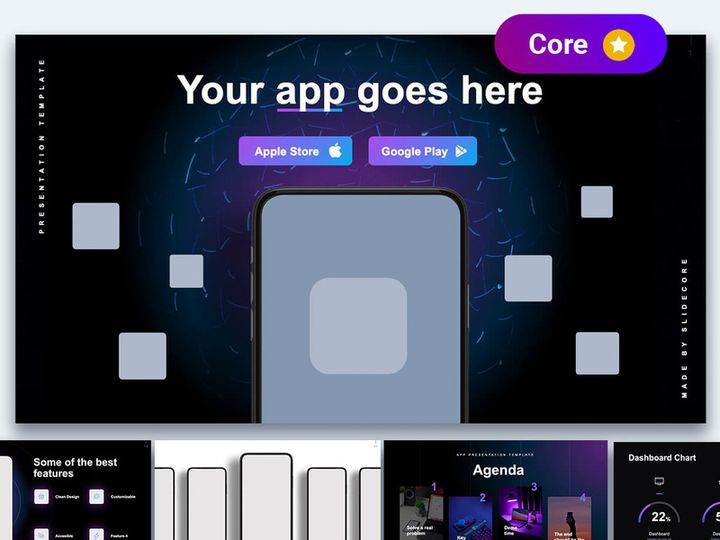
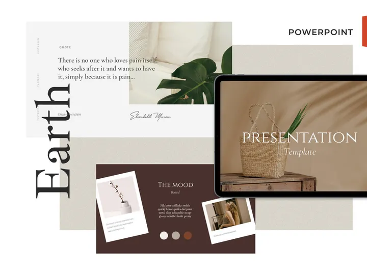
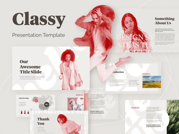
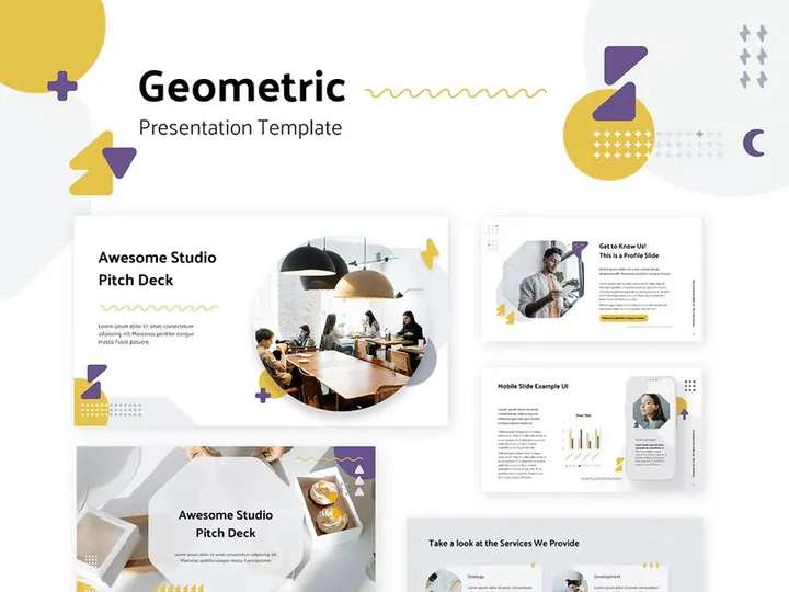
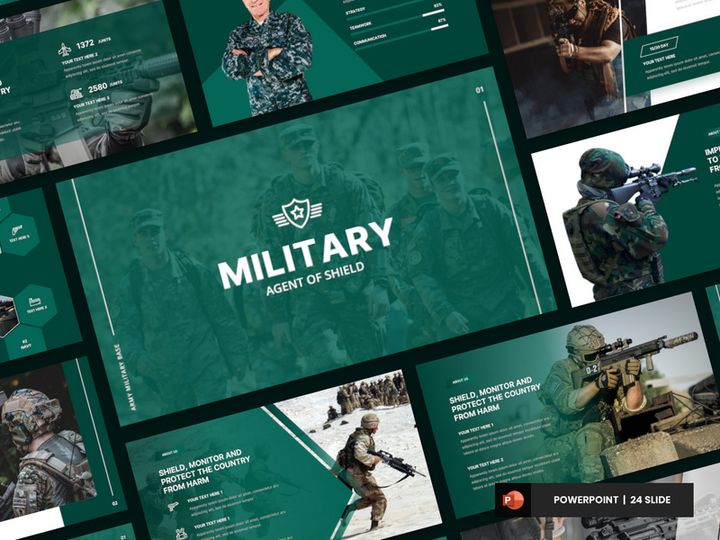
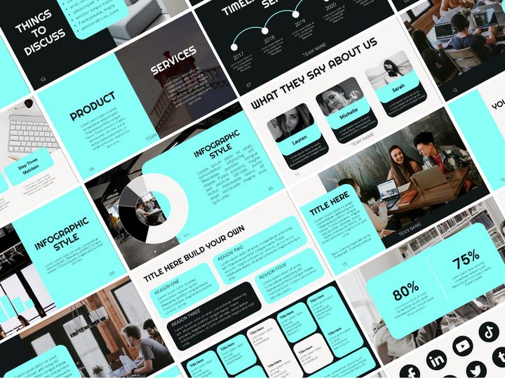
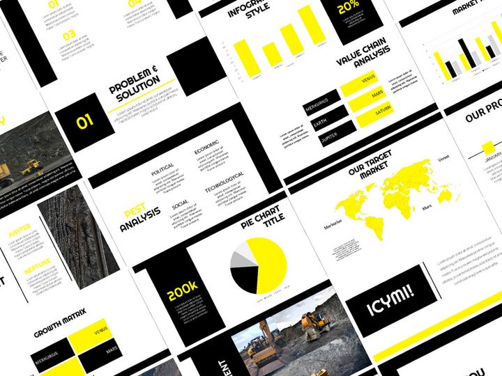
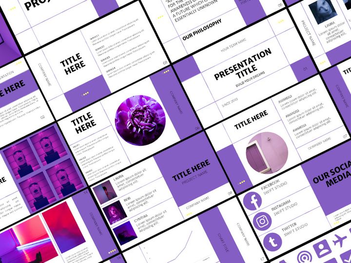
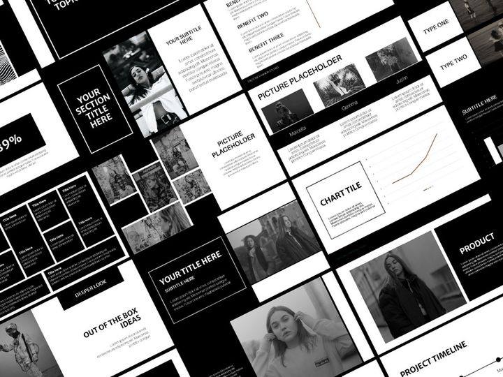
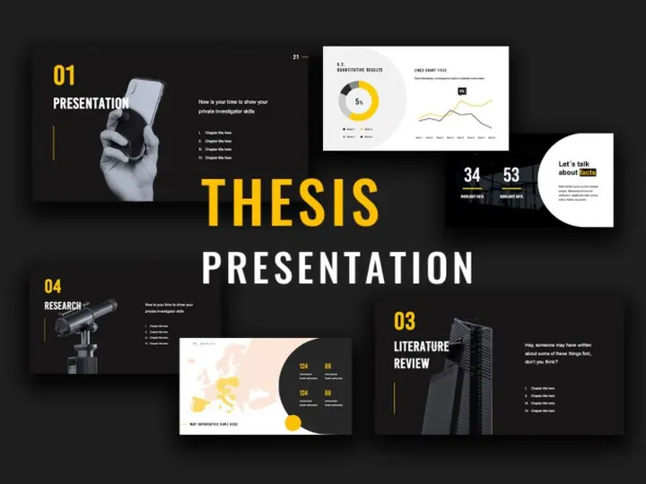
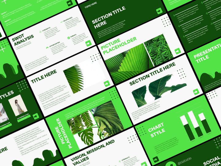
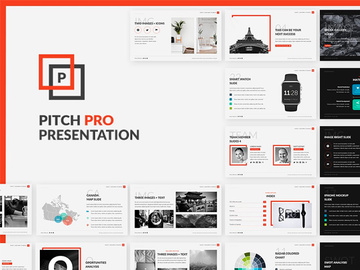
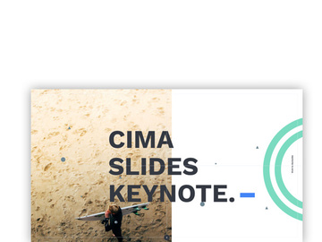
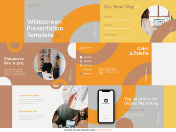
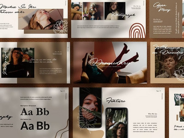
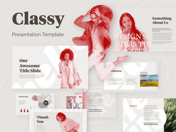
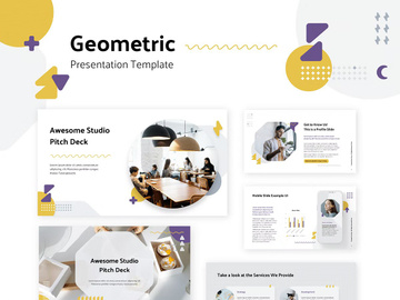
Top Templates
Handpicked resources from our curated collection


Try Our Free Resources
Download any of these for free - no account required
Best Presentation Design Examples in 2026
In 2026, presentation design has evolved into a powerful blend of storytelling, visual artistry, and user-centered interaction. The best presentation design examples are no longer just slides with bullet points—they are immersive experiences that captivate audiences from the first frame to the final call to action. These standout designs leverage bold visuals, minimalist layouts, and dynamic transitions to communicate complex ideas with clarity and impact. What sets these examples apart is their ability to balance aesthetic appeal with functional communication, making information not only digestible but memorable.
One of the most notable trends in top-tier presentations is the use of cinematic storytelling. Designers are adopting techniques from film and digital media, such as fade-ins, parallax scrolling, and timed animations, to guide viewers through a narrative arc. This approach transforms static content into a compelling journey, particularly effective for pitches, product launches, and educational content. Additionally, the integration of real-time data visualization and interactive elements allows presenters to engage audiences in new and meaningful ways.
Another hallmark of exceptional presentation design is the thoughtful use of whitespace and asymmetrical layouts. By breaking away from the traditional grid, designers create slides that feel modern, dynamic, and intentional. The influence of current design movements—such as neo-brutalism, glassmorphism, and kinetic typography—can be seen across industries, from tech startups to academic institutions. These trends reflect a broader shift toward authenticity, transparency, and emotional resonance in visual communication.
At the heart of these standout examples is a deep understanding of the audience. Whether it’s a boardroom presentation or a global keynote, the most effective designs are those that anticipate user needs, prioritize readability, and align with brand identity. Platforms like EpicPxls now offer access to over 620+ presentation design resources that embody these cutting-edge trends, giving creators a robust library of inspiration and ready-to-use templates to elevate their work.
What Makes Great Presentation Design?
Great presentation design goes beyond aesthetics—it’s about creating a seamless experience that informs, persuades, and inspires. The most effective presentations are built on a foundation of thoughtful design principles that ensure clarity, engagement, and accessibility. Whether you're presenting to a small team or a large audience, the quality of your design can significantly impact how your message is received and remembered.
Visual Hierarchy
Visual hierarchy is the backbone of effective presentation design. It involves organizing content so that the most important elements stand out first. This is achieved through strategic use of size, contrast, spacing, and placement. For example, a large headline paired with a supporting subheading and concise body text creates a clear path for the viewer’s eye. Designers often use grids and alignment tools to maintain consistency across slides, ensuring that each layout feels intentional and balanced. Strong visual hierarchy reduces cognitive load, helping audiences absorb information quickly and efficiently.
Color and Typography
Color and typography play a crucial role in setting the tone and reinforcing brand identity. A well-chosen color palette can evoke emotion, highlight key data, and improve readability. In 2026, muted earth tones, high-contrast duotones, and gradient overlays are widely used to create modern, professional looks. Similarly, typography choices—such as pairing a bold sans-serif header with a clean, readable body font—enhance legibility and visual interest. Designers are increasingly opting for variable fonts that adapt to different screen sizes and viewing conditions, ensuring optimal display across devices.
User Experience
User experience (UX) in presentation design focuses on how easily an audience can follow and interact with the content. This includes considerations like slide navigation, animation pacing, and accessibility features. For instance, using alt text for images, high-contrast color combinations, and readable font sizes ensures that presentations are inclusive for people with visual impairments. Additionally, minimizing distractions—such as excessive animations or cluttered layouts—helps maintain focus on the core message. Great presentation design anticipates the audience’s journey and removes friction at every step.
Presentation Design Trends & Patterns
As we move deeper into 2026, presentation design continues to reflect broader shifts in digital culture, technology, and user expectations. Designers are embracing new tools and philosophies that prioritize authenticity, engagement, and adaptability. These trends are not just about looking modern—they’re about creating presentations that resonate in an increasingly visual and fast-paced world.
Current Design Movements
Several design movements are shaping the look and feel of today’s best presentations. Neo-brutalism is gaining traction with its raw, unpolished aesthetic—think bold outlines, stark contrasts, and intentional asymmetry. This style works well for brands aiming to appear bold and unapologetic. Meanwhile, glassmorphism—characterized by frosted glass effects, soft shadows, and layered transparency—adds depth and sophistication, especially in tech and creative industries. Kinetic typography, where text moves and transforms dynamically, is also widely used to emphasize key messages and maintain viewer attention.
Industry-Specific Approaches
Different industries are tailoring presentation design to meet their unique communication needs. In the tech sector, clean, data-driven slides with minimalist layouts dominate, often incorporating real-time dashboards and interactive prototypes. Healthcare presentations prioritize clarity and empathy, using warm colors, human-centered imagery, and simple language to explain complex topics. Educational institutions are adopting modular slide formats that support hybrid learning, with embedded quizzes and navigable content paths. Even financial firms, traditionally conservative in design, are modernizing with animated infographics and brand-aligned templates that make reports more engaging.
Emerging Innovations
New technologies are pushing the boundaries of what’s possible in presentation design. AI-powered design assistants can now suggest layout improvements, auto-generate color schemes, and even create slide content based on a brief. Augmented reality (AR) integrations allow presenters to project 3D models during live talks, particularly useful in architecture and product design. Meanwhile, responsive design frameworks ensure that presentations look great on any device—from large auditorium screens to mobile phones. These innovations are making it easier than ever to create professional, impactful presentations without starting from scratch. With platforms like EpicPxls offering over 620+ presentation design examples, creators can explore and adopt these trends with confidence.
How to Create Your Own Presentation Design
Creating a standout presentation doesn’t require starting from a blank canvas. With the right approach and resources, you can build a compelling, professional deck that communicates your message effectively. The key is to move from inspiration to execution in a structured way, leveraging existing designs as a foundation while adding your unique voice and brand identity.
- Define Your Objective – Begin by clarifying the purpose of your presentation. Are you informing, persuading, or inspiring? Knowing your goal will shape your content, tone, and design choices.
- Know Your Audience – Tailor your message and visuals to your audience’s expectations and level of expertise. A technical team may appreciate detailed data, while executives may prefer high-level summaries.
- Gather Inspiration – Explore curated galleries of presentation design examples to identify styles and layouts that resonate. Platforms like EpicPxls offer a vast library of templates and concepts to spark ideas.
- Choose a Template – Select a professionally designed template that aligns with your brand and message. A strong template provides a solid foundation for layout, color, and typography.
- Customize Thoughtfully – Replace placeholder content with your own, adjust colors and fonts to match your branding, and ensure visual consistency across all slides. Avoid overloading slides—keep them clean and focused.
- Test and Refine – Preview your presentation on different devices, check for accessibility issues, and rehearse your delivery. Make adjustments based on feedback and usability testing to ensure a smooth experience.
By following these steps, you can transform inspiration into a polished, effective presentation. Using pre-made resources doesn’t limit creativity—it accelerates it, giving you more time to focus on your message and delivery.
Presentation Design Resources on EpicPxls
Finding the right starting point for your next presentation can be overwhelming—especially when time and resources are limited. That’s where EpicPxls comes in. With over 620+ presentation design resources available, the platform offers one of the most comprehensive collections of templates, slide decks, and design assets tailored to modern needs. Whether you're crafting a startup pitch, a corporate report, or an educational module, EpicPxls provides professionally designed options that combine aesthetic appeal with functional structure.
The resources on EpicPxls span a wide range of styles, from minimalist and corporate to creative and artistic. Each template is built with current design trends in mind, ensuring your presentation feels fresh and relevant. You’ll find options optimized for different formats, including widescreen, square, and vertical layouts—ideal for digital sharing and social media. The collection includes fully editable slides, customizable color schemes, and scalable vector graphics, making it easy to adapt each design to your brand and message.
What sets EpicPxls apart is its focus on accessibility and usability. Many of the templates are designed with inclusive practices in mind, featuring high-contrast visuals, readable typography, and organized layouts. Both free and premium options are available, giving creators at every level the tools they need to succeed. Whether you're a seasoned designer or a beginner looking for inspiration, browsing the 620+ resources on EpicPxls can jumpstart your creative process and help you deliver presentations that truly stand out.
Why Download from EpicPxls?
Commercial License
Use in personal and commercial projects
No Account Required
Download free resources instantly
Quality Curated
Every resource is reviewed for quality
Preview Files
See Figma and Photoshop files before downloading
Who Uses These Templates?
Professionals and teams who benefit most from our collection
UI/UX Designers
Speed up your workflow with ready-to-use templates for design tools. Perfect for prototyping and client presentations.
Developers
Get production-ready assets without design skills. Export in any format for web and mobile apps.
Startups & Agencies
Save design budget with affordable premium templates. Commercial license included for client work.
Marketing Teams
Create professional campaigns faster. All templates are optimized for social media and ads.
Templates FAQCommon questions about these resources
Simple, Transparent Pricing
Get unlimited access to all premium resources
Yearly
- 20 downloads per month
- All file formats
- Commercial license
Lifetime
- Unlimited downloads forever
- All file formats
- Commercial license
Ready to Get Started?
Access 4,441+ free design resources today.
Browse Free ResourcesView Premium PlansEarn 85% and
more on all sales
Upload your products and put them up
for sale at whatever price you want.

