UI Kits for Photoshop: 637+ Resources
EpicPxls offers 200+ curated ui kits for Photoshop, all with a commercial license and editable source files (Figma, Sketch, PSD). We have 200+ ui kits compatible with Photoshop, tested and verified for seamless integration.
Last updated February 12, 2026
Discover 637+ handpicked ui kits for Photoshop.
Trusted by designers at leading companies
Top UI Kits for Photoshop
Handpicked resources from our curated collection


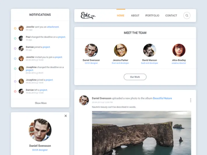

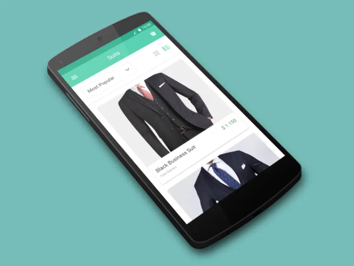


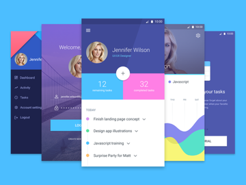
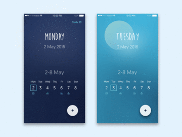
![Clean & Modern iOS UI Kit [PSD] preview picture](https://imgproxy.epicpxls.com/3QrebASS4Q_uhm0WRR9MwTYFkCQl4xIkpqnW40yWw5M/rs:fill:720:540:0/g:no/aHR0cHM6Ly9pdGVt/cy5lcGljcHhscy5j/b20vdXBsb2Fkcy9w/aG90by8yYjI1ZmY4/ZmVmNjcyNTcyYjkx/OTRmZjBmYWE3NzRk/MC5qcGc.jpg)
Try Our Free Resources
Download any of these for free - no account required

Why Photoshop for UI Kits?
Photoshop has long been a cornerstone tool for digital designers, and its widespread adoption in UI design stems from its powerful feature set and industry familiarity. While newer tools have emerged, Photoshop remains a preferred platform for many designers working with UI kits due to its precision, customization, and compatibility with existing design ecosystems. Its layered structure allows for meticulous control over interface elements, making it ideal for crafting pixel-perfect user interfaces.
One of the standout benefits of using Photoshop for UI kits is its robust support for smart objects, layer styles, and vector shapes. These features enable designers to create reusable components that maintain quality at any scale. Layer styles such as drop shadows, gradients, and strokes can be saved and applied consistently across buttons, cards, and navigation bars—ensuring visual harmony throughout a project. Additionally, Photoshop’s extensive plugin library enhances functionality, allowing for faster prototyping, asset export, and integration with development handoff tools.
Designers also appreciate the flexibility of Photoshop’s workspace, which can be tailored to accommodate UI workflows with custom workspaces, keyboard shortcuts, and panel configurations. This adaptability streamlines the design process when working with large UI kits containing hundreds of elements. At EpicPxls, we recognize the enduring value of Photoshop in UI design, which is why we curate only high-quality, fully compatible resources. Our collection of 637+ resources includes meticulously organized PSD files, vector assets, and layered templates that are optimized for immediate use. Each submission undergoes a rigorous review to ensure clarity, scalability, and adherence to modern design standards, making EpicPxls a trusted destination for Photoshop-based UI kits.
Top UI Kits Picks for Photoshop
With such a vast selection available, choosing the right UI kit can significantly impact your design efficiency and output quality. Whether you're just starting out or are a seasoned professional, there’s something in the 637+ resources collection to meet your needs. Below are handpicked recommendations across key categories to help you find the perfect fit for your workflow.
Best for Beginners
If you're new to UI design, starting with intuitive and well-documented UI kits is essential. Look for kits that include clear labeling, organized layer structures, and comprehensive guides. Many beginner-friendly options feature drag-and-drop components, pre-built screen templates, and color-coded layers that make navigation easy. These kits often follow common design patterns such as mobile app layouts, dashboard interfaces, and e-commerce pages, helping newcomers learn best practices through practical application. EpicPxls highlights beginner kits that prioritize usability without sacrificing design quality, ensuring a smooth learning curve.
Best for Professionals
Experienced designers benefit from advanced UI kits that offer granular control, dynamic components, and scalability across multiple breakpoints. The top-tier kits available through EpicPxls include comprehensive design systems with consistent typography scales, icon sets, and interactive states. Many are built with enterprise-level projects in mind, supporting dark mode variants, accessibility standards, and modular architecture. These resources often come with style guides and component libraries that integrate seamlessly into larger design systems, making them ideal for team collaboration and long-term maintenance.
Best Free Options
High-quality free UI kits are abundant in the EpicPxls collection, proving that affordability doesn’t mean compromise. These resources are carefully selected based on design integrity, usability, and completeness. From minimalist admin panels to full-featured mobile app templates, the free tier offers professionally crafted kits suitable for portfolios, startups, and rapid prototyping. Many include vector icons, customizable buttons, and responsive grids—all within a well-structured PSD file. By offering access to premium-grade free content, EpicPxls empowers designers at every level to create impactful work without budget constraints.
Photoshop vs Other Tools for UI Kits
While modern design tools like Figma and Sketch have gained traction for collaborative UI workflows, Photoshop maintains a unique position in the design landscape—especially for individual creators and agencies with established pipelines. Unlike vector-based tools that emphasize real-time collaboration, Photoshop excels in pixel-level precision and image manipulation, making it ideal for high-fidelity mockups and detailed visual effects.
One of Photoshop’s key advantages is its deep integration with other Adobe Creative Cloud applications. Designers can easily transfer assets to Illustrator for vector refinement or into After Effects for motion prototyping. This interoperability is invaluable when working on complex projects that extend beyond static screens. Additionally, Photoshop supports a wide range of file formats, including layered PSDs, PNGs, SVGs, and PDFs, ensuring broad compatibility across platforms and teams.
When it comes to UI kits, Photoshop’s format flexibility allows designers to import and export components with full fidelity. Many of the 637+ resources on EpicPxls are delivered as multi-layered PSD files, preserving editable text, smart objects, and blending modes. This level of control is particularly beneficial when customizing interfaces for specific branding requirements or adapting designs for print and web simultaneously. While newer tools may streamline collaboration, Photoshop remains unmatched in visual refinement and asset versatility—making it a powerful choice for designers who value creative control and detail-oriented workflows.
Setting Up UI Kits in Photoshop
Getting started with a new UI kit in Photoshop is a straightforward process when you follow a structured approach. Proper setup ensures you can quickly access components, maintain consistency, and scale your designs efficiently. Follow these six essential steps to integrate any UI kit into your workflow.
- Download and extract the kit: Begin by downloading your chosen UI kit from a trusted source like EpicPxls. Most kits come in ZIP format, so extract the contents to a dedicated folder on your computer for easy access.
- Open the main PSD file: Navigate to the extracted folder and locate the primary Photoshop document (usually labeled “Main.psd” or similar). Double-click to open it in Photoshop. Ensure your version of Photoshop supports the file’s features (e.g., smart objects, layer comps).
- Explore the layer structure: Use the Layers panel to navigate through groups and subgroups. Well-designed kits will have clear naming conventions (e.g., “Buttons / Primary,” “Icons / Social”) and organized folders. Take a few minutes to familiarize yourself with the layout.
- Save a working copy: Before making edits, go to File > Save As and save a new version of the file. This preserves the original kit for future use and prevents accidental overwrites.
- Customize core elements: Update colors, fonts, and branding elements to match your project. Use global styles—such as layer styles and color swatches—to ensure consistency. Replace placeholder text and images with your own content.
- Create reusable components: Convert frequently used elements (like navigation bars or cards) into smart objects. This allows you to reuse them across artboards and update all instances simultaneously, streamlining your design process.
By following these steps, you’ll be able to efficiently set up and begin using any of the 637+ resources available. Whether you're building a single screen or an entire application interface, a well-organized foundation makes all the difference in productivity and design quality.
Photoshop Workflow Tips
Maximizing your efficiency in Photoshop goes beyond simply knowing where tools are—it’s about establishing smart habits and systems that scale with your projects. When working with extensive UI kits, a few strategic practices can dramatically improve your output and reduce repetitive tasks.
Organizing UI Kits Libraries
As your collection grows, maintaining an organized library becomes crucial. Create a master folder on your local drive or cloud storage labeled “UI Kits” and subdivide it by category (e.g., Mobile Apps, Dashboards, E-commerce). Within each subfolder, store the original downloaded files and any customized versions separately. Use consistent naming conventions such as “AppName_Version_Date” to easily identify iterations. Consider maintaining a spreadsheet or digital catalog listing each kit’s features, author, and license type. At EpicPxls, we recommend downloading kits with clear folder structures and documentation to minimize setup time and confusion later on.
Batch Operations
Photoshop’s Actions panel is a powerful tool for automating repetitive tasks across multiple files or components. For example, you can record an action to resize icons, apply consistent shadows, or export assets in various formats. Once created, actions can be applied in bulk using the File > Automate > Batch function. This is especially useful when standardizing elements from different UI kits or preparing assets for development handoff. Combine this with Data Sets and Variables to dynamically update text and images across multiple artboards, saving hours of manual editing.
Collaboration Best Practices
While Photoshop is often seen as a solo tool, it can support team workflows with proper protocols. When sharing PSD files, always flatten unnecessary layers, compress large files, and include a README with instructions. Use layer comps to present different screen states or design variations within a single file. Enable version control by integrating with cloud services that track changes, and communicate updates clearly with team members. When sourcing from EpicPxls, choose kits that are team-ready—featuring modular components, consistent naming, and minimal embedded fonts to reduce compatibility issues. These small steps ensure smoother collaboration, even in distributed environments.
Why Download from EpicPxls?
Commercial License
Use in personal and commercial projects
No Account Required
Download free resources instantly
Quality Curated
Every resource is reviewed for quality
Preview Files
See Figma and Photoshop files before downloading
Who Uses These Ui Kits?
Professionals and teams who benefit most from our collection
UI/UX Designers
Speed up your workflow with ready-to-use ui kits for Photoshop. Perfect for prototyping and client presentations.
Developers
Get production-ready assets without design skills. Export in any format for web and mobile apps.
Startups & Agencies
Save design budget with affordable premium ui kits. Commercial license included for client work.
Marketing Teams
Create professional campaigns faster. All ui kits are optimized for social media and ads.
UI Kits for Photoshop FAQCommon questions about these resources
Simple, Transparent Pricing
Get unlimited access to all premium resources
Yearly
- 20 downloads per month
- All file formats
- Commercial license
Lifetime
- Unlimited downloads forever
- All file formats
- Commercial license
Ready to Get Started?
Access 4,441+ free design resources today.
Browse Free ResourcesView Premium PlansEarn 85% and
more on all sales
Upload your products and put them up
for sale at whatever price you want.

