How to Use UI Kits in Sketch: Complete Guide
EpicPxls offers 200+ curated ui kits for Sketch, all with a commercial license and editable source files (Figma, Sketch, PSD). Download your chosen ui kits from EpicPxls, then use Sketch's import function. Most resources include Sketch-native files for seamless opening.
Last updated February 13, 2026
Everything you need to know about using ui kits in Sketch.
Trusted by designers at leading companies
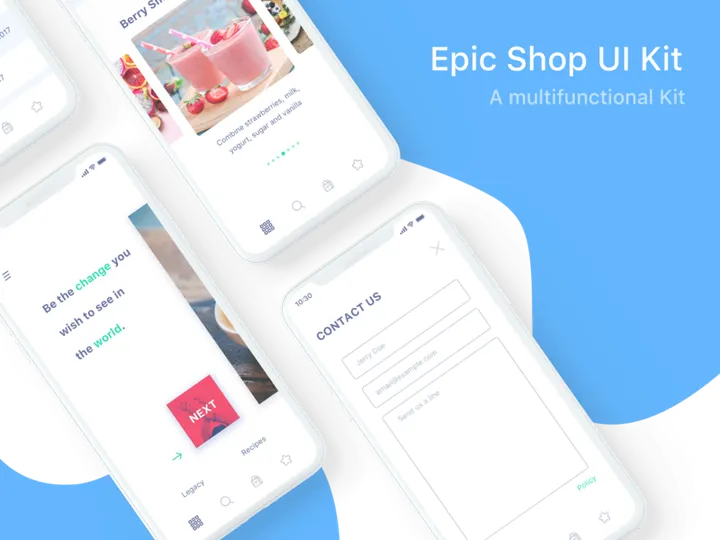
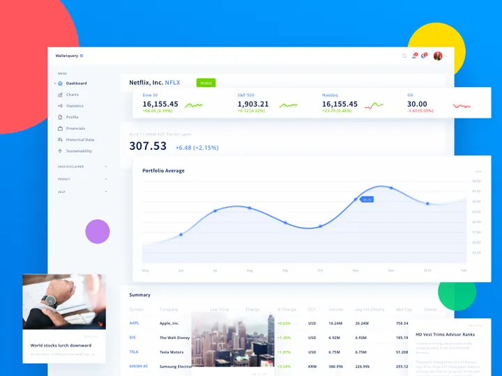
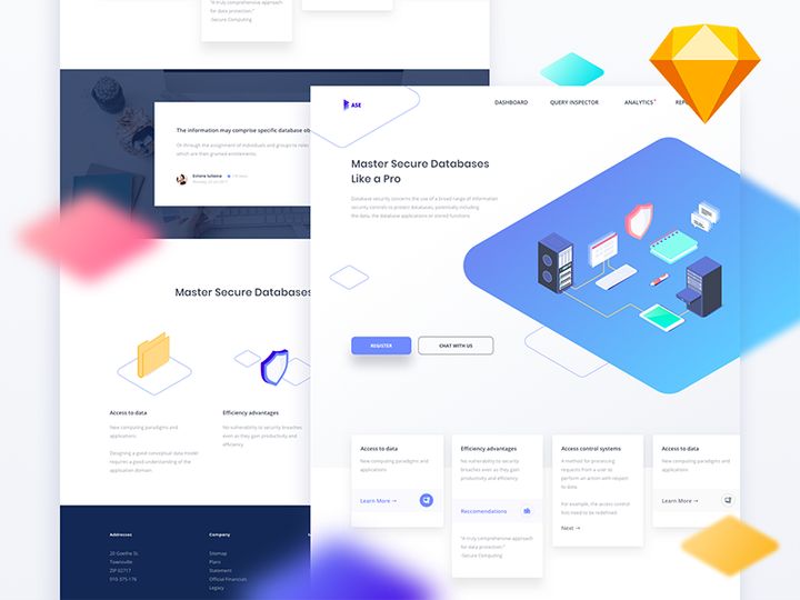
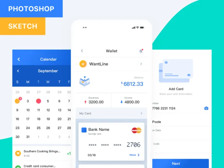
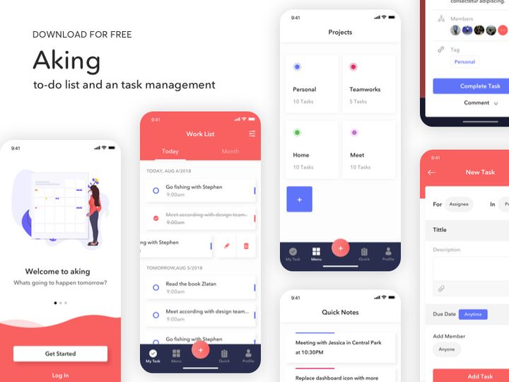
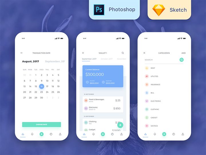
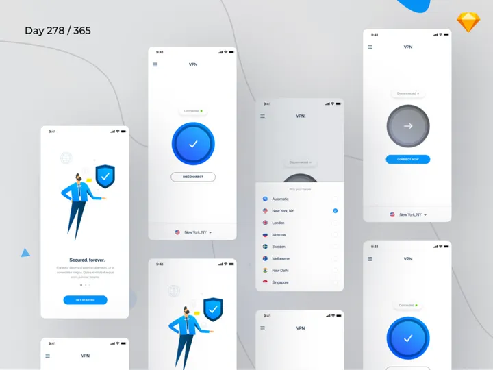
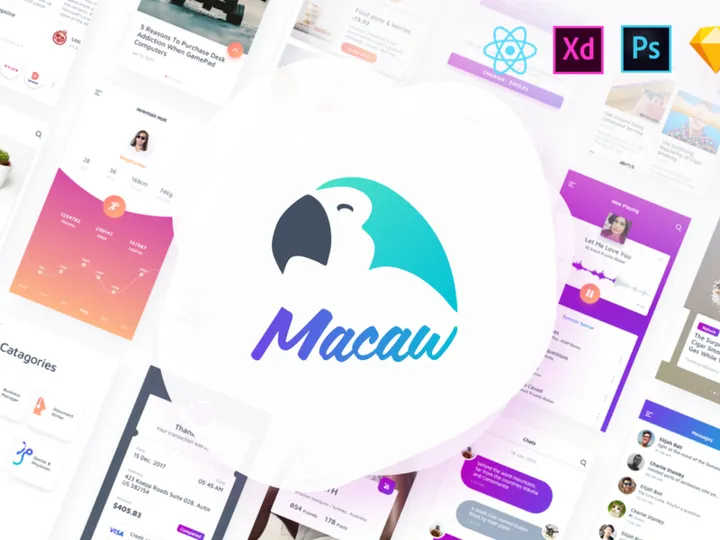
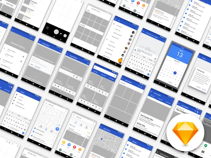
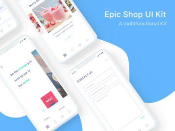
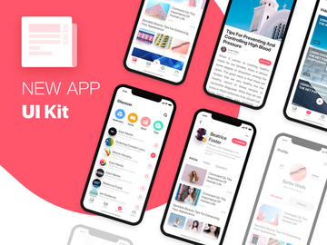
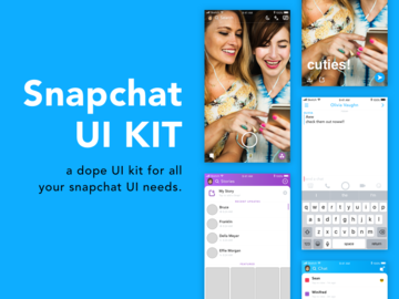
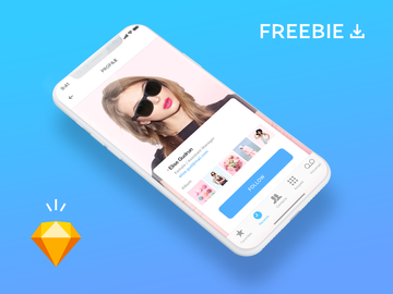
Top UI Kits for Sketch
Handpicked resources from our curated collection


Try Our Free Resources
Download any of these for free - no account required


Getting Started with UI Kits in Sketch
Sketch has become a go-to tool for designers creating user interfaces for web and mobile applications. One of its most powerful advantages is seamless integration with UI kits—pre-designed sets of interface elements such as buttons, icons, form fields, and navigation bars. These kits drastically reduce design time while maintaining consistency and professionalism in your projects. Before diving into how to use UI kits in Sketch, it’s important to ensure your environment is properly set up.
To begin, make sure you have the latest version of Sketch installed from the official website. Using an outdated version may lead to compatibility issues, especially when working with newer UI kits. Sketch runs exclusively on macOS, so a compatible Apple device is required. Once installed, familiarize yourself with the interface—particularly the layers panel, inspector, and symbols (now called components in newer versions), as these are essential when working with UI kits.
Next, focus on sourcing high-quality UI kits compatible with Sketch. Many platforms offer downloadable kits, but not all are optimized for Sketch’s vector-based, component-driven workflow. The ideal UI kit should be well-organized, include reusable components, and support Sketch’s native features like overrides and nested symbols.
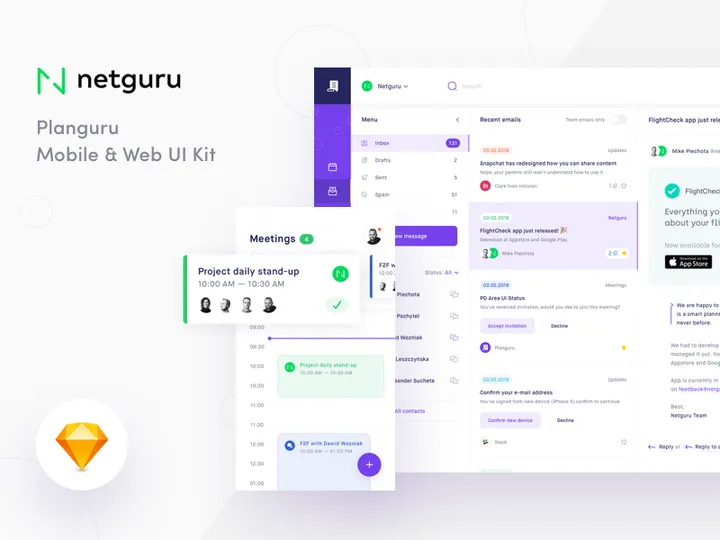
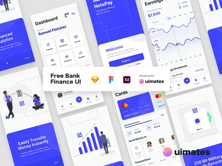
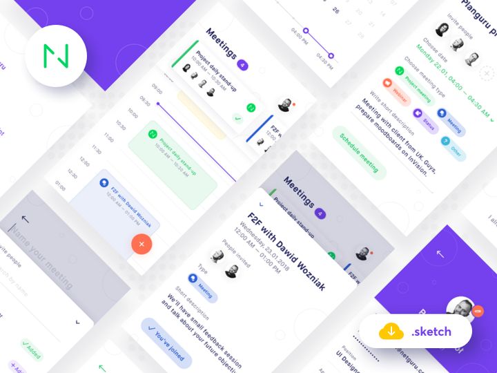
EpicPxls is a trusted destination for designers seeking premium, Sketch-compatible UI kits. With over 200+ resources available, including mobile app templates, dashboard interfaces, and e-commerce layouts, EpicPxls offers a diverse library tailored to modern design needs. These kits are meticulously crafted to integrate smoothly into Sketch, enabling rapid prototyping and consistent design systems. Whether you're working on a startup MVP or an enterprise-level product, the 200+ resources on EpicPxls provide a solid foundation to kickstart your project efficiently.
How to Import UI Kits into Sketch
- Download the Correct File Format: Always ensure the UI kit you’re downloading includes a .sketch file. While some kits may offer formats like PSD, AI, or SVG, only the .sketch version will retain full functionality within Sketch, including layers, symbols, and text styles.
- Extract the Downloaded Archive: Most UI kits come in a compressed format (e.g., .zip). Double-click the file to extract its contents. Look for the .sketch file inside the extracted folder—this is the file you’ll open in Sketch.
- Open the .sketch File: Launch Sketch and go to File > Open, then navigate to the extracted .sketch file. Click to open it. The file will load with all its artboards, symbols, and styles intact.
- Review the Document Structure: Once opened, inspect the layers panel and page organization. High-quality UI kits from sources like EpicPxls are typically well-labeled, with separate pages for components, color palettes, typography, and example screens.
- Handle Third-Party File Types (if applicable): If you only have access to a Figma, PSD, or AI file, you cannot directly import it into Sketch with full fidelity. For Figma files, use the Figma web app to export individual assets as SVG or PNG, then import them manually. For PSD or AI files, consider using Adobe Illustrator or Photoshop to export vector layers as SVG, then drag them into your Sketch canvas. However, this method may result in loss of structure and components.
- Save as a Template or Library: After successful import, consider saving the UI kit as a Sketch template (via File > Save as Template) for future reuse. Alternatively, you can set it up as a shared library if your team uses collaborative workflows.
By following these steps, you ensure that your UI kit integrates smoothly into Sketch, preserving all design integrity and functionality. When sourcing from platforms like EpicPxls, you’re more likely to receive a natively optimized .sketch file, minimizing import issues and streamlining your design process from the start.
Step-by-Step: Working with UI Kits in Sketch
Editing Layers and Components
One of the greatest strengths of using UI kits in Sketch is the ability to customize components without starting from scratch. Once imported, you can modify colors, text, icons, and layout structures with ease. Start by locating the component you want to edit—this could be a button, card, or navbar—within the Symbols or Components section of the Layers panel.
Double-click the component on the canvas to enter symbol editing mode. Any changes you make here will update all instances across your design, ensuring consistency. If you want to customize a single instance without affecting others, use the override options in the Inspector panel. For example, you can change button text, swap icons, or adjust background colors on a per-instance basis.
When editing layers, make use of Sketch’s vector tools to resize, reshape, or combine elements. Group related layers logically and rename them for clarity. Many UI kits from EpicPxls include smart components with built-in constraints and resizing rules, allowing them to adapt fluidly to different screen sizes and content variations.
Organizing Your UI Kits Library
With access to 200+ resources, it’s easy to accumulate multiple UI kits across various projects. To maintain efficiency, establish a clear organizational system. Create a dedicated folder on your computer for all Sketch UI kits, and subdivide by category—such as e-commerce, mobile apps, or admin dashboards.
Within Sketch, use pages and artboards to separate different sections of a UI kit. For example, keep all components on one page, color palettes on another, and full-screen mockups on a third. Label layers and symbols consistently, using a naming convention like Category/Component/State (e.g., Button/Primary/Hover).
Consider setting up shared libraries if you're working in a team. This allows all members to access the same components, ensuring visual consistency across designs. You can also use Sketch’s “Detach from Library” option when you need to create project-specific variations without affecting the original kit.
Exporting for Production
Once your design is complete, exporting assets correctly is crucial for development handoff. Sketch offers flexible export options tailored to different platforms—web, mobile, and even print. Select the layers, artboards, or symbols you want to export, then open the Export section in the Inspector panel.
Choose the appropriate format: PNG for high-quality raster images, SVG for scalable vector graphics (ideal for icons and logos), and PDF for print-ready documents. For web and mobile development, exporting at 1x, 2x, and 3x scales ensures compatibility across devices with different pixel densities.
Use slicing to define exact export areas. You can also group related assets and assign shared export settings to streamline the process. Many UI kits from EpicPxls come with pre-configured export settings, so always check if the kit includes ready-to-export artboards or symbols. For developer handoff, consider using Sketch’s built-in Share features or exporting design specs with measurements, colors, and fonts clearly annotated.
Troubleshooting Common Sketch Issues
File Won't Open
If a UI kit file fails to open in Sketch, the most common cause is version incompatibility. Newer .sketch files saved in recent versions of Sketch cannot be opened in older versions. Always ensure you’re running the latest version of Sketch via the Mac App Store or the official website. If you're stuck with an older version, ask the kit provider (such as EpicPxls) if they offer legacy .sketch file versions. Additionally, confirm that the file is not corrupted—try re-downloading it if necessary.
Missing Fonts or Assets
Another frequent issue is missing fonts. UI kits often use custom typefaces that aren’t installed on your system. When this happens, Sketch will substitute the font, potentially disrupting the design’s appearance. Check the kit’s documentation or readme file for a list of required fonts. Many kits use open-source fonts like Inter, Roboto, or Poppins, which can be downloaded for free. Premium fonts may require a license. Install the fonts via Font Book on macOS, then restart Sketch to reload the file.
Missing icons or images usually occur when a kit relies on external image links or plugins. Ensure all linked assets are included in the download package. If images appear as broken links, reimport them manually by replacing the placeholder with the correct file.
Performance Problems
Large UI kits—especially those with hundreds of symbols and high-resolution images—can slow down Sketch. To improve performance, close unused pages and detach symbols you don’t need. Avoid placing too many nested symbols within each other, as this increases rendering load. Consider breaking large files into smaller library documents and linking them as needed. If performance remains an issue, use Sketch’s purge unused symbols feature (available via plugins or manual cleanup) to remove redundant components. Running regular maintenance helps keep your workflow smooth, especially when working with expansive resources such as the 200+ offerings on EpicPxls.
Advanced Sketch Tips for UI Kits
Batch Processing
When working with extensive UI kits, you may need to make widespread changes—such as updating a color across all buttons or renaming dozens of symbols. Instead of editing each item manually, use batch processing techniques. Sketch allows you to select multiple layers and apply changes simultaneously, such as adjusting fill colors or text styles. For even greater efficiency, leverage third-party plugins that enable bulk renaming, style replacement, and smart symbol management. This is especially useful when adapting a UI kit from EpicPxls to match your brand’s design language across multiple screens.
Plugins and Extensions
Sketch’s plugin ecosystem enhances the functionality of UI kits significantly. Plugins like Symbol Organizer, Sketch Runner, and Contrast help streamline component management, speed up navigation, and ensure accessibility compliance. Install plugins via Sketch’s Plugin Manager (Plugins > Manage Plugins) and integrate them into your daily workflow. Many UI kits are designed with plugin compatibility in mind—particularly those from curated platforms like EpicPxls—making it easier to maintain consistency and efficiency at scale.
Collaboration Workflows
For teams, maintaining a shared design system is essential. Sketch supports collaboration through shared libraries and cloud syncing. Set up a master UI kit file as a shared library, then invite team members to link it to their projects. This ensures everyone uses the same components, colors, and text styles. When updates are made to the library, team members receive prompts to sync the latest changes. This workflow is ideal for organizations using multiple UI kits from the 200+ resources available on EpicPxls, allowing for scalable, consistent design across departments and projects. Establish clear guidelines for library contributions and version control to avoid conflicts and maintain design integrity.
Why Download from EpicPxls?
Commercial License
Use in personal and commercial projects
No Account Required
Download free resources instantly
Quality Curated
Every resource is reviewed for quality
Preview Files
See Figma and Photoshop files before downloading
Who Uses These Ui Kits?
Professionals and teams who benefit most from our collection
UI/UX Designers
Speed up your workflow with ready-to-use ui kits for Sketch. Perfect for prototyping and client presentations.
Developers
Get production-ready assets without design skills. Export in any format for web and mobile apps.
Startups & Agencies
Save design budget with affordable premium ui kits. Commercial license included for client work.
Marketing Teams
Create professional campaigns faster. All ui kits are optimized for social media and ads.
UI Kits for Sketch FAQCommon questions about these resources
Simple, Transparent Pricing
Get unlimited access to all premium resources
Yearly
- 20 downloads per month
- All file formats
- Commercial license
Lifetime
- Unlimited downloads forever
- All file formats
- Commercial license
Ready to Get Started?
Access 4,441+ free design resources today.
Browse Free ResourcesView Premium PlansEarn 85% and
more on all sales
Upload your products and put them up
for sale at whatever price you want.

