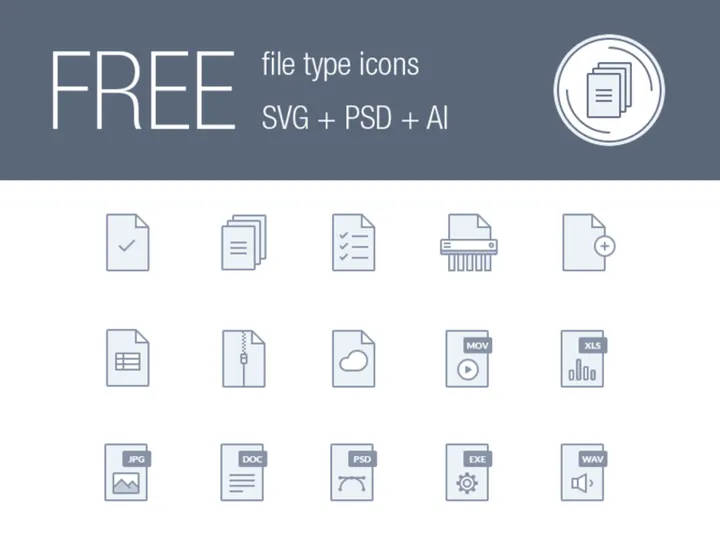
Flat Icons: 83+ Flat Designs
EpicPxls offers 62+ curated icons, all with a commercial license and editable source files (Figma, Sketch, PSD). Flat icons are characterized by specific visual elements, typography choices, and color palettes that define the flat aesthetic in design.
Last updated February 12, 2026
Discover 83+ curated flat icons for your projects.
Trusted by designers at leading companies
Top Icons
Handpicked resources from our curated collection

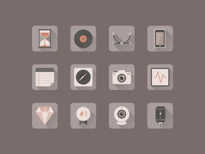


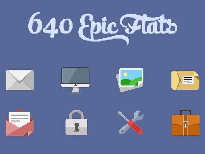
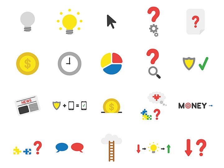
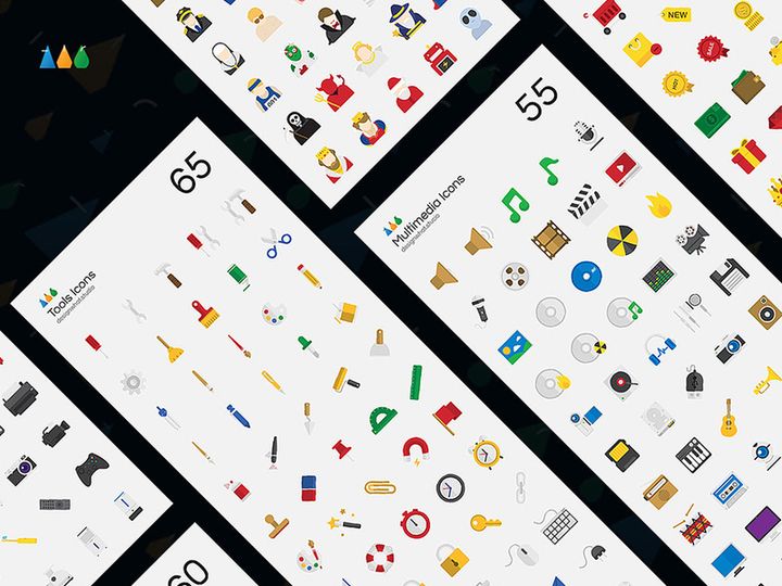
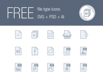
![60 Icons - Vector [Free] preview picture](https://imgproxy.epicpxls.com/U01BA4daO8hyEY63utCP3w-8OXbcAv47Deh7_Ui7jSI/rs:fill:720:540:0/g:no/aHR0cHM6Ly9pdGVt/cy5lcGljcHhscy5j/b20vdXBsb2Fkcy9w/aG90by9lYTg0NjUy/YTA2MTA2YmVmZTEx/MTNjMmM4NzA4N2Jm/Zi5naWY.jpg)
Try Our Free Resources
Download any of these for free - no account required


Flat Design Principles
Flat design is a minimalist approach to visual design that emphasizes usability, clarity, and simplicity. Emerging as a reaction to the once-dominant skeuomorphic style—where digital elements mimicked real-world textures and depth—flat design strips away gradients, shadows, bevels, and other embellishments to create a clean, two-dimensional appearance. What makes flat design distinctive is its focus on function over form, prioritizing user experience through intuitive navigation and visual hierarchy.
At the core of flat design are several key visual elements. Typography plays a crucial role, often relying on clean, sans-serif fonts that enhance readability and pair seamlessly with simple iconography. Color palette choices are bold and intentional, using high-contrast combinations to guide attention and differentiate interface components without relying on depth cues. Spacing is generous and purposeful, ensuring that elements breathe and content remains scannable. Imagery, particularly in the form of icons, is simplified to essential shapes and lines, avoiding unnecessary detail to maintain visual consistency and fast loading times.
The evolution of flat design can be traced back to early 20th-century modernist movements like Bauhaus and Swiss Design, which championed minimalism and functionality. However, its digital resurgence began in the early 2010s, notably with Microsoft’s Metro design language and later embraced by Apple with iOS 7. This shift reflected the growing need for responsive, scalable design systems that work seamlessly across devices and screen sizes. Today, flat design remains a cornerstone of modern digital aesthetics, evolving into what some call “flat 2.0”—a refined version that incorporates subtle shadows and layering while maintaining its core minimalist ethos. With 83+ resources available at EpicPxls, designers can explore a vast library of flat icons that embody these principles, making it easier than ever to implement polished, professional visuals across projects.
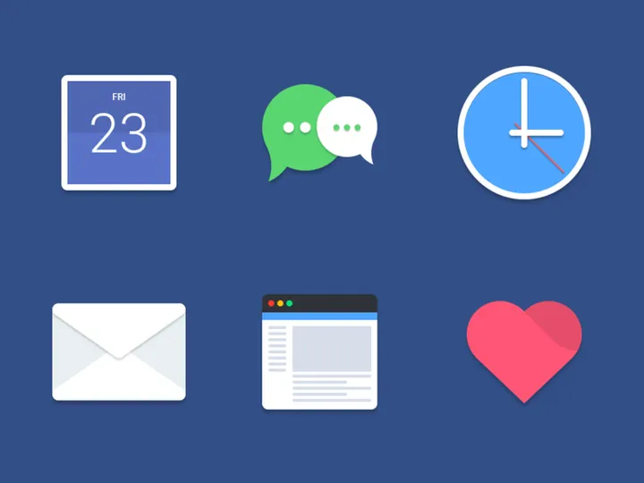
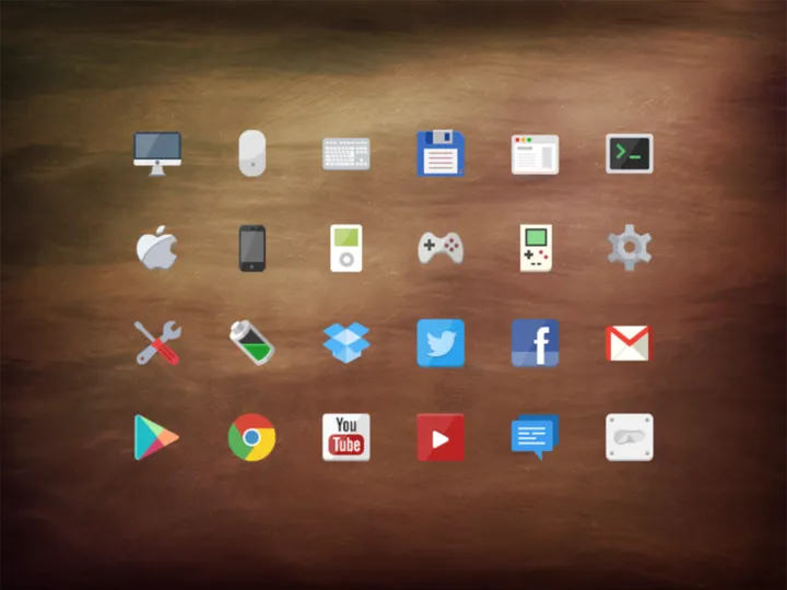
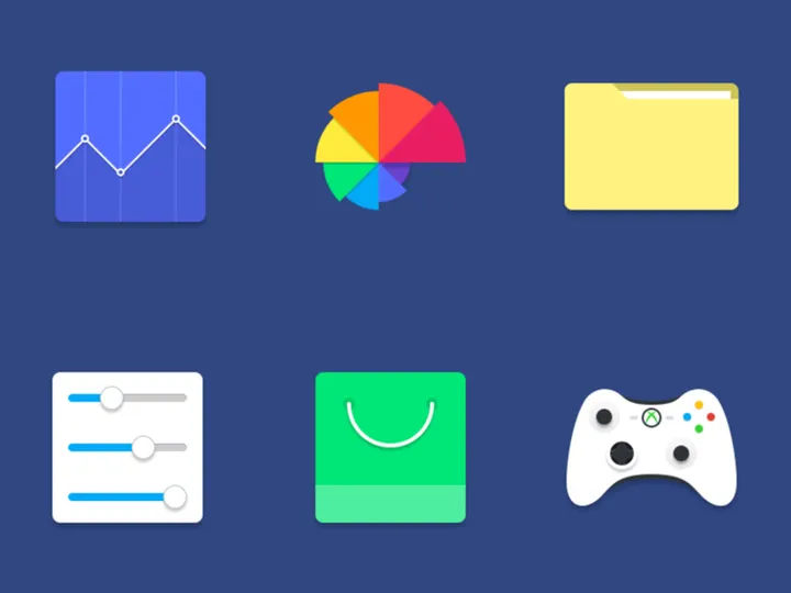
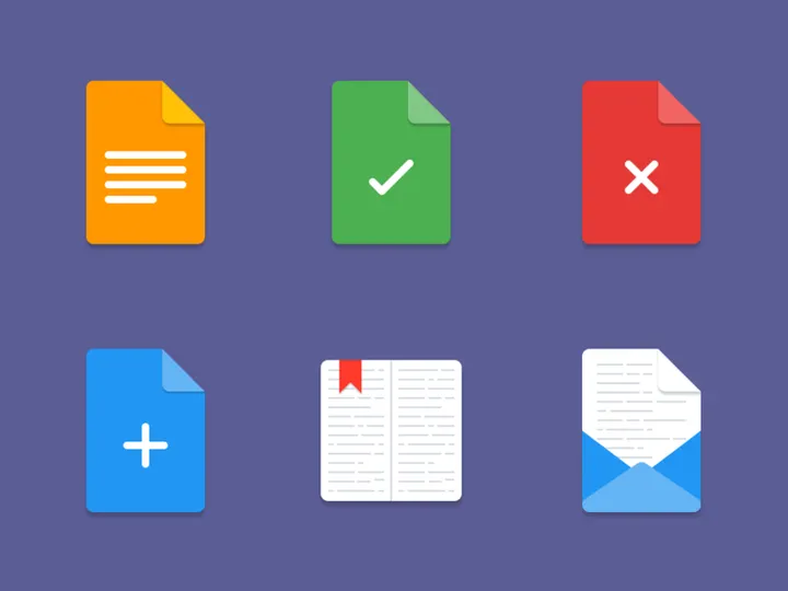
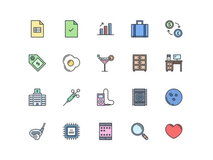
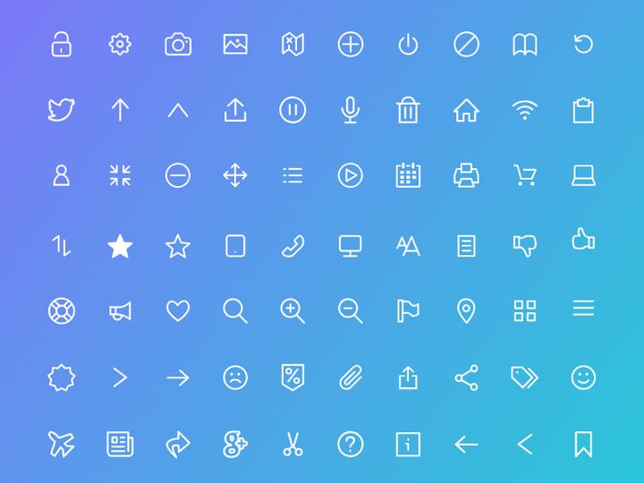
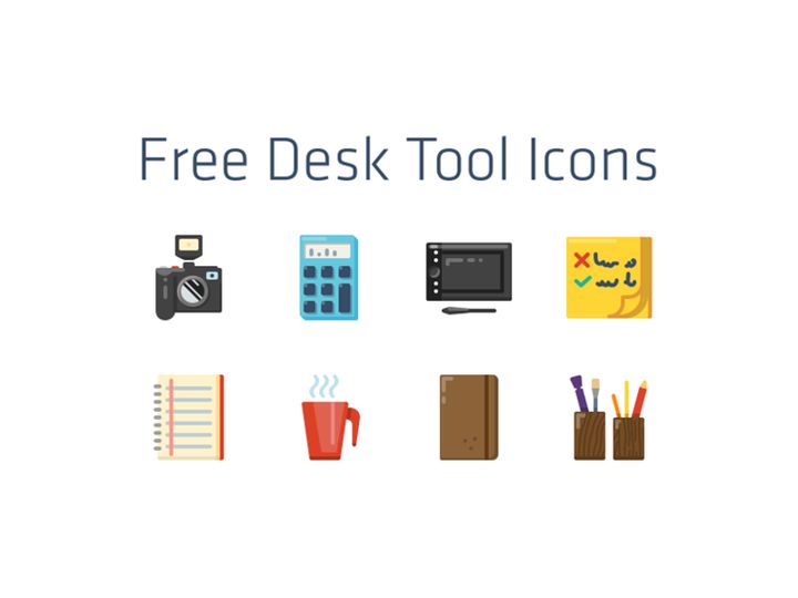
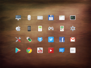
Inspiring Flat Icons Examples
Web & App Design
In the realm of web and app design, flat icons serve as essential navigational tools that enhance user experience without overwhelming the interface. Their clean, uncluttered appearance allows for faster comprehension and seamless integration into responsive layouts. From mobile dashboards to SaaS platforms, flat icons improve scannability and help users identify functions at a glance. At EpicPxls, the 83+ flat icons available are optimized for digital use, ensuring crisp rendering at various resolutions. Designers appreciate how these icons maintain visual harmony across menus, toolbars, and onboarding flows, contributing to a cohesive and modern user interface.
Print & Branding
Flat design has also made significant inroads into print and branding applications. Its scalability and clarity make it ideal for logos, business cards, brochures, and packaging. Brands aiming for a contemporary, professional look often adopt flat aesthetics to communicate transparency, innovation, and accessibility. The simplified forms translate well across mediums, ensuring consistent brand recognition whether viewed on a billboard or a smartphone screen. The flat icons from EpicPxls are particularly useful in branding kits, where a unified visual language strengthens identity and improves memorability.
Social Media & Marketing
In social media and marketing content, flat icons are widely used to convey messages quickly and effectively. Infographics, promotional banners, and digital ads benefit from the clarity and visual appeal of flat design. These icons help break down complex ideas into digestible visuals, increasing engagement and shareability. Platforms like Instagram, LinkedIn, and email newsletters frequently feature flat-style graphics to maintain a clean, modern aesthetic. With 83+ resources to choose from, EpicPxls empowers marketers to find the perfect icons that align with campaign themes while preserving a cohesive flat design language across all touchpoints.
How to Apply Flat Style to Your Projects
- Assess your project’s visual needs—Determine where icons will be used (e.g., navigation, illustrations, infographics) and identify the required themes (e.g., technology, communication, health). This helps narrow down the most suitable flat icons from the 83+ options available at EpicPxls.
- Select icons with consistent styling—Ensure all icons share the same stroke weight, corner radius, and level of detail. Cohesion is key to maintaining the integrity of the flat aesthetic across your design.
- Customize while preserving simplicity—Modify colors or proportions as needed, but avoid adding gradients, shadows, or textures that could compromise the flat look. Use vector editing tools to safely recolor or resize icons without losing quality.
- Integrate with your layout strategically—Position icons where they enhance usability, such as near labels or within buttons. Use whitespace effectively to prevent visual clutter and maintain readability.
- Pair with complementary typography—Choose modern, sans-serif fonts that align with the clean lines of flat design. Avoid overly decorative typefaces that may clash with the minimalist icon style.
- Test across devices and formats—Verify that your flat icons remain legible and visually appealing on mobile, desktop, and print outputs. The scalable nature of EpicPxls icons ensures sharp rendering at any size, making them ideal for responsive projects.
By following these steps, designers can seamlessly incorporate flat icons into diverse projects, from websites to marketing materials. The curated collection at EpicPxls offers not only variety but also quality assurance, ensuring that each icon supports a polished, professional outcome.
Flat Pairing Guide
Complementary Styles
While flat design stands strong on its own, it pairs exceptionally well with certain design approaches. Minimalism is a natural companion, as both styles prioritize simplicity and intentionality. Flat icons also work harmoniously with material design when used in moderation—subtle shadows or depth effects can enhance usability without undermining flat principles. For more dynamic compositions, flat elements can be combined with geometric patterns or abstract shapes to add visual interest without clutter. When executed thoughtfully, these pairings result in designs that are both modern and functional. The 83+ flat icons at EpicPxls are designed with versatility in mind, making them easy to integrate into hybrid design systems.
Typography Choices
Selecting the right typography is essential for maintaining the flat design aesthetic. Sans-serif fonts like Helvetica, Roboto, Open Sans, and Montserrat are top choices due to their clean lines and excellent legibility. These typefaces complement the geometric precision of flat icons and support a modern, uncluttered layout. For a slightly more distinctive look, consider using geometric fonts like Poppins or Quicksand, which echo the shapes found in many flat icons. Avoid serif or script fonts unless used sparingly for contrast, as they can disrupt the visual rhythm of a flat design. When using text alongside flat icons from EpicPxls, ensure consistent alignment and spacing to create a balanced, professional composition.
Color Palettes
Color plays a pivotal role in flat design, where vibrancy and contrast replace depth and texture. Bold, saturated hues are commonly used to differentiate sections and guide user attention. Popular palettes include monochromatic schemes for a sleek, modern look, or vibrant complementary combinations (e.g., teal and coral) to create visual excitement. Pastel tones have also gained popularity, especially in wellness, education, and lifestyle brands, offering a softer yet still modern aesthetic. Tools like color wheel generators or pre-built schemes from design systems can help maintain harmony. The flat icons from EpicPxls are delivered in universally compatible formats, allowing easy recoloring to match your chosen palette. Whether you opt for a high-contrast tech look or a muted, elegant brand tone, these icons adapt effortlessly to your vision.
Flat Icons Trends in 2026
As we move further into the decade, flat icons continue to evolve while staying rooted in their minimalist origins. The current trend is a refinement of “flat 2.0,” where designers incorporate slight depth cues—like soft shadows, subtle gradients, or layered transparency—without sacrificing the clean, two-dimensional foundation. This evolution enhances usability, especially in complex interfaces, by providing better visual hierarchy and focus. Additionally, there’s a growing emphasis on inclusivity and accessibility, with flat icons increasingly designed to represent diverse cultures, abilities, and identities. This shift ensures that digital experiences feel welcoming and representative for a global audience.
Today, flat icons are being used not only in traditional UI/UX contexts but also in emerging technologies such as AR interfaces, smart home dashboards, and AI-powered applications. Their scalability and clarity make them ideal for small screens and fast-loading environments, where performance and usability are paramount. Designers are also leveraging flat icons in motion graphics and micro-interactions, adding subtle animations to engage users without overwhelming the interface. Looking ahead, the trend is moving toward even greater personalization and adaptability. We’re seeing the rise of adaptive icon sets that change based on user preferences, themes, or even time of day—enhancing both functionality and emotional connection.
With 83+ resources available, EpicPxls remains at the forefront of this evolution, offering designers a rich library of forward-thinking flat icons that meet modern standards. As design tools become more intelligent and user expectations continue to rise, flat icons will remain a vital component of effective visual communication—balancing aesthetics, performance, and clarity in an increasingly digital world.
Why Download from EpicPxls?
Commercial License
Use in personal and commercial projects
No Account Required
Download free resources instantly
Quality Curated
Every resource is reviewed for quality
Preview Files
See Figma and Photoshop files before downloading
Who Uses These Icons?
Professionals and teams who benefit most from our collection
UI/UX Designers
Speed up your workflow with ready-to-use icons for design tools. Perfect for prototyping and client presentations.
Developers
Get production-ready assets without design skills. Export in any format for web and mobile apps.
Startups & Agencies
Save design budget with affordable premium icons. Commercial license included for client work.
Marketing Teams
Create professional campaigns faster. All icons are optimized for social media and ads.
Icons FAQCommon questions about these resources
Simple, Transparent Pricing
Get unlimited access to all premium resources
Yearly
- 20 downloads per month
- All file formats
- Commercial license
Lifetime
- Unlimited downloads forever
- All file formats
- Commercial license
Ready to Get Started?
Access 4,441+ free design resources today.
Browse Free ResourcesView Premium PlansEarn 85% and
more on all sales
Upload your products and put them up
for sale at whatever price you want.

