Fonts for Apps: 46+ Resources
EpicPxls offers 47+ curated fonts, all with a commercial license and editable source files (Figma, Sketch, PSD). Purpose-built fonts for app projects save time and ensure professional results with design elements tailored to app requirements.
Last updated February 12, 2026
Discover 46+ fonts ideal for app design projects.
Trusted by designers at leading companies
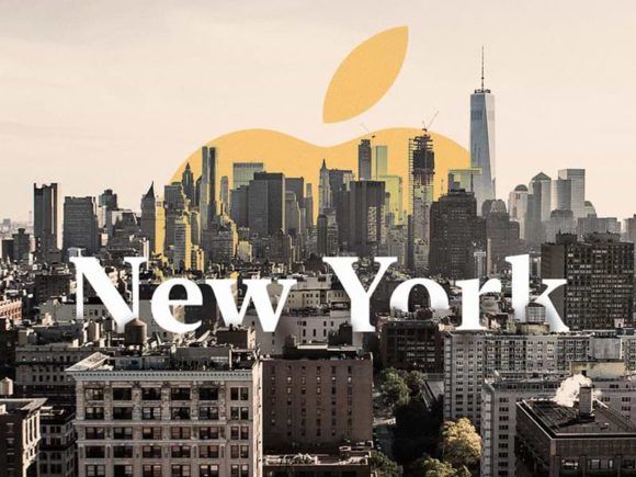
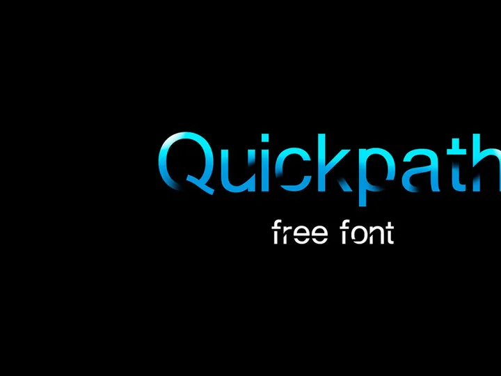
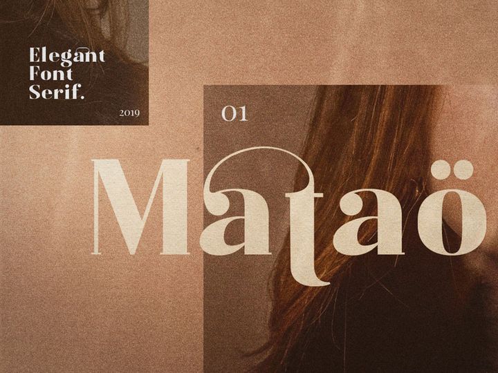
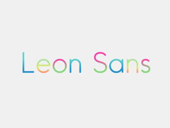
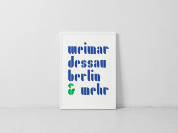
Top Fonts
Handpicked resources from our curated collection


Try Our Free Resources
Download any of these for free - no account required

Why Fonts for App Projects?
Typography plays a pivotal role in shaping the user experience of any mobile or web application. Choosing the right fonts can influence readability, brand perception, and overall interface usability. In fast-paced app development environments, designers often rely on pre-made fonts to accelerate the design process without sacrificing quality. Pre-designed, app-ready fonts eliminate the need to create typefaces from scratch, allowing teams to focus on layout, functionality, and user interaction. With well-crafted fonts, designers ensure that text elements—from navigation labels to call-to-action buttons—remain legible across various screen sizes and resolutions.
Common app design requirements include responsive typography, accessibility compliance, multilingual support, and visual harmony with brand identity. App interfaces demand clarity and consistency, especially when dealing with dense content or gesture-based navigation. Fonts must support a wide range of weights and styles to accommodate different UI elements, such as headlines, body text, captions, and form fields. Additionally, performance is critical; fonts must load quickly and render smoothly across devices, which is where optimized, professionally designed typefaces make a significant difference.
At EpicPxls, we understand the unique demands of app design. That’s why our library features a handpicked collection of 46+ resources specifically curated for mobile and web application projects. Each font is evaluated for legibility, scalability, licensing suitability, and compatibility with modern design tools. Whether you're building a fintech dashboard, a social media platform, or a health and wellness app, our collection offers versatile, high-quality fonts that meet industry standards. By providing app-ready typography solutions, EpicPxls empowers designers to maintain creative momentum while ensuring professional-grade output.
What App Designers Need
Essential Fonts Types
Not all fonts are created equal when it comes to app design. The most effective typefaces for digital interfaces fall into three primary categories: sans-serif, geometric, and humanist. Sans-serif fonts dominate app design due to their clean lines and excellent readability on screens. Examples include modern typefaces with neutral proportions and open letterforms that enhance legibility at small sizes. Geometric fonts, inspired by shapes like circles and squares, offer a contemporary, tech-forward aesthetic ideal for apps targeting younger or design-savvy audiences. Meanwhile, humanist sans-serifs mimic natural handwriting rhythms, providing warmth and approachability—perfect for lifestyle, education, or wellness apps.
Designers also benefit from fonts that include multiple optical sizes, variable weights (from thin to black), and true italics. These variations allow for dynamic typographic hierarchies without compromising visual consistency. For multilingual apps, extended language support and proper diacritic rendering are essential. Iconic apps often pair a highly legible body font with a distinct display font for branding or splash screens, creating visual interest while maintaining usability.
Format Requirements
When integrating fonts into app design workflows, file format compatibility is crucial. The most widely supported formats include WOFF2, WOFF, TTF (TrueType), and OTF (OpenType). WOFF2 is preferred for web-based apps due to its superior compression and faster load times, while TTF and OTF are commonly used in native mobile development environments like iOS and Android. Variable fonts—available in a single file that contains multiple weights and widths—are increasingly popular for their efficiency and flexibility in responsive design.
Designers using tools such as Figma, Sketch, or Adobe XD should ensure their chosen fonts are compatible with these platforms. Most modern design software supports web font linking and local font integration, but licensing restrictions can sometimes limit usage. Always verify that font licenses permit embedding in digital products and redistribution within app builds—a key consideration when selecting from third-party libraries.
Quality Standards
App-ready fonts must meet rigorous quality benchmarks. First and foremost is legibility: characters should be easily distinguishable, even at small sizes or on low-resolution screens. Look for generous x-heights, consistent stroke widths, and adequate spacing (kerning and tracking) that prevent crowding. Rendering consistency across devices and operating systems is another critical factor—some fonts appear pixelated or distorted on certain platforms if not properly optimized.
Professional-grade fonts also include comprehensive glyph sets, covering punctuation, numerals, symbols, and special characters needed for diverse content. Diacritical marks for European, Cyrillic, or Asian languages should be accurate and well-integrated. EpicPxls ensures that every font in its 46+ resources collection meets these standards, with thorough testing across real-world app scenarios. Additionally, clear licensing terms and documentation help designers avoid legal pitfalls during deployment.
App Design Project Walkthrough
- Define Your App’s Typographic Needs: Begin by outlining your app’s content structure—headings, body text, buttons, captions, and navigation labels. Identify how many font weights and styles you’ll need. Consider brand tone: is your app minimalist, playful, or authoritative? This informs your font selection.
- Select App-Ready Fonts from Trusted Sources: Browse curated libraries like EpicPxls to find fonts tailored for digital interfaces. Filter by category, language support, or license type. Download fonts with multiple weights and OpenType features for maximum flexibility.
- Import Fonts into Your Design Tool: Install the fonts on your system or link them directly in Figma, Sketch, or Adobe XD. Organize them in your project’s typography styles to ensure consistency from the start.
- Establish a Typographic Hierarchy: Assign specific fonts and sizes to each text element. Use bold or medium weights for headings, regular for body text, and light or italic variants for subtle cues. Maintain sufficient contrast between text and background for accessibility.
- Test Across Devices and Languages: Simulate how your fonts appear on different screen sizes, resolutions, and OS versions. Check rendering on both iOS and Android. If your app supports multiple languages, verify that all characters display correctly.
- Export and Hand Off to Developers: Package your font files with proper licensing documentation. Provide developers with font weights, sizes, line heights, and usage guidelines. Use design tokens or style guides to ensure accurate implementation in code.
Combining multiple fonts effectively requires balance. A common strategy is pairing a highly legible sans-serif for body text with a stylized display font for headlines or logos. Limit your palette to two or three typefaces to avoid visual clutter. Use contrast in weight, size, and spacing to differentiate sections without introducing new fonts unnecessarily. The 46+ resources available through EpicPxls include expertly designed font families and complementary pairs, making it easier to achieve cohesive, professional results.
App Design Workflow Tips
Speed Up Your Process
Leveraging pre-made, app-optimized fonts significantly reduces design time. Instead of testing multiple typefaces or adjusting kerning manually, you can start with professionally crafted fonts that are already optimized for screen readability. Use design system presets or UI kits that include integrated typography styles based on proven font combinations. EpicPxls offers ready-to-use font bundles that sync seamlessly with popular design tools, enabling rapid prototyping. By reducing trial and error, you free up time to focus on user flow, interaction design, and usability testing.
Maintain Consistency
Consistency is key to creating trustworthy, intuitive app experiences. Define a core set of typographic rules early in the project—such as font pairings, size scales, and color usage—and document them in a shared style guide. Use component libraries to standardize buttons, cards, and input fields with embedded text styles. When team members access the same font resources from a centralized source like EpicPxls, it minimizes discrepancies between mockups and final builds. Consistent typography reinforces brand identity and helps users navigate your app with confidence.
Client Presentation
When presenting app designs to clients, clarity and professionalism matter. Use high-fidelity prototypes that reflect real-world typography behavior, including dynamic text resizing and language switching. Explain your font choices in terms of usability, brand alignment, and technical performance. Include licensing details to reassure clients that all assets are legally compliant. With polished, well-documented typography, you demonstrate attention to detail and elevate the perceived value of your work. The diverse selection of 46+ resources ensures you always have the right font to match your client’s vision and technical requirements.
App Design Inspiration
Today’s top app designs embrace minimalist aesthetics, bold typography, and inclusive design principles. Clean, spacious layouts paired with expressive typefaces create memorable user experiences. Many leading apps use variable fonts to dynamically adjust weight and width based on screen size or user preferences, enhancing both performance and personalization. Dark mode typography is another growing trend, requiring careful consideration of contrast, luminance, and font rendering to prevent eye strain.
Leading designers often start with typography as a foundational element, shaping layout and color schemes around the chosen typeface. They prioritize accessibility by adhering to WCAG guidelines for text contrast and minimum font sizes. Motion and micro-interactions are also enhanced through typographic animation—such as animated headlines or typing effects—that guide user attention without overwhelming the interface.
To stay ahead of the curve, explore curated collections that spotlight emerging trends in digital typography. EpicPxls regularly updates its library with modern, app-optimized fonts that reflect current design directions. From sleek neo-grotesques to expressive display typefaces, the 46+ resources available provide endless inspiration for your next project. Whether you're refining an existing app or launching a new concept, the right font can transform your design from functional to exceptional.
Why Download from EpicPxls?
Commercial License
Use in personal and commercial projects
No Account Required
Download free resources instantly
Quality Curated
Every resource is reviewed for quality
Preview Files
See Figma and Photoshop files before downloading
Who Uses These Fonts?
Professionals and teams who benefit most from our collection
UI/UX Designers
Speed up your workflow with ready-to-use fonts for design tools. Perfect for prototyping and client presentations.
Developers
Get production-ready assets without design skills. Export in any format for web and mobile apps.
Startups & Agencies
Save design budget with affordable premium fonts. Commercial license included for client work.
Marketing Teams
Create professional campaigns faster. All fonts are optimized for social media and ads.
Fonts FAQCommon questions about these resources
Simple, Transparent Pricing
Get unlimited access to all premium resources
Yearly
- 20 downloads per month
- All file formats
- Commercial license
Lifetime
- Unlimited downloads forever
- All file formats
- Commercial license
Ready to Get Started?
Access 4,441+ free design resources today.
Browse Free ResourcesView Premium PlansEarn 85% and
more on all sales
Upload your products and put them up
for sale at whatever price you want.

