What Is a Color Palette? Complete Guide for Designers
EpicPxls offers 75+ curated graphics, all with a commercial license and editable source files (Figma, Sketch, PSD). A color palette is a pre-made design resource that helps designers work faster. Browse 75+ color palettes on EpicPxls for your projects.
Last updated February 12, 2026
Everything you need to know about color palettes — definition, types, and how to use them.
Trusted by designers at leading companies
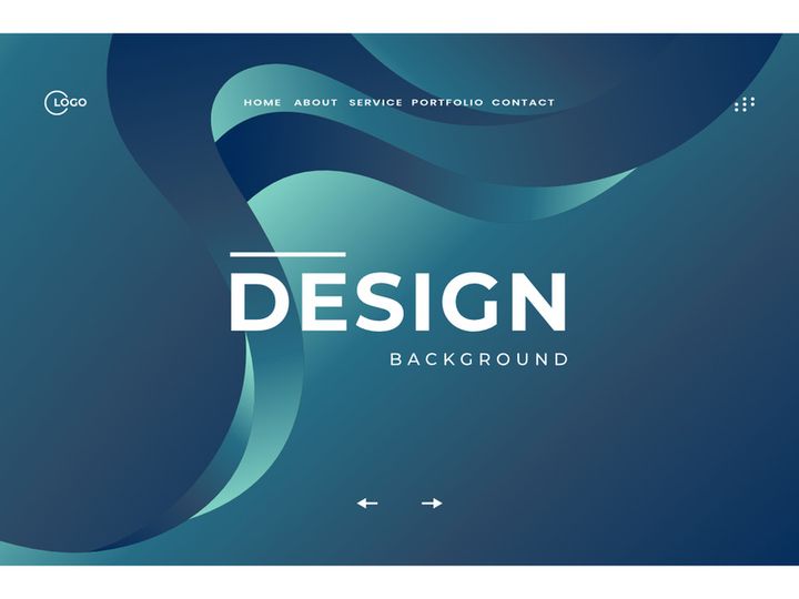
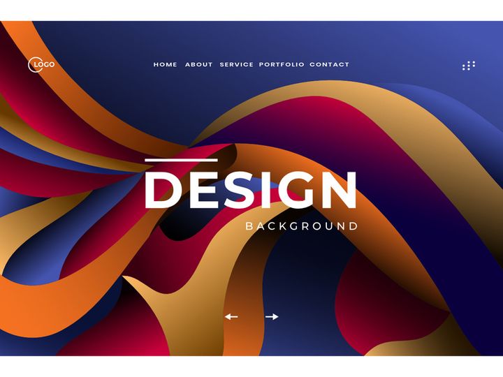
Top Graphics
Handpicked resources from our curated collection
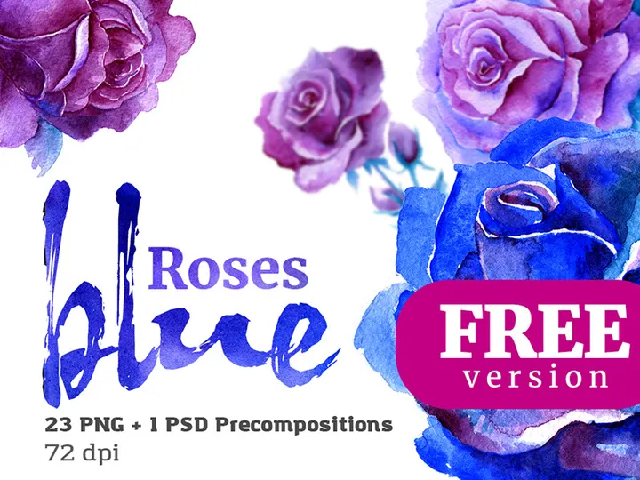


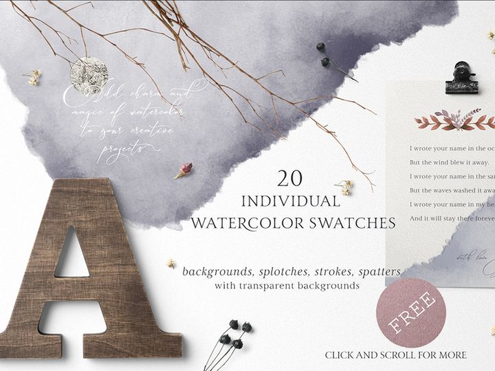


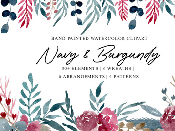
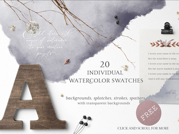
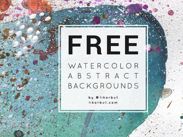
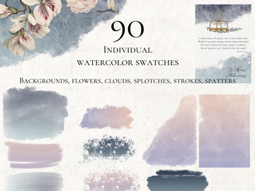
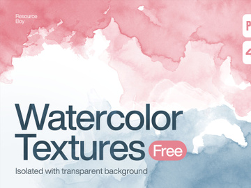
Try Our Free Resources
Download any of these for free - no account required

What Is a Color Palette?
A color palette is a curated selection of colors chosen to work harmoniously together in a design project. Think of it as a designer’s toolkit—just like a painter selects specific pigments before starting a canvas, a designer uses a color palette to define the visual tone, mood, and consistency of digital or print media. Whether you're crafting a website, mobile app, branding package, or marketing campaign, a well-constructed color palette ensures that every color choice supports the overall aesthetic and functional goals of the design.
The concept of a color palette dates back centuries, originally rooted in traditional art. Painters would physically arrange their chosen pigments on a wooden board—also called a palette—before beginning a piece. As design evolved into digital formats, the term transitioned into the virtual space. Today’s color palettes are often defined using precise color codes such as HEX, RGB, CMYK, or HSL, ensuring consistency across devices and platforms. With the rise of user interface (UI) and user experience (UX) design, color palettes have become foundational in creating cohesive, accessible, and emotionally resonant digital experiences.
Why do color palettes matter so much in modern design workflows? The answer lies in both psychology and practicality. Colors influence perception, evoke emotions, and guide user behavior. A carefully chosen palette can reinforce brand identity, improve readability, and create visual hierarchy. For example, a calming blue might be selected for a healthcare app, while a vibrant red could energize a food delivery platform. Moreover, using a consistent color palette streamlines collaboration among design teams, developers, and stakeholders, reducing confusion and ensuring brand integrity across multiple touchpoints.
With the growing demand for high-quality, visually appealing content, access to well-designed color palettes has never been more important. Platforms like EpicPxls offer designers a vast selection of professionally curated options, making it easier to find inspiration and implement color strategies quickly. Whether you're a beginner or a seasoned creative, understanding and leveraging color palettes is essential for creating impactful, professional-grade designs. With over 1481+ resources available, including ready-to-use palettes tailored for diverse industries and styles, finding the perfect color combination has never been simpler.
Types of Color Palettes
By Purpose
Color palettes are often designed with specific applications in mind. A branding palette, for instance, includes primary and secondary colors that represent a company’s identity across all media. These palettes are built for consistency and long-term use, often including alternate versions for dark and light backgrounds. UI/UX palettes focus on usability, incorporating colors for interactive elements like buttons, alerts, and navigation. They typically include neutral tones for text and backgrounds, along with accent colors for calls to action.
For creative projects like illustrations or editorial designs, artistic palettes prioritize mood and visual impact over functionality. These are often inspired by nature, seasons, or cultural themes—think “sunset hues” or “ocean blues.” Meanwhile, accessibility-focused palettes are engineered to meet contrast ratio standards (like WCAG guidelines), ensuring readability for users with visual impairments. Each purpose-driven palette serves a unique role, and choosing the right one depends on your project’s goals and audience.
By Format
The way a color palette is delivered can affect how easily it integrates into your workflow. Common formats include ASE (Adobe Swatch Exchange), which is compatible with Adobe Creative Suite applications like Photoshop and Illustrator, allowing designers to import and apply colors seamlessly. SKP (Sketch Palette) files are tailored for Sketch users, while XML or JSON formats are often used in development environments for web and mobile apps.
Some palettes come as PDF guides with color codes and usage suggestions, ideal for client presentations or team documentation. Others are embedded directly into design systems or style guides. Many modern tools also support copy-paste HEX or RGB values, making it easy to transfer colors between platforms. At EpicPxls, all 1481+ color palette resources are available in multiple usable formats, ensuring compatibility across design and development tools.
By Complexity
Color palettes can range from simple to highly complex, depending on the needs of the project. A basic palette might include just 3–5 colors: a primary, a secondary, an accent, and one or two neutrals. This minimal approach works well for startups or small-scale designs where clarity and simplicity are key. In contrast, a comprehensive palette can contain 10 or more colors, including variations for different states (hover, active, disabled), semantic colors (success, warning, error), and contextual tones (light mode, dark mode, high contrast).
Complex palettes are common in enterprise-level design systems, where consistency across hundreds of screens and components is crucial. They often come with detailed documentation on usage, spacing, and combinations. Whether you need a minimalist set for a personal brand or a full-scale system for a SaaS platform, the right level of complexity ensures your design remains both functional and scalable.
How to Use Color Palettes in Your Projects
- Define Your Project Goals: Before selecting a palette, understand the purpose of your design. Is it a corporate website, a playful app, or a luxury brand? The emotional tone and audience expectations will guide your color choices.
- Choose a Palette That Matches Your Mood: Browse curated collections—like the 1481+ options on EpicPxls—to find a palette that aligns with your vision. Look for palettes labeled with moods like “modern,” “vintage,” “minimalist,” or “vibrant” to narrow your search.
- Test for Accessibility: Ensure your palette meets accessibility standards. Use tools to check contrast ratios between text and background colors, especially for interfaces. Adjust tones if necessary to maintain readability for all users.
- Apply the 60-30-10 Rule: This classic design principle suggests using 60% of a dominant color, 30% of a secondary color, and 10% of an accent color. It creates visual balance and prevents color overload.
- Customize for Your Brand: Even if you’re using a pre-made palette, tweak hues, saturation, or brightness to better reflect your brand’s personality. Most design tools allow easy adjustments to imported swatches.
- Document and Share: Once finalized, save your palette in multiple formats and share it with your team. Include usage guidelines—such as which colors to use for buttons, text, or icons—to ensure consistency across all deliverables.
Best practices for using color palettes include maintaining consistency, avoiding color overload, and regularly reviewing your choices as the project evolves. Many designers rely on tools like Figma, Adobe Color, or specialized plugins to manage and apply palettes efficiently. With EpicPxls, you can download palettes directly into your preferred software, speeding up the design process and reducing guesswork. Whether you're working solo or on a large team, integrating a well-chosen color palette early in the workflow saves time and enhances the final outcome.
Color Palette vs Related Concepts
While the term “color palette” is sometimes used interchangeably with related design elements, it’s important to distinguish it from similar concepts. A color scheme refers to the theoretical arrangement of colors based on color theory—such as complementary, analogous, or triadic combinations. A color palette, on the other hand, is the practical application of such schemes, often including specific color values and usage guidelines.
Another related term is color system, which goes beyond a simple palette by incorporating rules for application, contrast, states, and responsiveness. A color system might include multiple palettes for different modes (e.g., light and dark themes), making it more comprehensive than a standalone palette. Similarly, a design system encompasses typography, spacing, components, and interactions in addition to color.
So when should you use a color palette versus a full design system? For small projects or quick prototypes, a well-chosen color palette is often sufficient. For larger, scalable products—especially digital platforms with multiple contributors—a full color system or design system is recommended. That said, a strong color palette is usually the foundation of any larger system. By starting with a solid palette, you lay the groundwork for consistency, usability, and brand recognition. Platforms like EpicPxls make it easy to begin with a professional palette and build outward as your project grows.
Where to Find Quality Color Palettes
Finding high-quality color palettes starts with knowing what to look for. A professional palette should include a balanced mix of colors that work well together, be grounded in sound color theory, and offer practical usability. Look for palettes that provide clear color codes (HEX, RGB, etc.), usage suggestions, and accessibility information. Well-organized palettes often include neutrals, accents, and semantic colors (like success green or error red), making them ready for real-world application.
One of the best ways to access reliable resources is through curated design platforms. EpicPxls stands out by offering over 1481+ color palette resources, each thoughtfully designed for specific industries, moods, and use cases. From minimalist monochromatic sets to bold, gradient-rich combinations, the collection caters to a wide range of creative needs. The platform ensures that every palette is tested for harmony and usability, saving designers time and effort in the selection process.
When choosing between free and premium options, consider your project’s requirements. Free palettes can be great for personal projects or learning, but premium palettes often come with better documentation, extended color variations, and commercial licensing. At EpicPxls, many premium palettes include multi-format downloads and are licensed for both personal and commercial use, making them ideal for professional workflows. Whether you're designing a portfolio, launching a brand, or building an app, having access to trustworthy, ready-to-use color palettes accelerates your process and elevates your results.
Why Download from EpicPxls?
Commercial License
Use in personal and commercial projects
No Account Required
Download free resources instantly
Quality Curated
Every resource is reviewed for quality
Preview Files
See Figma and Photoshop files before downloading
Who Uses These Graphics?
Professionals and teams who benefit most from our collection
UI/UX Designers
Speed up your workflow with ready-to-use graphics for design tools. Perfect for prototyping and client presentations.
Developers
Get production-ready assets without design skills. Export in any format for web and mobile apps.
Startups & Agencies
Save design budget with affordable premium graphics. Commercial license included for client work.
Marketing Teams
Create professional campaigns faster. All graphics are optimized for social media and ads.
Graphics FAQCommon questions about these resources
Simple, Transparent Pricing
Get unlimited access to all premium resources
Yearly
- 20 downloads per month
- All file formats
- Commercial license
Lifetime
- Unlimited downloads forever
- All file formats
- Commercial license
Ready to Get Started?
Access 4,441+ free design resources today.
Browse Free ResourcesView Premium PlansEarn 85% and
more on all sales
Upload your products and put them up
for sale at whatever price you want.

