UI Kits
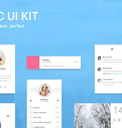
Search 2 ui kits to use for theme development, page design, social media and landing pages. Any website can use the UI elements, wireframe kits and templates that also have bootstrap integration for a faster development.
2 resources


Featured categories
Check out the limited selection of products we put together for you to download. We picked these to make your search for the perfect theme, template or design much quicker.


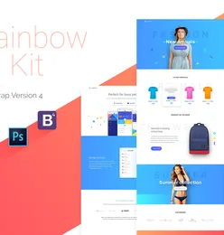
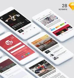
Bootstrap UI kit
UI kits that can help you build your website faster


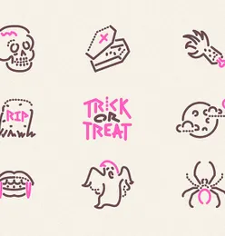
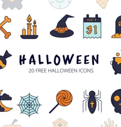
Halloween items
icons and illustration that can help you build your Halloween themed projects easier.


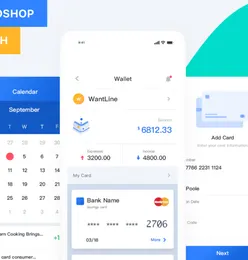
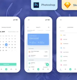
Fintech Mobile Apps
Useful resources that can help you develop or build your own projects.React Native useful resources
Cool react native resources that can help you create interesting products


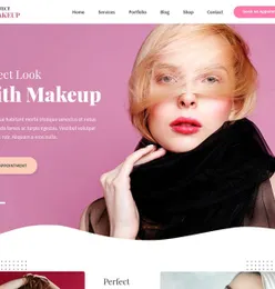
WordPress Themes
We've collected some of our epic WordPress themes to help you build excellent and remarkably functional WordPress websites.


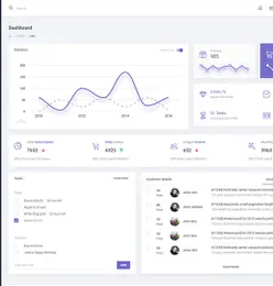
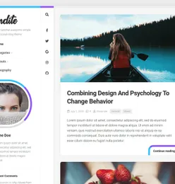
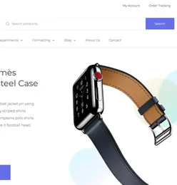
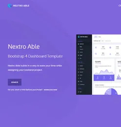
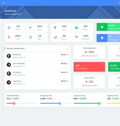
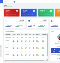
Bootstrap Admin Templates
Create fast & stunning web apps with the help of our easily customizable Bootstrap admin templates



Frequently Asked Questions
What is a UI kit and how do I use one?
A UI kit is a collection of pre-designed interface components -- buttons, forms, cards, navigation bars, and more -- that you can assemble to build app or website designs quickly. Download the kit, open it in your preferred design tool (Figma, Sketch, or Adobe XD), and drag components onto your canvas.
Which design tools are compatible with EpicPxls UI kits?
Most UI kits on EpicPxls include files for Figma, Sketch, and Adobe XD. Some also include HTML/CSS versions or Framer components. Check each product's details for specific format compatibility.
What is the difference between a UI kit and a design system?
A UI kit provides ready-made interface components. A design system goes further with documented guidelines, spacing rules, color tokens, and component variants. Many premium UI kits on EpicPxls include design system elements.
Can I customize the UI kit components for my brand?
Yes. All UI kits are fully editable in their respective design tools. Change colors, typography, spacing, and content to match your brand. Most kits use organized layers and components for easy customization.
How do I install a Figma UI kit?
Download the .fig file from EpicPxls, then open Figma and use File > Import to add it to your workspace. The components will be available in your local components library.
Earn 85% and
more on all sales
Upload your products and put them up
for sale at whatever price you want.


