Modern Risk Management Dashboard UI Design | SaaS Admin PanelPremium
Description
Most dashboards fail not because of features…
but because users can’t understand them quickly.
This Risk Management Dashboard is designed with one goal:
👉 Clarity under pressure.
When users are dealing with risk, compliance, or security —
they don’t have time to “figure things out.”
So this design focuses on:
• Clean and structured layout
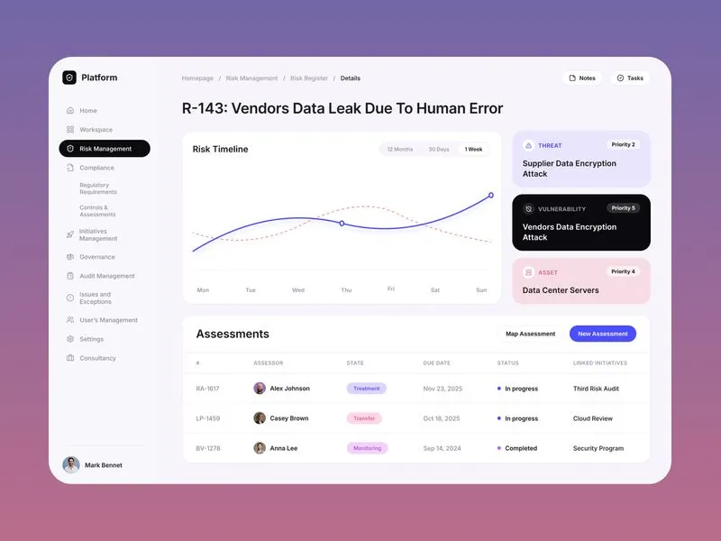
• Clear risk visualization (timeline + insights)
• Priority-based information hierarchy
• Minimal cognitive load
• Soft, premium SaaS aesthetics
The sidebar navigation keeps everything accessible,
while the main dashboard highlights what actually matters —
risk trends, threats, and active assessments.
Every element is intentionally designed to help users:
→ Scan faster
→ Decide quicker
→ Act confidently
Because in enterprise products,
clarity is not a feature — it’s the product.


Earn 85% and
more on all sales
Upload your products and put them up
for sale at whatever price you want.

