Header:
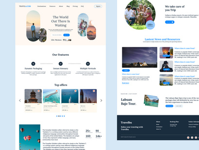
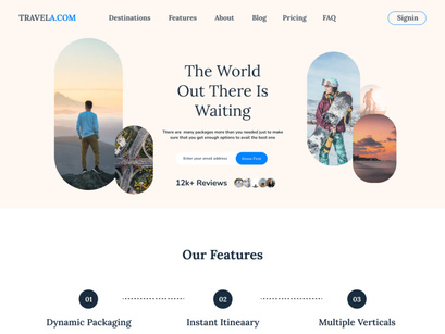
The landing page begins with a captivating header section. It features a high-resolution image or video background that showcases a breathtaking travel destination. Overlaying this imagery is the travel agency's logo on the top-left corner and a transparent navigation bar on the top-right corner. The navigation bar includes menu items such as "Home," "Destinations," "Tours & Packages," "Blog," "Contact," and possibly "Book Now" or "Sign Up" buttons.
Hero Section:
Directly below the header is the hero section. It includes a concise and compelling headline that encapsulates the essence of the travel agency's services. A call-to-action (CTA) button with a vivid color stands out prominently, encouraging users to explore the agency's offerings or to start planning their trip.
Featured Destinations:
The next section showcases a grid or carousel of featured travel destinations. Each destination is represented by a high-quality image, a brief description, and an enticing CTA button that leads to more details about that specific destination. Users can easily browse through these options and click on any that capture their interest.
Tours & Packages:
This section highlights the agency's various tour packages. It could be presented as a grid or a list, with each package having a thumbnail image, a brief description, duration, price, and a "Learn More" button. Hovering over or clicking on a package might display additional information, such as itinerary, inclusions, and dates.
Testimonials:
The landing page may include a section dedicated to customer testimonials. It showcases reviews and feedback from satisfied travelers, along with their names and possibly profile pictures. This adds credibility and builds trust among potential customers.
Blog Highlights:
The travel agency might have a blog section, where they share travel tips, destination guides, and other related content. The landing page could feature a few recent blog posts with captivating images, titles, and excerpts, encouraging users to explore the full articles.
Newsletter Signup:
To engage users and build a mailing list, a newsletter signup section can be included. Users can enter their email addresses to subscribe for updates, exclusive offers, and travel inspiration. This section often features a complementary background image that aligns with the travel theme.
Contact Information:
Towards the bottom of the page, the agency's contact details should be prominently displayed. This might include a physical address, phone number, email address, and links to social media profiles. A well-designed contact form could also be integrated, allowing users to submit inquiries directly from the landing page.
Footer:
The footer of the page typically contains secondary navigation links, copyright information, privacy policy links, and additional quick links. It maintains consistency with the overall design and provides users with a way to access important pages without scrolling back up.
Visual Style:
The color palette of the landing page could consist of warm and inviting tones, often associated with travel and exploration. High-quality imagery and carefully chosen fonts contribute to a professional and user-friendly design. The layout is clean, utilizing white space effectively to avoid clutter and ensure a smooth browsing experience.
Overall, the Travel Agency Landing Page UI combines stunning visuals, persuasive content, and intuitive navigation to entice visitors, showcase the agency's offerings, and convert them into potential customers.
